1. Problem to be solved
Flat 2D graphs are boring, 3D graphs are hard to read. 2D graphs made to look 3D are the best of both worlds. We’re going to do is add a 3-color linear gradient to the bars and then if desired throw in a background texture to add a little more depth.
Experiment with the colors yourself and the background texture to get something that appeals to you, but most importantly makes your data easy to read so you can make your point with the graph.
And yes, I know, Excel calls them charts but they’re graphs, darn it!
This tutorial was created using Office 2011 for Mac.
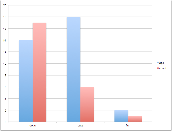
1.1 Flat 2D Graph
Boring!
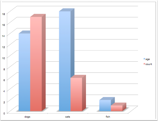
1.2 3D Graph
Confusing! Can’t read the heights of the bars accurately.
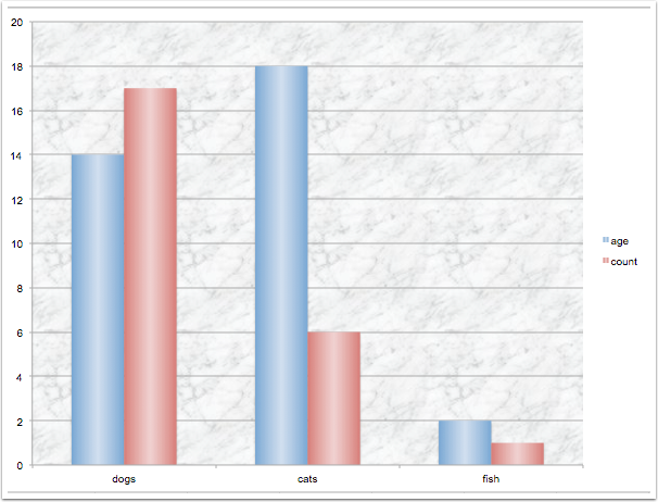
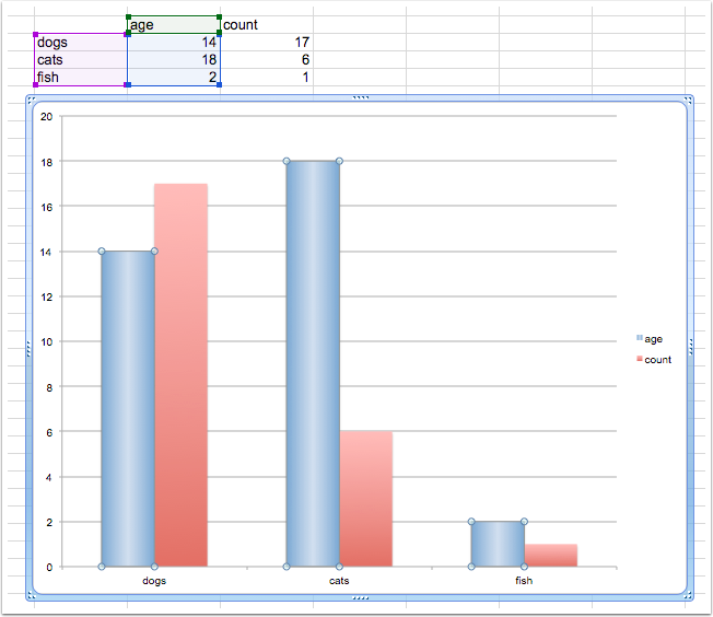
1.3 2D Graph Made to LOOK 3D
2D graph is easy to read the values, but the shading makes it look three dimensional.
2. Create the Initial Graph
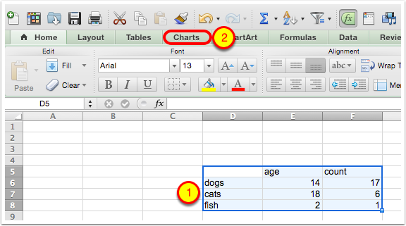
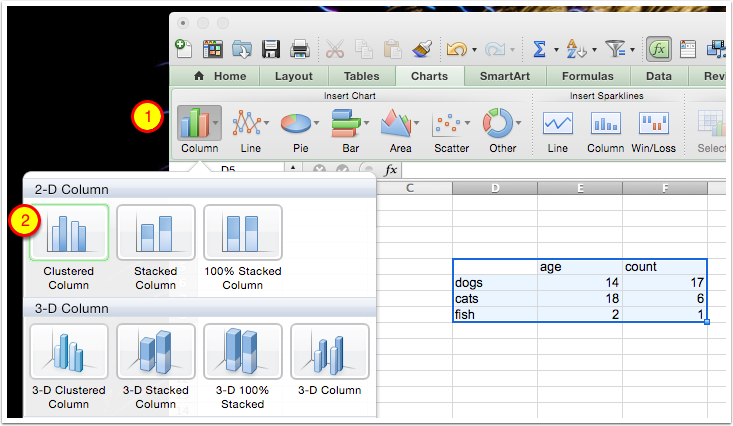
2.1 Select Data Range
Select Data Range and then tap on the Charts tab.
Alternatively you can select Insert/Chart… from the menubar.
2.2 Select Chart Type
Tap on Column in the Chart Menu and then choose 2D Column/Clustered Column
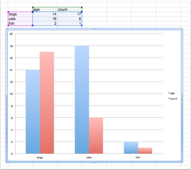
2.3 Flat, Ugly 2D Graph
Double tap on one of the blue bars. Alternatively you can tap once on a blue bar and select Format/Data Series…
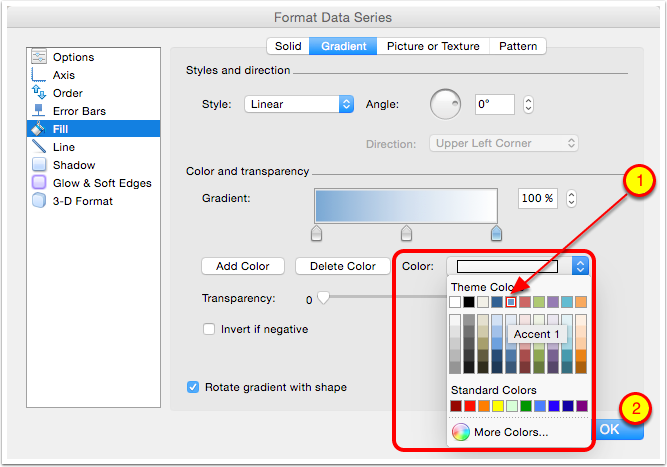
3. Format the Bars
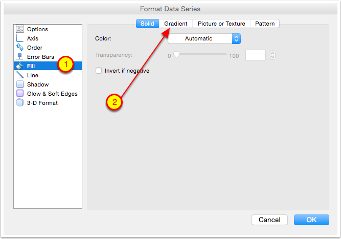
3.1 This Brings Up the Format Data Series Options
Select Fill from the left sidebar (if it isn’t already selected) and then tap on the Gradient Tab.
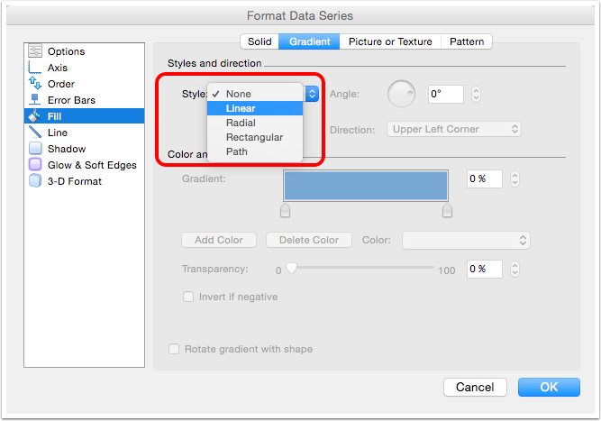
3.2 Choose Linear from the Style Pulldown
3.3 Default Goes from blue to white
In order to produce the illusion of 3D, we want the bars to be a darker blue on the left and right, with a light blue in the middle.
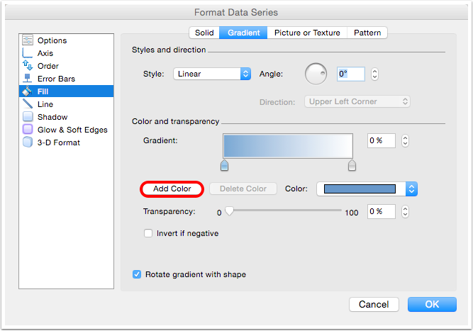
The default gradient only has two colors, so we need to add a color to the middle and then change the three colors to the desired dark/light/dark. Select Add Color.
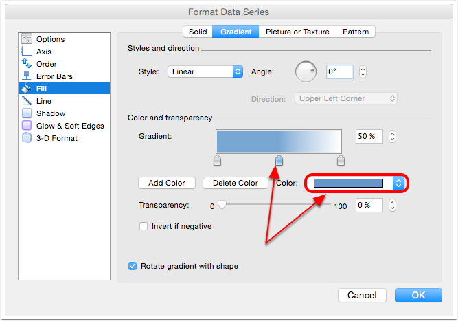
3.4 Change the Center Color
Note the three pointers below the color gradient. You can tell the center color is selected because the center pointer is highlighted. Tap the Color pulldown.
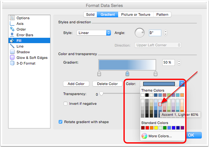
3.5 Select a Lighter Blue for the Center Color
I like Accent 1, Lighter 60% which is the second light one below the darker blue.
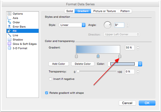
3.6 Select the Right Pointer
The left color is already the darker blue color, the center is a light blue so now we need to change the right color to the same darker blue as the left color.
We now need to repeat the process for the right color. Select the right pointer, and again click on the Color pulldown.
3.7 Choose Dark Blue for the Right Color
Click OK.
3.8 You Now Have a Fake 3D Bar
Rinse and repeat for the red bar
4. Background Texture (Optional)
4.1 Add a Background Texture
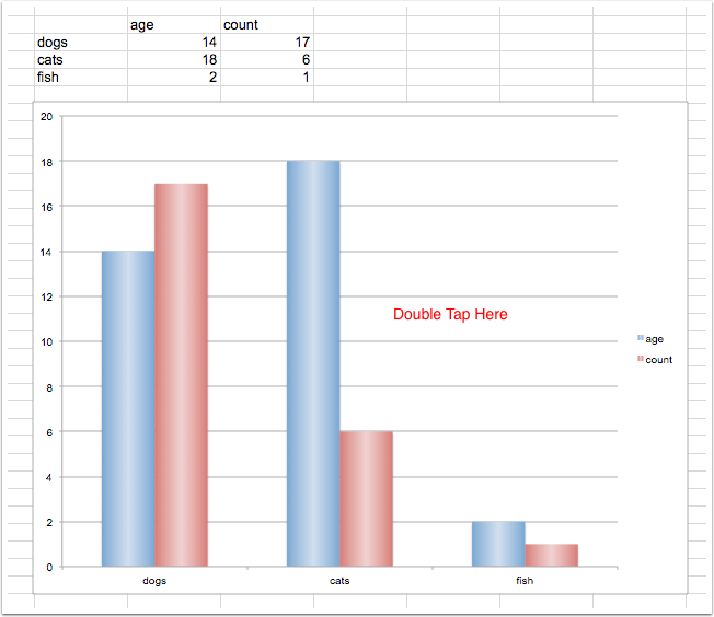
Double tap anywhere in the background area of the graph. Alternatively you can choose Format/Chart Area… from the menus.
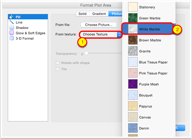
4.2 Select Picture or Texture

4.3 Select Texture
I favor White Marble for the background.
4.4 Change Transparency to 50%
The default texture is a bit distracting so I dial the transparency up which mutes the effect a bit.
5. Our New and Improved Graph
Celebrate!
