I pride myself on paying attention to accessibility, as part of the natural fabric of my podcasts and blog. What is that saying taken from Proverbs, “Pride goeth before a fall”? Yeah, I have fallen big time on this one.
I’m a fanatic about making sure I have alt tags on my images. Alt tags are text that web developers enter on images so screen readers can tell the viewer what they’re “looking” at. In Programming By Stealth, Bart has been doing an amazing job of making sure that the code we write meets the accessibility standards too. But as with most things, there’s always a lot more we can learn.
WebAIM Million Report
This week someone tweeted out the latest WebAIM Million report. WebAIM is short for “web accessibility in mind”. These folks do a report that evaluates the top 1,000,000 home pages for accessibility. The purpose is not to shame sites or developers but rather to find trends in what can be done to improve accessibility.
A report like this sounds super dull but I found it fascinating. It’s written extremely well and is very accessible to the layperson. They methodically go through how they pick the sites and why they only look at home pages. Spoiler: it’s because home pages are the most accessed and receive the most attention from developers and research indicates a correlation between issues discovered there and other site pages.

When you get past the methodology paragraphs, you’ll find a single, easy-to-read graph that shows the top six most common failures according to the Web Content Accessibility Guidelines (WCAG 2). Sadly, 97.8% of home pages had WCAG 2 failures. But let’s take a look and see how hard they would be to fix.
They are in order:
- Low contrast text
- Missing alt text for images
- Empty links
- Missing form input labels
- Missing document language
- Empty buttons
I was curious how my own website would stack up. My first assumption was that the only thing I might need to look at would be whether my text is high enough contrast. I had often wondered about contrast, but I didn’t know how to measure it or what it was supposed to be. Luckily, the WebAIM Million report had a link to their own article explaining low contrast text, with references to the WCAG documentation.
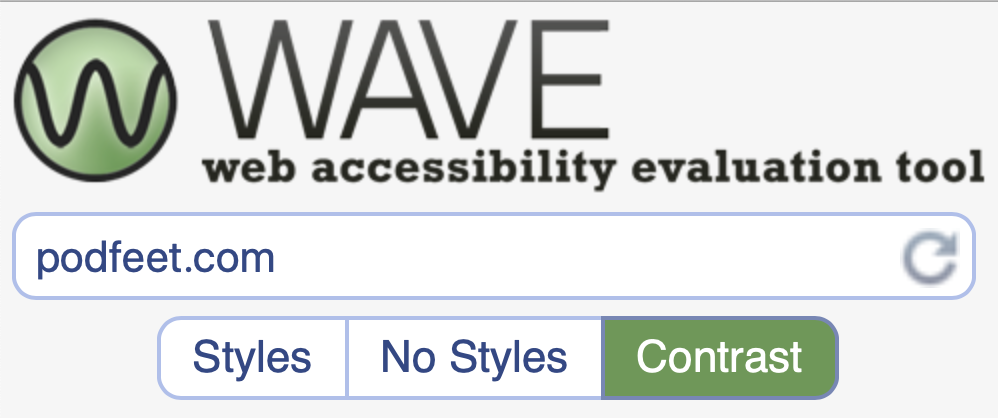
WAVE Accessibility Evaluation Tool
There was a lot of information on that page but the most useful section explained that the minimum contrast ratio is 4.5:1, and that Large text needs to be at least 3:1. Ok, great, I’ve got it! Wait, how the heck do I know whether the text on my home page meets that 4.5:1 minimum? It’s almost like the WebAIM folks knew that would be my next question because they included a link to the WAVE Accessibility Evaluation Tool. This tool analyzes any web page for accessibility and then provides specific information on failures.
There are two ways to use the tool. You can put the page in question into the website at wave.webaim.org, or you can download an extension for Firefox or Chrome to give you the same information. If you have a lot of sites and pages to analyze and repair, the extension would be very useful to you, but if you just need to look at one or two, the website gives you the same information.

I checked out the home page at podfeet.com with WAVE. When the page comes up in WAVE, there’s a left side panel showing a summary of how well the page meets the WCAG2 guidelines.
I was surprised to find a fair number of errors at podfeet.com, but that’s good news that I was finding out about it, right? In the screenshot I’ve supplied in the shownotes, it shows that I have 5 errors. This summary level explains that there are 3 more tabs to dig down into in the WAVE tool, the first of which is Details.

Clicking on Details shows that I didn’t really have 5 errors, there are currently 22 contrast errors alone! The good news is that the 22 errors are designated right on the page with a little red icon showing ABC with descending contrast. So I can look right at the page and see the offending text. The link titles under the images on the home page were failing the contrast test. They were a pretty dark red but evidently not dark enough.
In my red on white link titles, it said the contrast was 4.91:1, which is technically slightly above the guideline of 4.5:1 (though just barely). It also has AA and AAA below the contrast ratio, where AA said Pass in green while AAA said Fail in red. At first I assumed the triple A meant large text, but in another section it shows large text with pass at both double and triple A. So, now to figure out what AA and AAA mean. When I clicked on the little red symbol next to one of my links, it offered to give me more information and that took me to a listing of the section in the WCAG 2 spec that talked about AA and AAA.
And that’s where I got lost. I kept digging and going deeper and deeper into specs, ending up at WCAG 2, section 1.4.6: Contrast (Enhanced) which explains for AAA (Enhanced) the contrast ratio minimum is 3:1 … but no explanation of what AA vs AAA means. I started wondering if it might mean like a triple-A rating on a hotel is better than a double A-rating?
I sent out a tweet asking the question with the hashtag #a11y which means accessibility ally, and I got an answer back from Peter Grucza @pgrucza, who is a lovely Canadian with a focus on accessibility. He said:
It doesn’t relate to text size. WCAG uses individual success criteria as a means to test for levels of conformance. These levels are broken down into A, AA, AAA. In order to meet conformance for a level, all checks for it and lower levels must pass. A is the starting point.
I’ve decided to set AAA as my stretch goal and to fix the bigger errors first. When I looked at the WAVE tool results, I found that the text of my menus across the top (the About, Subscribe to the Podcasts, etc) was too low of contrast to even meet the AA rating of 4.5:1.
Now we still need to know how to fix this. Below the contrast errors there is a contrast tool. You can type in the hex code for the foreground and background color and it will calculate the contrast ratio for you. Ok, that’s swell, but how do I know what hex code to put in there to check? There are a lot of tools available to do this: just type “color picker” into your search engine of choice and you’ll find one. I chose to use a plugin for Firefox and Chrome called ColorZilla from colorzilla.com. Now on my website I can tap on the ColorZilla icon and find out the actual color of my fonts and such. Yeah, I know, Helma, I could just look in my CSS but at this point I was too lazy for that. Color pickers like ColorZilla will spit out several different ways of defining the color but I find the hex codes the easiest to work with. The hex code is 6 characters long, and you’ll see a hash in front of it, so for example pure white is represented by #FFFFFF.

From ColorZilla I can determine the hex code of my text, but that’s the text that’s not high enough contrast. How do I find something of higher contrast? Now we need a tool where we can plug in the hex code, and then figure out how to make the contrast higher.
This part is even more fun. I found a site called HTML Color Codes that works great. You can enter a hex code and it shows you the color you’ve entered. It also gives you some sliders for opacity and also hue, saturation, and light. But the coolest thing is that you can ask it to simply lighten or darken the color by a specific percentage! So let’s say I want my red, which was #A94346, to be 10% darker – it spits out #902A2D. To save time inching up on it, this tool gives you 20, 30, 40, 50 and 60% darker as shades and tints from which you can choose. How fun is that?
Now I’m armed with the right code, so I can finally go into my style sheet as Helma wanted me to way back at the beginning, and figure out which font to change to the new and improved high-contrast color.
More Wrong at Podfeet
You’d think by this time I’d have been exhausted, but I really enjoyed this. Plus, I’ve only told you about the problems with contrast. The WAVE tool found a few more things wrong. The tool showed me what it called “long alt text” as a failure. On podfeet.com’s home page, I have little images for each of the types of tutorials I’ve created. The last tutorial section’s alt text said, “Two little cartoon kids holding hands wearing backpacks and carrying pencils – one of my favorite images.” Ok, that’s long, but it’s fun, right? Fine, I’ll shorten it. I always thought longer was better but I guess not.
The really embarrassing thing the WAVE tool discovered was that in building my home page, I’d used the wrong widget from my theme vendor’s layout builder tools for one row of image icons. The rows for Listen to the Podcasts, Tutorials, and Join the Conversation were all done using one type of widget, but I used a different widget for the Support the Show row of icons.
You know the one where it shows you how to pledge support via Patreon, shop via Amazon, donate via PayPal, or record your own review? The widget I chose simply does not have the option to enter an alt tag for the images so I never even noticed it wasn’t there! How embarrassing is that??? I dusted off of my muscles on how those widgets work and got it fixed.
I also need to fix the contrast on the date and author of the blog posts and my asides are a bit low on contrast as well. There’s also a pesky missing form input label I need to fix; Should be fun to hunt those problems too.
Bottom Line
I know you think it’s weird that I’m calling this whole thing fun, but it really was fun. I got to learn more about what’s important in accessibility, I got to run new tools, and I got to make podfeet.com a better place for everyone. I’m really glad I read the WebAIM Million report or I wouldn’t have learned so much and been able to improve my site.