
With just a few exceptions, like the birth of my first grandchild and a pandemic, I’ve been honored to be allowed to speak at Macstock each year. I’m a very confident public speaker, but for some reason, about a month before Macstock, I find myself doubting whether my chosen topic will be any good. One year, my doubts got so strong that I changed topics just two weeks before the show.
Last year, my doubts got really loud, all the way up to and including the day of the talk. I ended up modifying it a fair bit just hours before I went on stage.
All of these talks have one thing in common: they all worked out great. I know this will sound braggadocious, because it is, but I rocked these talks.
This week I’m doing a talk at Macstock, and I’m pretty convinced it will be a disaster. For therapy reasons only, I’m going to tell you what I’m going to attempt to do.
My crazy idea is to teach some of my favorite spreadsheet methods. That was my first mistake. No matter what I teach, there will be people in the audience who are better than me at this, and they’ll be judging me. Nicely, of course, because everyone at Macstock is nice, but they can’t help but think about cooler tricks they know that I didn’t teach, or better ways to do the thing I just taught. I like to learn from the audience, but the topic of spreadsheets is so vast that whatever I teach, it will be an inadequate subset.
So my first mistake was the chosen topic.
I didn’t stop with that mistake. I wanted to teach my beloved Excel. But what if people don’t use Excel? Maybe they use Apple Numbers. And a lot of people use Google Sheets. The obvious thing was to teach all of the techniques in all three of the apps! I thought it was a genius idea, but as I worked on the talk, I realized how hard this was going to be.
How on earth would I teach even a small handful of concepts in three different tools, all without making everyone’s heads spin?
Mind Mapping the Idea
The first course of action was obviously to start working out the concepts in a mind map. I started fleshing out my ideas of what I wanted to teach, walking through how to do the steps in each tool. The best thing about mind mapping is that you can create a jumbled mess and then organize it. As I worked my way through the different concepts, I started to see that some of them folded nicely into others, and I could rearrange the topics to tell more of a story.
The other thing this process told me was that I had way too many concepts I wanted to teach. Having them in a mind map lets me move them around to keep the “most likely to succeed” demos early in the talk, but to keep the other ones in the wings just in case I mistime the content. You never know when you’ll get tons of questions or absolute silence and get done early.
Topics
The topics that I suspect will make the cut are:
- Fill down
- Demonstrating pattern matching such as months, days of the week, numbers, and your own patterns
- Absolute vs. Relative cell references
- Named cells
- By naming cells, the use of them in formulas makes the formulas much easier to understand
- Sort of a show off for Excel and Sheets because Numbers can’t do it
- Custom formatting
- This allows you to set the format of a cell to something like “6 miles/hour”, and yet it’s still a numerical value on which you can calculate
- Concatenate
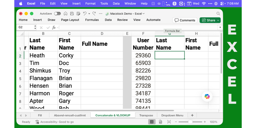
- Lets you combine cells together. My demo will be a list of attendees’ first and last names, where I create a column for their full names
- VLOOKUP
- Lets you look up a value in a column and then go find the same value in a table, and return the value for it in a specific column
- In my attendee list example, I gave each attendee a user number, and I’ll look up user numbers in the table and return their first, last, and full name
- Transpose
- Ever get a data set where the values are in a horizontal row, but you want them vertically in your spreadsheet? Transpose is your friend.
- Dropdown menu … maybe
- Maybe this one is for control freaks, but if you want to force the viewers of your spreadsheet to choose from prescribed options, creating a dropdown menu is for you
Pivot Tables
I’m betting that’s all I can fit in, but I really wanted to teach pivot tables. I needed a big data set to teach it, and I found something perfect, but I actually BROKE Excel trying to use it. The US Government has been tracking baby names from Social Security Card applications since 1879, and provides a download of baby names by frequency by year. To provide anonymity, they only include names with 5 occurrences or more. This sounded awesome.

The downloaded file for the last 147 years was 37MB, which should have been the first clue that I was going to run into trouble. When I tried to open the CSV (comma-separated value) file in Excel, I was presented with an error that said “This data set is too large for the Excel grid. If you save this workbook, you’ll lose data that wasn’t loaded.”

This surprised me, but I soldiered on. I said OK to the warning and then scrolled to the very bottom of the imported data… and found the END OF EXCEL.. Want to know how big Excel is? 1,048,576 rows!

Of course, I had to find out why the number was 1,048,576. Turns out that’s exactly 220. Evidently, Microsoft upgraded us to this “big grid” size in Excel 2007, from 216 in Excel 2003. I don’t know how people lived with only 65,536 rows. Can you imagine?
The error warned me that my data would get cut off, and sadly, this meant that it stopped in 1989. I’d rather it just cut the data off for the fewest number of people of a given name instead.
I asked one of the AIs to write a little bash script to sort the data by the number for each name and then return only the first 1,048,575 rows, leaving one row for the header. This allowed me to create an Excel file with all of the data from 1880 to 2026, with the exception of the least frequently used names.
#!/usr/bin/env bash
set -euo pipefail

IN="baby_names_combined.csv"
OUT="baby_names_top_1048575.csv"
LIMIT=1048575

# Extract header
head -n 1 "$IN" > "$OUT"

# Sort by count descending (3rd column, numeric), then year, then name
# and take the top LIMIT rows
tail -n +2 "$IN" \
  | sort -t',' -k3,3nr -k4,4n -k1,1 \
  | head -n "$LIMIT" \
  >> "$OUT"
With the baby name data in Excel, I started giving it a play with pivot tables. It was quick work to create a pivot table that gave me a sorted list of names by total number of occurrences (not by year, but totals). While that worked, it wasn’t terribly interesting. It did tell me that the top 10 names since 1880 are: James, John, Robert, Michael, William, Mary, David, Joseph, Richard, Charles.
The only surprising thing this revealed is that Mary was the only female name in the top 10. This suggests (but doesn’t prove) that girls are given more unique names than boys. That got me thinking it would be fun to change the pivot table to show the gender assigned at birth along with the top 10 list.
This revealed something really interesting. Most of the names have both girls and boys with the name. For example, while William shows 4.2M male babies, it also shows 16K female babies. 41M girls were named Mary, but so were 15K boys.

In scrolling around in the pivot table, I also discovered that babies are sometimes named after days of the week. But get this: babies are only named Sunday, Tuesday, and Wednesday. Zero babies are named Monday, Thursday, Friday, or Saturday! How weird is that? Also, only female babies are named Tuesday or Wednesday.
That got me wondering about Month names. Would you believe babies are named after every month except February? Why would that be? 88% of the babies named after a month are girls, but the 12 babies named March are all boys, and boys also dominate the name August.

I did notice these day and month names on my own, but I have to admit that I let Copilot create the tables for me of the data I’ve just described. I have no idea what any of it means, though! But if I wanted to name a baby right now, I’d name a boy baby Saturday February Sheridan. And then buy that domain name right away.
As it turns out, I’m pretty sure I won’t have time to teach pivot tables, but I might tell this story if I have time. Let’s get back to why this presentation will be so hard.
How to Present
After I’d worked out in a mind map which topics I was going to teach, I rearranged the topics into a sensible order. Then I ran through each app over and over again for each topic so I had accurately recorded the steps in each Excel, Numbers, and Sheets.
Then I threw away most of my test files and created one canonical Excel file with a tab for each concept I was going to teach. I labeled the tabs and made sure I had a good dataset for each tab that would make it easy to explain the given topic. Once I had Excel sorted, I replicated all of the data in Numbers and Sheets.
One of the biggest challenges of teaching at Macstock is that the room lighting is not ideal. We meet in a very large ballroom with overhead chandeliers that cast quite a bit of glow on the projection screens. I’ve watched presentations where I couldn’t see a thing on the slides even though I usually sit pretty close to the front. Performing calculations on a spreadsheet could very likely be nearly invisible to the audience. I needed to make sure my text would be as big as possible.
The projector has a standard resolution of 1920×1080, but Mac laptops don’t natively offer that resolution. Once I get there and plug in via HDMI, my MacBook Pro will adapt correctly, but I needed to be able to replicate it before arrival to set everything up.
A year ago, I wrote an article about Virtual Monitor HDMI Dongles that will allow you to choose odd resolutions, which I could have used to set my Mac to 1920×1080, but I decided to make my life even harder. I did all of my practicing at home using the app Better Display, which also creates virtual displays. I say harder, because it’s been a bit twitchy, sometimes leaving me with a display with no menus or dock. I conquered it, but it was a challenge.
Another challenge is how to do the context switching between the apps without making everyone’s head spin as I teach each concept.
My first idea was to ask the audience to yell out which app I’d switched to every time. I thought it might be a fun way to get audience participation. But then I realized I’d be flipping around 20 times, and it might get a bit old.
I’m rather proud of my solution. I decided to use Spaces for the three apps. If I used full-screen apps, taking advantage of all the screen real estate, people would have to either read the name in the upper left-hand corner or recognize the app at a glance to know which one I was using. Instead, I got more creative.
Using the Affinity app in its vector design mode, I created 3 background images at 1920×1080 pixels: one solid green, one solid blue, and one solid red. On the green background, I wrote “EXCEL” in white in all caps in a vertical line on the right side of the background. On blue, I typed “NUMBERS”, and on red, I typed “SHEETS”. Then I made them the desktop background for the three spaces.
I opened each app in its respective space, with the window covering all but that vertical area where the app name was displayed. Now, when I flip between the spaces, it will be super obvious which app I’m working on.

But as I looked at these beautiful spreadsheets on their unique backgrounds, even with the fonts in the spreadsheets at huge sizes, I realized the text of the apps was way too small.
The beauty of Better Display is that, in addition to allowing you to add a new resolution to the mirrored imaginary display, you can add custom variant resolutions. I used Better Display to add half-resolution at 960×540. It’s really hard to work in such a low resolution, but it’s worth it if people can actually see what I’m doing! I’ve done all of my testing at this dreadful resolution and I think I can stand it but I hope not. I also added a custom resolution of 1440×810. That gives me 3/4 of 1920×1080 and feels like dancing in an open field compared to being squished in the tiny 960×540 box.
I’m hoping to get a chance to plug in when nobody is around before my presentation and see which resolution will work, but at least I have 960×540 available as a worst-case scenario.
My final step was to use Moom from Many Tricks to memorize the exact size and location of the three apps in their separate spaces.
Shortened Notes
While my mind map was a great way to brainstorm what I was going to talk about, and while I organized the mind map into steps for each app, it was far too verbose to be of use as notes during the presentation. I needed a set of notes that were concise and yet detailed enough to remind me of how each app provided the different functions. I also find zooming in and out and around in a mind map during a presentation a very clumsy way to keep track of what I’m doing.
The right tool for the job is an outlining tool. I’ve been using Cloud Outliner through my Setapp subscription for a long time. Oddly, though, when I exported my huge mind map to OPML as a first step to cut it down, Cloud Outliner only got the first part of the OPML file.
I could have spent time trying to figure out why, but the obvious answer was to go play with new tools rather than working on my presentation. In Setapp, I found another outlining app called Bike Outliner and gave it a try. I won’t tell you all about it just now, but I’ll tell you that it’s delightful.
In Bike, I wrote super tight notes, with one concept on each new .bike document. I was so happy with all of these separate documents to keep me focused on only one concept at a time. Only when I was mostly done did I realize I had a big problem. Since my presentation would obviously be conducted on my MacBook Pro, I would need my notes on the iPad…but Bike isn’t cross-platform. This problem would burn precious hours I didn’t have left before leaving for Chicago.
I had three options at this point:
- Export each Bike file to OPML and open each one in MindSpace on iPadOS. I thought maybe if they were small and focused, it wouldn’t be too much scrolling around. I tested the idea and found it tedious but not terrible.
- Export the Bike files to plain text files. Unfortunately, the files didn’t retain any of the nice attributes of the original Bike files, like checkboxes, headings, and nice indent graphics. Text files just didn’t work for me.
- PDF is normally a good option, so I tried printing the separate documents to PDF, and it looked nearly as nice as the original Bike document. But then I discovered something annoying. Preview on the iPad can’t open multiple PDFs. If I kept each concept as a separate document, I’d be going in and out of saving and opening the files, which was also unacceptable. I tried combining them all into one PDF on the Mac and opening on the iPad, but then it was hard to tell at a glance when I started each new concept.
I spent a great deal of time testing these ideas, all the while things were getting fiddly beyond belief. For example, I usually keep all of my Macstock documents in Google Drive, but Drive started failing on the iPad. I’d go to Drive via the Files app, and it would simply say, “Something’s gone wrong, try again.” The only way I could get it to work was to toggle off Google Drive in Files and turn it on again. But it kept happening.
I couldn’t have that, so I moved all the files to my Desktop so it would sync through iCloud instead. That turned out to be even more entertaining. I created new Bike files, saving them in a folder on my Desktop, but then when I edited them, I got an alert telling me I didn’t have permission to save. What the heck??? According to Get Info, I had read and write privileges, but the problem persisted, and at one point all of the opened bike files said they were locked. I selected the folder above them in Finder, and set permissions to be applied to all included files, and that seems to have sorted things out, but now I’m nervous. Should never have happened in the first place, though!
I was complaining to Jill from the Northwoods about all of the anarchy, and she wondered whether I might be able to use Notion as the place for my outlines that would be accessible across platforms. It’s a bit dicey to use a web-based app for a demo where you can’t guarantee stable WiFi, but I love to learn from Jill, so we played around with it a bit.
Notion didn’t look like a perfect fit, but while we were noodling together, I had an idea for how to access the PDFs more easily on iPadOS. I put them in Apple Books! On iPadOS, I can open each “book” individually. I do have to close and reopen the next one, but it’s very quick, and the notes look very clear and are easy to flip page to page. I also put the combined file in Books, just in case it’s more tedious to close and open than it seems right now.
To be honest, I think paper copies of my notes might be even better, so I may print them all out and be done with it.
Will it Work?
I started this story with all of my doubts about this whole topic idea. While working through the final details helped me see the path to success, I still can’t help but wonder whether it will work. What if nobody really cares about this topic? What if it’s boring? What if Numbers people are annoyed during the Sheets and Excel parts? What if flipping between the apps confuses people? And worst of all, what about all those people I mentioned in the room who are thinking about all of the things I could have/should have taught?
Wish me luck.
As you said, you are a very confident and awesome presenter! Where are all these doubts coming from? Throw them out of your thought and just enjoy yourself. I love Excel, and I love learning more about it. I’m sure I will learn something new. I’m looking forward to hearing your presentation.
Debby – you are so kind to write this. I’m going to focus on your smiling face in the audience!