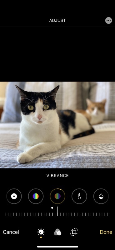
I’ve been a fairly happy user of Apple Photos on iOS and macOS ever since it came out. Sure I complain about how long it takes to download my 77K photos when something goes wrong, but the feature of having all of my photos everywhere is glorious. I’ve really found the tools to edit photos to be pretty darn good, and again having all of the changes sync across my devices is magical.
The one complaint I had about the editing capabilities of Photos is that the tools were not very discoverable. I think they didn’t want people getting overwhelmed with tools and options so they just hid them so normal people wouldn’t worry their pretty, little heads about it. I dug in and learned every tool but I have to wonder how many people wished they had more power in Photos for editing and didn’t realize that the capabilities were literally under their fingertips.
The interface of the Photos app in iOS 13 has been dramatically changed, and I think it does a far better job of exposing the capabilities than the previous version. In addition, there are a bunch of cool features.
Extensions
The new Photos app in iOS feels more like the desktop version of Photos on macOS. You know how when you go into Edit in Photos on macOS, you see a circle with 3 dots inside it in the upper right, and when selected it reveals any Photos extensions you have installed. For example, I can use an Affinity Photo extension called Affinity Retouch to use the inpainting brush to remove a power line that’s wrecking a sunset, and when I save, I’m back in Apple Photos with my improved photo.
In iOS Photos, you’ll see the same circle with 3 dots in the upper right that when selected shows any apps that will work as extensions to Photos. I have TouchRetouch installed on my phone and again I’m able to remove a power line and when I’m done be right back in Photos with my improved image.
You may be yelling into your device right now that we had that 3-dot circle and that it did allow you to open photos in other apps. Technically that’s true but not nearly as many (and it wasn’t in the upper right where it should be). I fired up an old iPhone 7 with iOS 12 and while I could see Markup and FaceApp, I couldn’t see TouchRetouch or Pixelmator as I can in iOS 13.
Adjust
As I explain the changes in the interface, I should mention that I’m describing the iPhone view of Apple Photos. Things are moved around a bit on bigger devices, like the 12.9″ iPad Pro. I figure if you care about this topic, as a minimum you have an iPhone so we’ll use this as our reference.
It’s kind of empty up at the top of Photos in Edit mode now. Other than the 3-dot circle, the only other thing up there is a single word. When you first get into Edit it simply says Adjust. That word will change depending on which set of tools you have selected. Adjust is the default word.
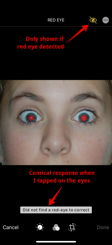
Now I said there’s nothing else at the top, but in some cases, that’s a lie. If Photos detects red eye in an image, a little red eye button will occur up next to the 3-dot circle inviting you to tap on any red eyes to remove them. I found a photo on Wikipedia illustrating really bad red eye, and I got the little symbol in Photos. Comically, tapping on the eyes it said, “Did not find a red-eye to correct”. Sandy will also appreciate that at the top the words changed to say “Red Eye” with a space between the words, and in the note saying it couldn’t find any, it was red-eye with a hyphen.
Ok, enough about fixing a problem we no longer have with our phones. Let’s walk through what’s useful in Photos Editing. We’ll start with Adjust since that’s where Apple starts.
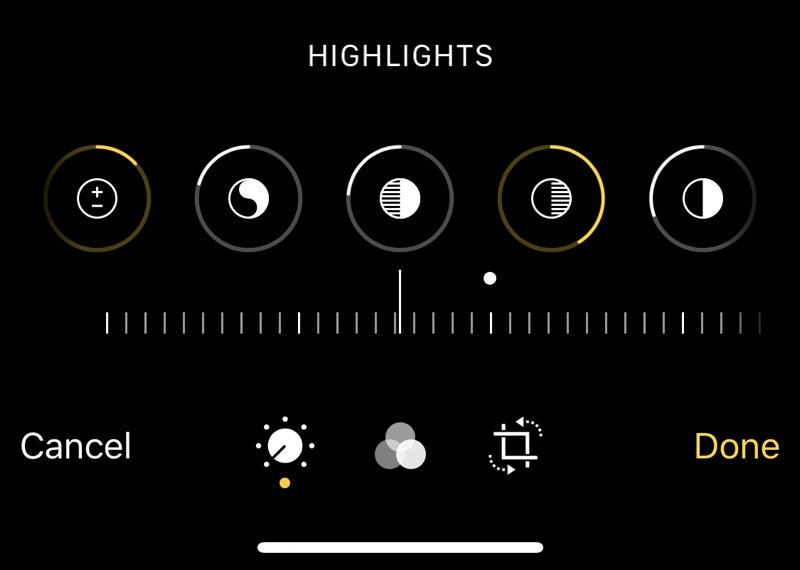
The new interface shows a series of circles in a row under the image you’ve opened. These are all the different adjustments, and for many of them they have a little dial slider down underneath. The adjustments are much the same as what we had before, like exposure, brilliance, contrast, definition and more.
If you select an adjustment and move the dial underneath, if you go in the positive direction (such as increasing exposure), a yellow arc will form in the positive direction from the top of the circle. Conversely, a negative direction will start a solid white arc in the negative direction. At a glance, you can see on each adjustment icon whether you’ve changed it, in which direction, and how much you’ve changed it.
Adjustments also contain quite a few controls we didn’t have in iOS 12. They’ve added vibrance, separate cast and tint controls, separate sharpness and definition controls, vignette, and even noise reduction. I’m not the best to judge how well noise reduction works; I’ll leave final judgment to pixel peepers like Steven Goetz.
What you didn’t hear me list was any black and white controls like we had in iOS 12 because they’re not there anymore. In the Filters section, 3 of them are monochrome. I think if you’re serious about monochrome images you’ll use a big-girl tool like Affinity Photo, and if you’re not, a filter option is probably fine. Let me know if you think I’m wrong about that.
Crop/Rotate
As cool as the adjustments are, I think I’m most excited about the new features in what I guess we’ll call the crop/rotate section. That’s the one with the crop symbol with two dotted arrow lines around it. I simply love what they’ve done with this section, even though they didn’t give us a nice name for it at the top.
Remember how in iOS 12 and before, when you went into crop/rotate, Photos would decide for you that it didn’t think you had your image quite straight and adjust it for you? Sometimes that was awesome but lots of times it irritated me and it was hard to get it back the way it was originally.
No longer will this happen. When you go into crop/rotate, there’s an Auto button at the top center. You get to decide whether to let it “fix” your photo. I think this gives us the best of both worlds, an instant horizon fix but only if we push the auto button.
On the top left in crop/rotate is the familiar flip button to get a mirror image (I’ve never understood why that’s so prominent, how often have you used it?). Also up on the top left is the rotate button we need all the time.
We’ve got a new crop button topside to represent the different standard crop sizes. When selected, the menus under the image change to show you original, freeform, square 16:9 and on down the line, and you’ve got portrait vs. landscape buttons revealed along with those sizes.
On iPhones 11 only, the camera app has changed in layout. I don’t want to get buried in the details of it or I’ll never finish telling you about photos, but now instead of a slider to go from Photo to Square, along the bottom are all of the options for flash, timer, filter shots, along with an aspect ratio button. This button allows you to choose from square, 4:3, or 16:9.
At first, since I only found this option on the iPhone 11 Pro and not the XS, I assumed 16:9 had something to do with the Ultrawide lens. But it doesn’t have anything to do with that. It’s just a different way to crop the image being captured by the sensor. There’s zero reason that the older iPhones couldn’t have this option, but they didn’t redesign the menus for the older phones so there’s no room for it. Weird.
Keystoning
I want to get back to the Photos app because I’ve buried the lead here on one of my favorite features of the new app. And it’s available to everyone. Let’s describe the problem to be solved first.
How many times have you tried to take a photo of something rectangular and it comes out looking wonky with two sides bent in like a trapezoid because you didn’t point the camera perfectly perpendicular to the rectangle? That effect in optics is called keystoning. You might also have seen this problem when using a projector onto a screen. If the screen is up high and you have to point the projector up, you’ll get that annoying trapezoid. Many projectors even have a button on them called keystoning that help bring the sides of the trapezoid into parallel again.
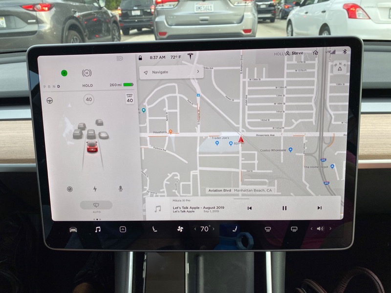
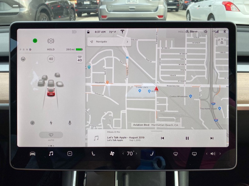
I find that really often I’m taking a photo of a rectangle and running into this keystoning problem. Maybe something funny or interesting happened on TV and I want to take a photo or video of it. Or I’m taking a photo of the screen in my Tesla and no matter how hard I try, I can’t get it perfectly perpendicular so it doesn’t look stupid for the show notes. Or maybe you’re taking a picture of a receipt to send into your accountant. All kinds of rectangle problem photos.
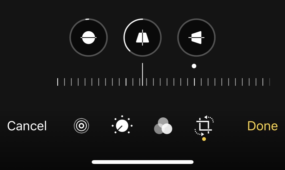
In the Photos app, under the crop/rotate section there are now three buttons. One for tilt like we had before, but there are also two keystoning buttons. One helps remove keystoning along the vertical axis, the other along the horizontal axis. If you open an image with a keystone problem in crop/rotate, you may find that Photos automatically removes your keystoning problem. I put a photo in the show notes that I took of my Tesla screen. It’s warped and stupid looking, and when I opened it in crop/rotate, it automatically removed my keystone problem.
Bottom Line
The bottom line is that Photos on iOS 13 got a major update which makes the tools much more discoverable, and the tools are more capable than ever before. The best part is that most of the tools are available to older iPhones as well. And one more thing. All of the adjustments I described can be done on video too, even keystone removal.
