 I have to give 100% credit for this tip to John Siracusa on the Accidental Tech Podcast. Here’s the problem to be solved. How many times have you been navigating your Apple TV interface, and you can’t tell what’s selected? On the Home Screen of the Apple TV interface, there’s a slightly more pronounced shadow for the selected icon, and if you gently jiggle your finger on the trackpad, the selected icon will jiggle. I don’t know about you, but that’s annoying to me.
Even more annoying is after I get inside some apps, I literally cannot tell what’s been selected. We watch a lot of shows on Hulu and if you get into the episode list, I defy you to explain to me how to tell which episode has been selected!

If this drives you bonkers, you’ll love this tip from John. We’re going to turn on high contrast in the Focus Style options. It’s buried, so here’s the path.
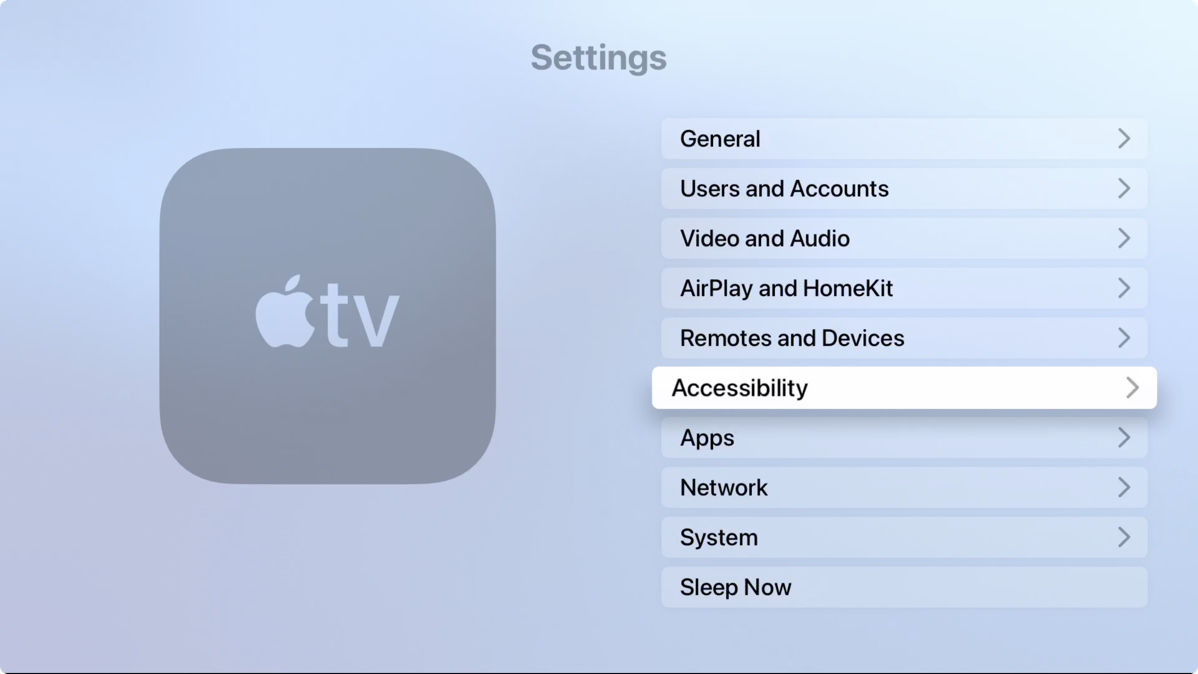
Open up the Settings app and Select Accessibility:
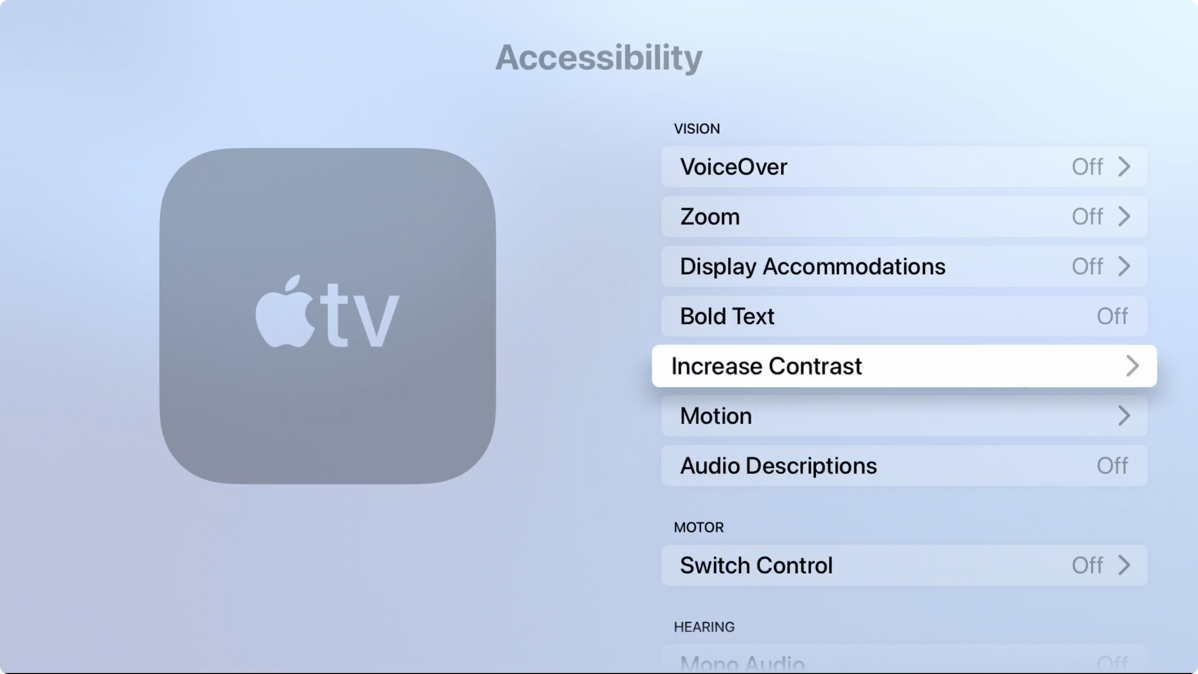
In Accessibility select Increase Contrast:
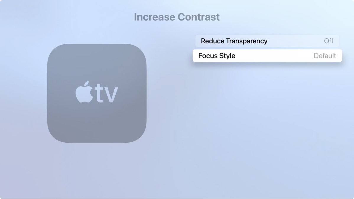
In Increase Contrast select Focus Style:
In Focus Style select High Contrast:
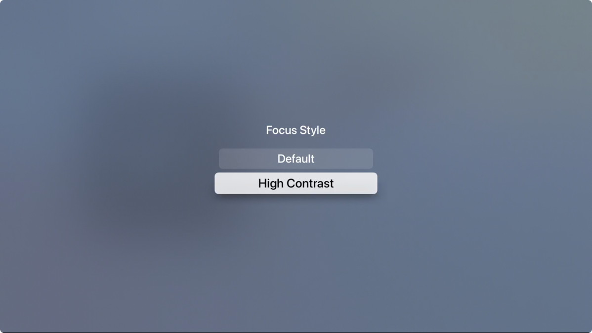
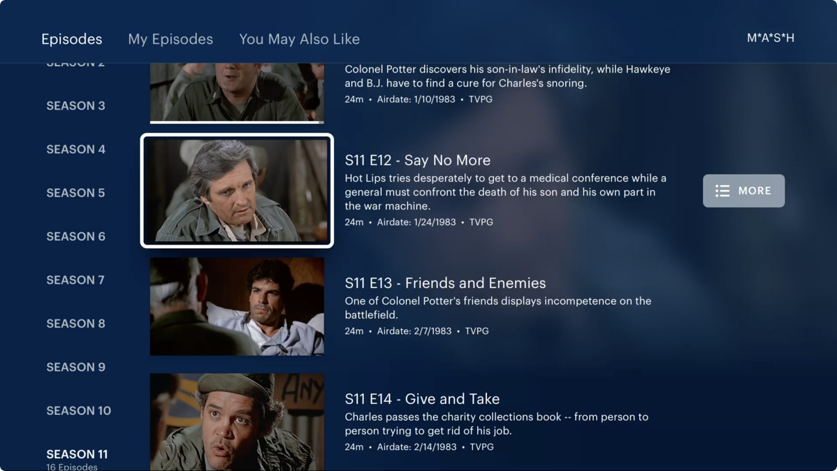
When you’re done, hold down the key on your particular remote that takes you back to the Home Screen (Menu on older remotes, the backward-facing chevron on the new one) and you’ll see a lovely bright white border on the icon you’ve selected.
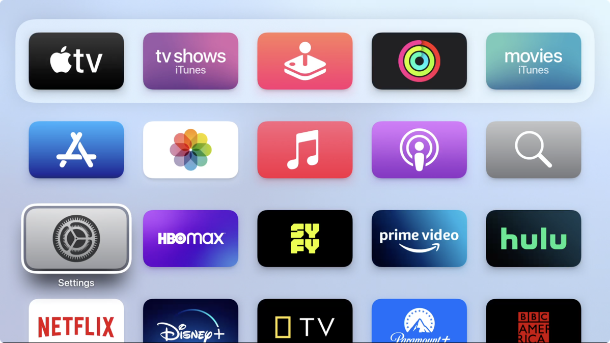
Every app doesn’t obey this in every spot, but it works in a lot of places. For example, when I go into Hulu and for some idiotic reason they designate the user you’re choosing by putting a green line above the name, it’s not highlighted. But when I go into a show and select the episode list, the thumbnail for the currently-selected episode is inside that nice white border.
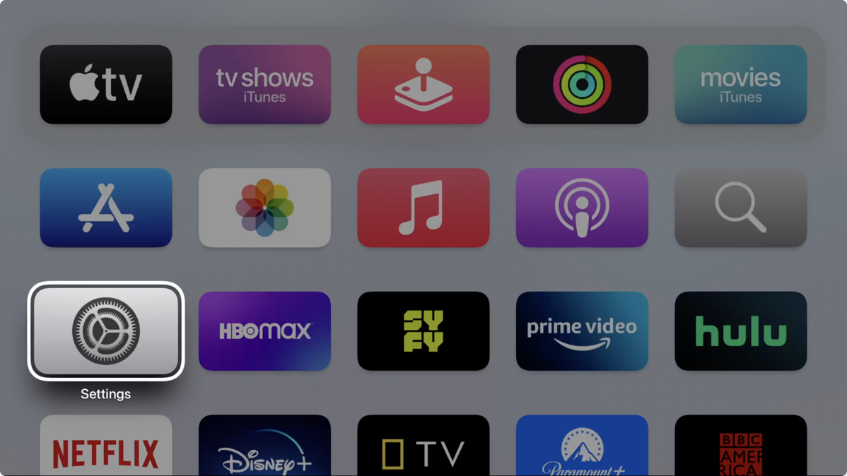
I’m not sure this last bit is super useful, but if you ignore the Home Screen for a while, the entire screen will dim except for the one icon you have selected which will be bright and obvious. Like I said, not sure it’s useful to have to sit and wait for this, but I thought it was interesting that it does that.
As soon as we tested this High Contrast Focus Style, Steve and I both decided we needed to enable the feature on all 5 Apple TVs in the house. As John said on Accidental Tech Podcast, “Why is this not the default?”


Yeah, it is counter intuitive that the selected item is ABOVE the text! I look forward to seeing this in action later today, (Wondering if it helps in MLB?) Thanks Al and John Siracusa.