As Apple appears poised to give its operating systems a new coat of paint, I wish they’d direct their attention elsewhere. I’d like to see some care put into bringing feature parity in Photos on macOS and iPadOS. I use a 12.9″ iPad Pro and a 13″ MacBook Air, so the two devices are nearly identical in the area available to lay out the tools and images, and yet the disparities are numerous.
I’m not really going to address Photos on the iPhone because it makes sense that the controls are different on such a small screen, and even that the capabilities are different.
I’ll even concede that it makes sense for the design of certain controls to be different on iPadOS since we use our big fat fingers to touch them, but the differences go way beyond that.
Layout
If you open the same photo in Apple Photos on both platforms, most of the same information is available; however, for no apparent reason, it’s in a different order and location.
On iPadOS, buttons for the share sheet, favorites, information, tools, and delete are located at the bottom. On macOS, some of the same buttons are available, but they’re in the upper right, and the order is info, share, and favorite. Trash isn’t an option, and instead of the tools icon, which looks like three sliders, it says edit. In between those controls, there’s a rotate button and Auto Enhance.
Why can’t it say edit in both places, or have the tools icon in both places? And what’s the value of having them in a different order? Why doesn’t macOS have a trash can to delete, and why doesn’t iPadOS have a rotate or Auto Enhance button?
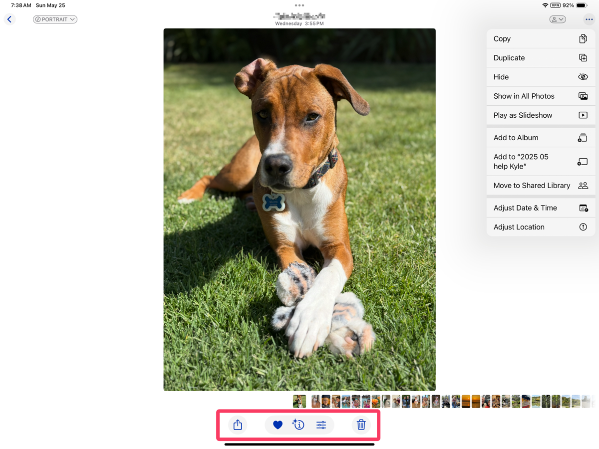
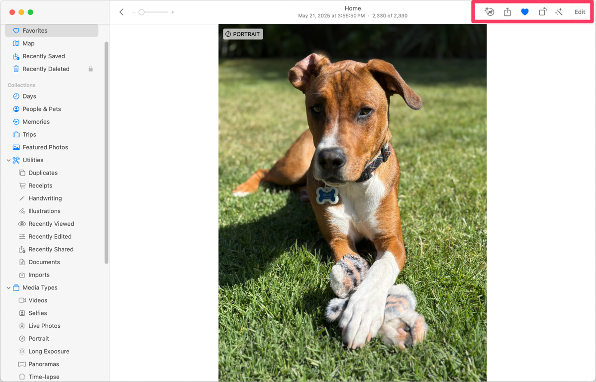
I mentioned they both have an info button, but even that isn’t the same between the two platforms. A few revs ago, Apple added a nifty feature where Photos can often identify plants, animals, and even famous landmarks. Using a photo of our adorable puppy Kepler as an example, on iPadOS, the info button has changed to be an i with a circle around it and some stars. This tells me that it thinks it’s identified what’s in the photo. But on macOS, the same icon is not an i, it’s a tiny drawing of a dog inside the circle with stars. Why did Apple pay two different designers to create the same icon so that they looked different?
On iPadOS, between the row of icons I just described, there’s a row of thumbnails. It’s quite easy to swipe along to view different images. Even though I’m pretty sure we know how to swipe to scroll using a mouse or trackpad, the ribbon of images doesn’t exist on macOS. However, if you swipe on the photo you’ve opened, it does flip between images. Why can’t we have the ribbon on macOS?
Steve and I are fans of having a shared photo library, so it’s handy that on iPadOS, in the upper right, there’s a little person icon with a dropdown to move an image from Personal Library to Shared, or vice versa. On macOS, there is no little icon. You have to go up to the Image menu, and drag down to the nineteenth item in the list to select Move Photo to Shared Library. Because I switch back and forth between the platforms, I often stare blankly at my images on macOS, looking everywhere for that little dropdown to move to the other library.
On iPadOS there’s a 3-dot menu with a dropdown containing a plethora of options: Copy, Duplicate, Hide, Show in All Photos, Play as Slideshow, Add to Album, Add to recent album, Move to Shared Library (yes, a second way to do it), Adjust Date & Time, and Adjust Location. This dropdown doesn’t exist on macOS, but all of the options I’ve described are sprinkled about in the traditional menus from the menu bar. I’m going to allow this one as the menus give Apple the opportunity to add more extensive options.
At the top of the image on macOS, it gives the location as “Home”, but on iPadOS, it says the city name where I live. Why would they do that differently? Both operating systems know where I live from my contact card, so they could both say “Home” or they could both say the city instead.
The photo of Kepler I’m using as an example was taken in Portrait mode. On iPadOS, there’s a dropdown in the upper left that says Portrait, and when selected, allows you to toggle it off. On macOS, the same button is on the photo, not in the upper left, and selecting it does nothing at all! Why would you be able to change modes on iPadOS right from there but not on macOS? Again, I believe they paid two different designers to build the same functionality, and they came up with two different solutions.
Would you believe I’ve only covered one screen on Apple Photos and I’ve found 700 words worth of discrepancies?
Left Sidebar Mania
The true madness of inconsistencies in Apple Photos is in the left sidebar. The sidebar in Photos for iPadOS and macOS is different, but different for reasons I cannot fathom. I decided to try to map one to the other to figure out what was missing from one OS or the other, and it turned into a rather hilarious glop of spaghetti. I’m going to try to explain it in words, but this may be a case where you’ll want to look at my graphic.
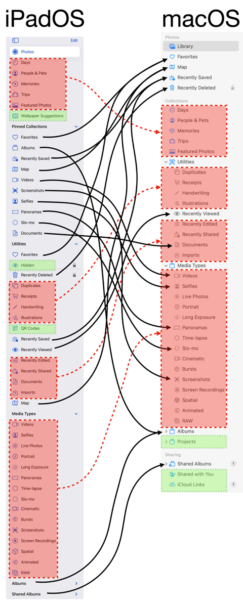
To start, if you want to view all of your Photos on macOS, you select the top button, labeled Photos. On macOS, to achieve the same goal, you also select the top button, but it’s labeled Library. Why make those different, Apple?
The main difference between the two sidebars is that clumps of options in macOS are simply sprinkled all over the place in iPadOS, and are often available twice on iPadOS.
On iPadOS, right under Photos, there are five items: Days, People & Pets, Memories, Trips, and Featured Photos. Those same five items are clumped together on macOS, but they’re under a heading called Collections, and are 4 lines lower in the sidebar. macOS has Favorites, Map, Recently Saved, and Recently Deleted above Collections.
Pinned Collections
But get this. Favorites on iPadOS is under Pinned Collections, AND under Utilities (much farther down). Map and Recently Saved are in the same two places on iPadOS, but neither one is anywhere near Favorites, nor are they near each other. The last item on macOS I listed was Recently Deleted, and it only exists in one place on iPadOS, at the top of Utilities. Why would 3 of the 4 be duplicated on iPadOS and not the 4th?
There are even more examples of this madness when trying to map Pinned Collections items on iPadOS to macOS. In a rare moment of sanity, Media Types maps one-to-one from iPadOS to Media Types on macOS. But that sanity is disturbed by the fact that Videos, Screenshots, Selfies, Panoramas, and Slo-mo are also in Pinned Collections on iPadOS.
When I posted my spaghetti graphic in our Slack, Allister Jenks suggested that if I just collapsed Pinned Collections and ignored it entirely, the graphic would make more sense, since everything in Pinned Collections is duplicated. But what’s the fun in that?
Utilities
If you can follow the spaghetti in my graphic, most of Favorites on iPadOS maps to someplace on macOS, but they’re sprinkled about in a different order and live under different headings. But like with Pinned Collections, there are two items that don’t exist on macOS. On the iPad, you can hide images. In the Utilities section, you’ll see the Hidden album with a padlock to tell you you’ll need your password to unlock it. On macOS … Hidden simply isn’t there.
As I was shaking my fist at this, I kept thinking that it seems highly unlikely that images would be hidden from us entirely when on macOS, with no way to unhide them. I decided to search the menus using help, and would you believe that under the View menu, there’s an option to Show the Hidden album? When selected, it now shows in the left sidebar. Even better, that menu item under View becomes Hide Hidden Album.
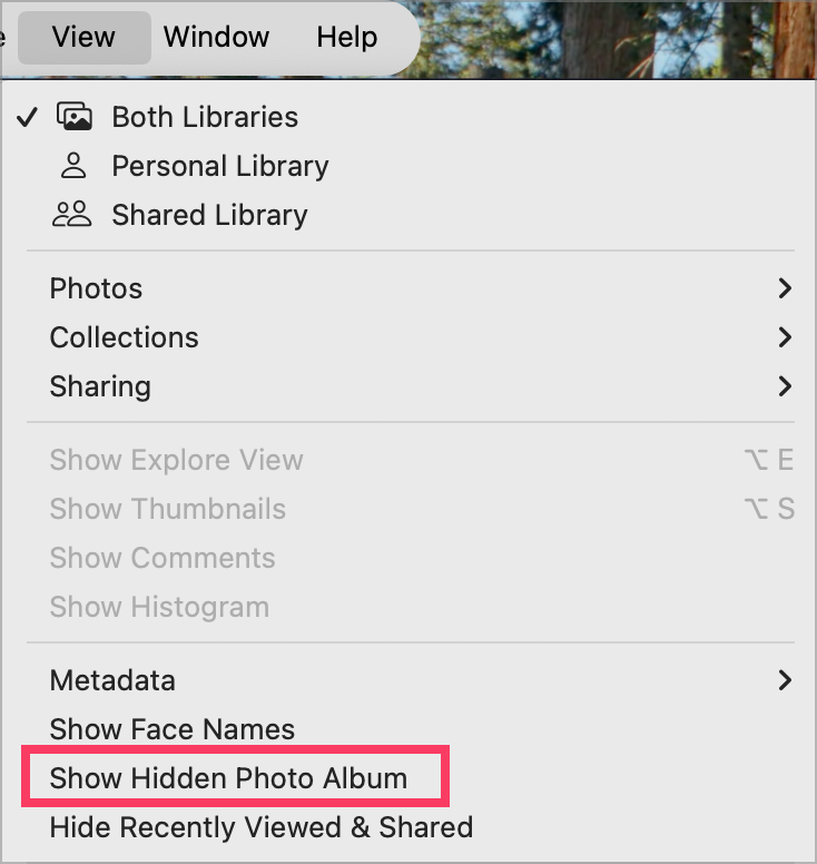
iPadOS also collects QR Codes into a separate album, but for some unknown reason, the developers of macOS Photos didn’t see fit to include that.
Albums
I had to collapse the Albums section on both platforms because it gets too confusing with personal albums. But rest assured that iPadOS includes Albums twice, once under our old friend Pinned collections as a simple button, and at the very bottom of the side bar as a button with a right-facing chevron. If you select Albums under pinned collections, you get a grid view of various album categories. The same thing happens if you tap the word Album at the bottom of the left sidebar on iPadOS.
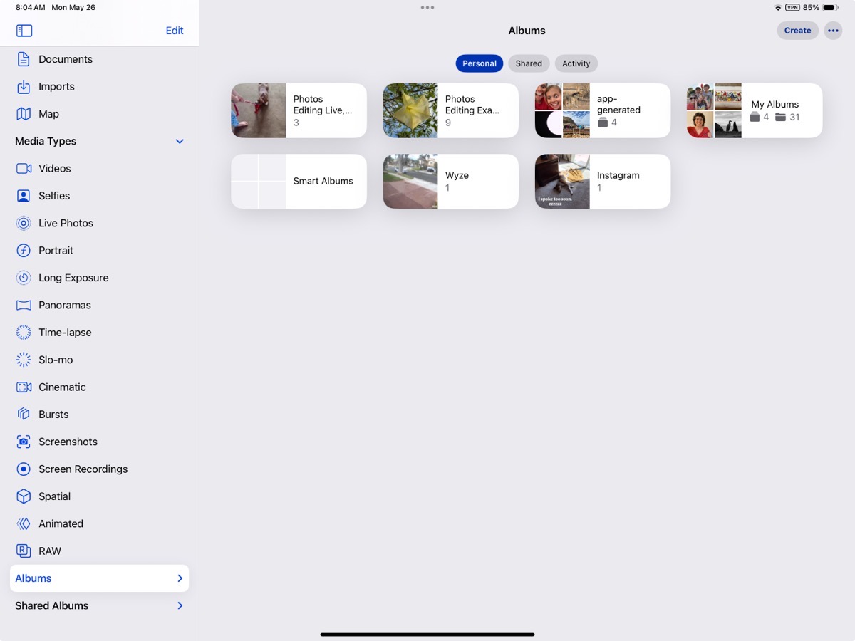
But if you tap the chevron to the right of the word Album at the bottom of the sidebar on iPadOS, it will unfold below, listing all of your albums and folder structure you’ve created. Photos on iPadOS isn’t even self-consistent.

Albums on macOS only exist once in the sidebar (which is more sane). Just like with iPadOS, you can tap on the word Album and get the grid view, but the chevron to get the list view is on the left instead of the right. Why, Apple, why?
One of the worst travesties of the inequities is that iPadOS doesn’t support Smart Albums. I mentioned recently that I use Smart Albums when I’m on travel to help me make real albums of images from specific dates when we’re on a big trip. I’ve used them to find photos taken with my big girl camera, or even to find photos taken above a certain altitude. I can’t think why this isn’t possible with iPadOS.
Sharing
macOS has a section called Sharing, and inside it has Shared Albums. iPadOS has the same Shared albums, but it doesn’t have two more things macOS has: Shared with You and iCloud Links. I’m not sure what the purpose of Shared with You is, since the images and videos in there also show up in your Photos Library like any other photo. They stay there forever because I only have a few pretty recent ones that were texted to me through Messages.
iCloud links are interesting. Adam Engst sent me a video over iMessage of two cords of wood being delivered by a dump truck into his backyard, and I can see it in iCloud links with a warning saying it expires on June 27th.
My son texted me 26 images of my grandkids in iMessage, but it wasn’t immediately obvious how to get all of them into Photos; only the first 8 or so would come in. I think they became part of an iCloud Link because I can see they’re only available till June 20th. Luckily, it says they were all saved to my Photo Library, too.
Both Shared with You and iCloud Links are confusing, so I don’t think it’s a big loss for iPadOS.
Edit
I had planned to go into detail about all the editing functions I can’t do on iPadOS that I can do on macOS. But in my thorough testing, I discovered that the vast majority of the tools exist on both platforms. The inconsistency of placement and design elements of the tools made me think they weren’t in both places.
Adjust
If we start with Adjust in the left sidebar on iPadOS, we see a series of circles in a vertical line down the right side of the image. Each circle represents a different adjustment, such as exposure or brilliance. When each is selected, all you get is a vertical slider to increase or decrease the amount of the adjustment.
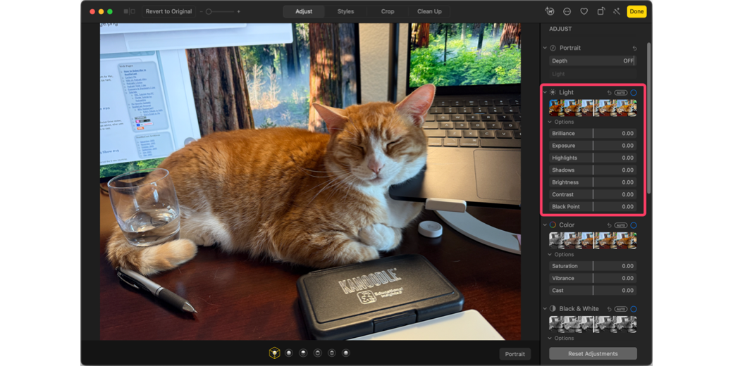
In contrast, on macOS, we have a “Light” section. You can choose to drag the Light slider right and left, and the app will make the adjustments it deems appropriate for that image. But the Light section also has a chevron you can drop down and open seven separate sections. It looks far more capable, but guess what? Every single slider under Light is one of the circles under Adjust on the iPad. It’s odd that you don’t get the easier overall control of Light on iPadOS.
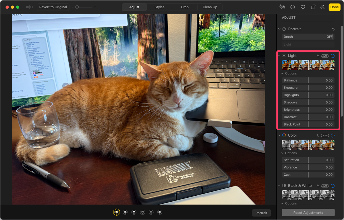
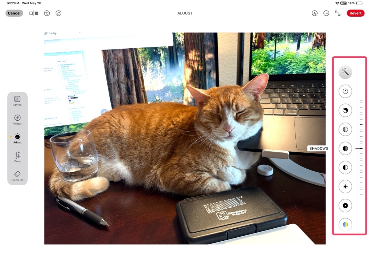
And as you might guess from the theme of this article, the controls are in a slightly different order just to make us crazy.
Several other sections have equivalents on both platforms, but some things are missing on iPadOS. On macOS, there’s a dedicated section for black & white conversion, including separate sliders for intensity, neutrals, tone, and grain. On both platforms, if the photo was taken with an iPhone 16 or later, the Styles section does allow some ability to make and control black & white settings.
If you’ve ever taken an indoor photo or one in snow, you know the white balance adjustment in macOS Photos is essential to color correcting your images, but don’t look for it on iPadOS because it’s not there.
Likewise, you don’t get a curves adjustment or levels control with iPadOS. I’ve never gotten the hang of curves, but levels is something I use pretty often. Selective color lets you enhance just one color within an image, changing hue, saturation, and luminance while limiting the range of color values affected, but iPadOS has no way to do this.
Before Apple Intelligence was a thing, the macOS version of Photos had a little band-aid icon called Retouch, and it would do minor corrections. It wasn’t great, but it was handy when it worked. However, on iPadOS, it didn’t exist. Now, if you have an Apple silicon-based Mac and an iPad running the current OS, both platforms have the Cleanup tool as part of Apple Intelligence. It’s not great either, but I’ll put one point in the feature parity column for Apple.
“Bottom” Line
I guess this was a long-winded way of saying that I’m baffled why Apple pays developers on two different teams to create and maintain different controls on the two platforms, and even when the controls are the same, to put them in a different order. If anyone has an answer to why Apple would do this, other than to make us crazy, I’d sure like to hear about it!

