I take a lot of screenshots on my Mac, iPhone and iPads. I use it to teach people how to use tools and to show developers where I have a question about their applications. I’ve reviewed a plethora of methods to take screenshots on macOS as a result.
I think I take as many screenshots with my iPhone and iPad as I do with my Mac. If I’m reviewing an iOS app for the podcast and blog, I take a ton of screenshots to make sure I remember exactly the steps I followed to set it up. I take screenshots of all sorts of other random things too, just to help me remember something I was viewing. I just checked and I have 3,135 screenshots so far. I mean seriously, there’s not one, but two screenshots of a toilet seat I was thinking of buying!
Apple added two cool features to screenshots in the last few years that have made the obsessive screenshotter’s image library more manageable. In the Photos app, there’s an auto-generated album for screenshots now. That’s cool because it gives you an opportunity to view just your screenshots and maybe delete the ones of the toilet seat.
The second feature is even more helpful to people like me who are clearly incapable of keeping their screenshots under control. In a recent update (perhaps iOS 13?), after you take a screenshot you’re able to annotate it and send it to someone or save it to Files, and then when you tap done, you’re given the option of deleting or saving the screenshot to Photos. That has helped me immensely. It hasn’t entirely saved me of course, but it’s probably cut my saved screenshots down by 70%.
Now Long-Form Content
All of this walk down memory lane was just laying the groundwork for Apple’s latest advancement in screenshots on iOS /iPadOS. They have added the ability to screenshot long-form content. I thought this was an enhancement with iOS 13.5, but I fired up an old iPhone and it’s been there as far back as 13.4.1 and never noticed it. I figured if I didn’t notice it (and we’ve established that I take a lot of screen snapshots), maybe you hadn’t noticed it either.
The easiest way to explain this cool feature is to use an example.
Open Safari to any web page, preferably a long-form blog post on podfeet.com. Might I suggest the one about Scylla the Sea Monster or perhaps the one about the Shelf of Abandoned Hardware? They’re nice and long. Now take a screenshot.
- If you’re on a device with Face ID, hold down the power and up buttons at the same time to take a screenshot
- If you’re on a Touch ID device, it’s power and the home button
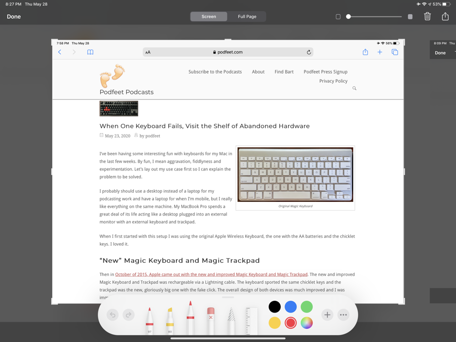
Tap on the screenshot thumbnail in the bottom left to open it in Markup. When it opens, you’ll see two new tabs at the top. The first says Screen and you’ll see the screenshot you just took below. The screenshot will have the familiar handles on the four corners and four sides inviting you to tighten up the screenshot to just what you want.
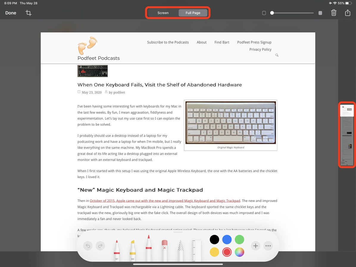
But the second tab says Full Page. You’ll still see the same screenshot but the handles to crop the image are gone. More importantly on the right side of the image, you’ll see the entire web page as a thumbnail with the first page highlighted! You can drag the highlight up and down to view the entire document.
In the upper left is a little crop symbol and if you tap that, you’ll see the entire web page in the middle of the screen, now with crop handles. This allows you to still capture long-form content and yet crop to just the portion you wanted. There’s a Cancel button in this cropping view to get back to the original Full Page view.
On iPadOS but not iOS, at the top right in both the Screen and Full Page views, you now have a slider that changes the opacity of the image. I’m not 100% sure what function that provides but I’ll keep experimenting on different pages and see if I can figure out a problem this solves. I hope to also figure out why it’s only on iPadOS and not on iOS.
You’ve always been able to delete a screenshot by hitting the Done button in the upper left and then tapping on Delete Screenshot but they’ve made it a bit easier now. There’s a trash can in the upper right inviting you to toss it away. But there’s another reason for that little trash can.
Multiple Screenshots
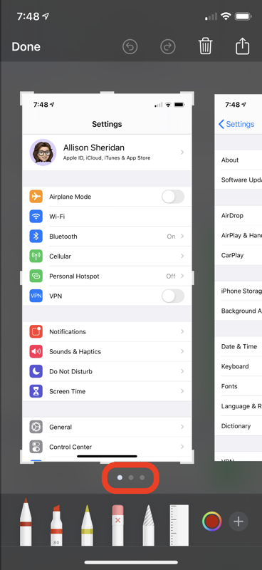
I’m not entirely sure why this is possible but when you are looking at a screenshot as we’ve been describing, you can screenshot that page. I know this is kind of meta but stick with me here. When you take a screenshot of the screenshot page, it puts the new shot to the right of the first one you created. Of course, the new shot is slightly different because it captures the markup tools that are on screen and the thumbnail down the side, and the trash can and all that. You can keep taking screenshots and they keep stacking up to the right.
On the iPhone only, as you take more shots (of this same page), you’ll see little dots below the screenshot shown to indicate that you can swipe to see the other shots. Personally I like to swipe across the middle of the screen, thereby dragging a red crayon line across my image, and then I find the undo arrow button and only then swipe in the correct area. Every. Single. Time.
Now of course taking screenshots of a screenshot is a goofy thing to do, so let’s use this functionality for a real use case. When you take a normal screenshot, for a short time the shot rests as a thumbnail in the bottom left of your screen. It turns out you can keep taking screenshots one after another and they stack up there.
Try this as an example. Let’s say you’re trying to teach someone how to modify the keyboard settings on an iPad. Open up Settings and drill down into the menus, and just keep taking screenshots as you drill down. When you’re done you’ll have a stack of thumbnails in the bottom left and if you tap on it right away you’ll get them all side by side in the markup utility. Don’t delay though or they whoosh into your Photos library!
Now you have all of the screenshots side-by-side in the Markup utility. You can mark them up and maybe mail them to someone as a quick little tutorial.
Sharing and Saving
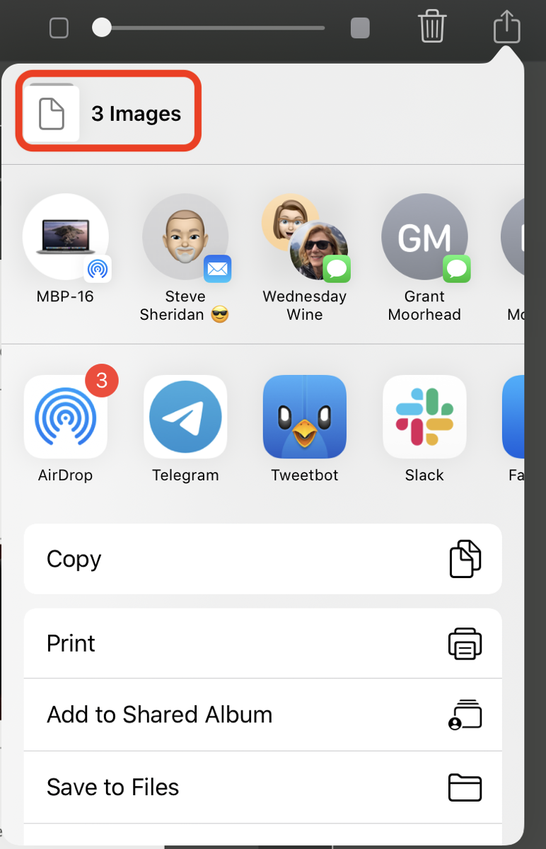
In the upper right there’s the familiar share box with the upwards arrow. When you select it, you have the option to save or share all of the snapshots you’ve taken so it will say “3 images” at the top if you’ve got your original plus 2 more like I took for this demonstration.
You can save all of your screenshots to either Files or Photos, but the long-form screenshot can only be saved to Files because those become beautiful PDFs. And not just PDFs, searchable PDFs. Isn’t that awesome?
Where Does Long Form Work?
I want to circle back on screenshotting of long-form content. I started with Safari but it works in some other Apple apps as well. When you take a screenshot in Apple Notes or Mail it does something really interesting. The Screen tab presents the full screenshot including the sidebars as you would expect. But if you switch to the Full Page tab, you only get the specific note or mail message you were viewing when you took the shot. I think that’s some brilliant work right there to separate it out like that.
I started digging deeper into Apple apps and I couldn’t get long form to be captured in the Home app or Stocks or the Apple TV app. But it does work in Numbers and Pages and even Keynote! I couldn’t believe how quickly it converted a 50-page Keynote deck to a PDF.
I wasn’t able to find any non-Apple apps that had the capability to do the PDF conversion of long-form content but I don’t know definitively that they can’t. I wrote to a dev buddy of mine and he believes that this feature is Apple-only.
Bonus Tips on Markup

I’m going to give you a bonus tip about markup that many of you may have figured out already, but most people I show it to never noticed it was there.
Let’s say you take a screenshot to send to your friend and you want to make sure they see the one thing in the screenshot you’ve been trying to explain to them. Most people use the marker or the crayon to furiously scribble around the thing they want me to see and send it along. But there are much more elegant ways to focus someone’s attention and it’s hiding in plain sight.
When you take a screenshot, the markup tools available are a pen, highlighter, crayon, and an eraser. Next is a funny pencil with diagonal lines on it. That funny pencil is actually a selection tool so you just sort of draw around an annotation and it puts a tight selection ring around it and allows you to drag it around. You also get a straight edge (pretending to be a ruler but there are no measurements possible with it). You can twist it with two fingers and draw nice straight lines.
Boxes, Circles and Arrows, Oh My!

But to the right of the colors you can choose to make your angry scribbles is a little plus button. If you tap that, you get several more tools. The tools I use all the time are the box, circle, and arrow (and sometimes the thought bubble if I’m feeling playful.). The arrow in particular is more useful than you might think. As soon as you select it, a long red arrow will plop on screen.
You can change the length and drag the endpoints around of course, but notice that there’s a green dot in the middle. You can drag that dot around and the arrow becomes an arced line instead of straight. That’s super useful in getting the point of the arrow where you need it but making sure the line itself doesn’t obscure something else important on the screenshot.
With the arrow you just plopped on screen still selected, you can change the color with one of the options across the bottom, but you’ll notice another button on the far left side has appeared. It has a solid, dark circle beneath a square. Tap that and you’ll see options to change the arrowed line to a plain line or a double-ended arrowed line and you can also change the line thickness from this menu.
If you make rectangles and circles, this same button lets you make them filled shapes or change the stroke thickness. I am going to confess right now that I never noticed this little menu button before!
Magnifier
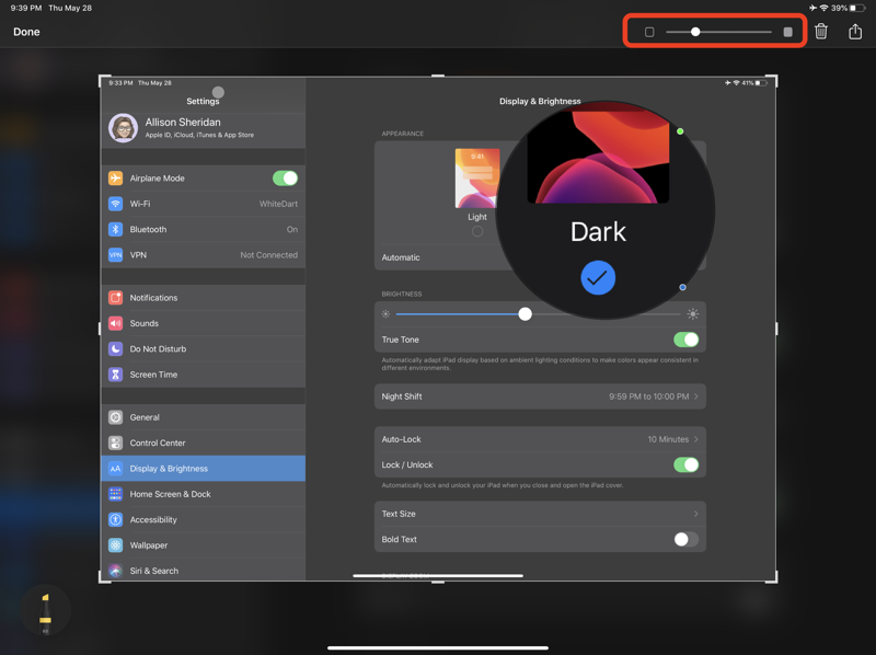
The plus button has even more features up its sleeve. You can add a text box or your signature, and also a magnifier. Adding a magnifier puts a circle on screen with the area inside the circle slightly magnified. There’s a blue dot on the circle that when dragged in and out will change the diameter of the magnified area.
You’ll also notice a green dot on the top of the circle. If you rotate that green dot clockwise to the right, the image inside the circle increases in magnification. Now isn’t that better than your scribbling you were doing before?
Remember earlier when I said that only iPadOS has the opacity slider? I was wrong about that. On iPhone, in addition to the tools I described under the plus button, they’ve also included the opacity slider. Guess they just didn’t have room for it on the main screen.
I also figured out a problem the opacity slider solves. Annotations are unaffected by the change in opacity. If you use the magnifier to draw focus to an area of the screenshot, you can really make it pop by sliding to the right to lower the opacity of the rest of the image. This is particularly dramatic if you were using Dark Mode when you took your screenshot.

Remember when we were talking about how you could view multiple screenshots in Markup at the same time and I said that on iPhone it shows you dots to indicate multiple screenshots but I didn’t mention iPadOS? I was careful to word it that way because on iPadOS the markup tools cover up the area where the dots would be.
But there’s one more hidden gem in the Markup toolbox on iPadOS. To the right of the plus sign that reveals the arrows and other geometry is a button with 3 dots inside it. When selected, it reveals a little toggle labeled Auto-minimize. If you turn on Auto-minimize, the entire palette of tools scoots off to the left, leaving a circle showing just the currently selected tool. You can now see the dots indicating the multiple screenshots. It’s also nice to scoot the tools out of the way because they actually cover part of the screenshot image in their normal position.
Bottom Line
As I said upfront, I love taking and annotating screenshots so I really enjoyed discovering so many cool features in Markup on iOS and iPadOS. Perhaps you knew some of these features but if you’re like me, some of them were an absolute revelation.

I love the Magnifier but sometimes the “opacity” option doesn’t appear. It’s really random as to when it happens and I haven’t been able to work out why some images work and some don’t. Does anyone know if there are any specification limitations on the use of Magnifier and when you are able to use Opacity?