
One of the most controversial things shown at Apple’s World Wide Developer Conference (WWDC) was the redesign of Safari. Apple didn’t do a great job of explaining what problem they were trying to solve, but the interface is going to be different from any browser we’ve ever used. The redesign is across all of their platforms, macOS, iOS, and iPadOS. Right now, to play with the new hotness, you have to install the developer betas of the operating systems. Not only does that cost money, but it’s also a very dicey thing to do with devices you depend on.
Soon there will be a public beta of the operating systems, so it won’t cost any money, but unless you enjoy living life on the wild side, it’s still not a great idea to install a beta operating system on your primary devices, even if it’s a public beta. If you have spare devices, then all bets are off, have a great time with the betas.
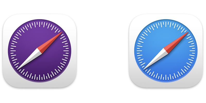
But what if you don’t want to take that risk, but you still want to play with Safari to decide whether you’re going to hate it or maybe even like it? I’ve never seen this before, but Apple has made available the Safari Technology Preview which you can download and run on macOS Big Sur. The cool thing is that it’s a standalone app separate from the currently-released version of Safari, and even has a purple logo so you can tell them apart. You can run both the Safari Technology Preview and “regular” Safari side by side with no danger of borking anything else on your Mac.
Downloads – Safari – Apple Developer developer.apple.com/safari/download/
Safari Technology Preview doesn’t appear to be available for iOS or iPadOS, but at least we can mess around on fully-released macOS Big Sur.
Let’s Talk About the URL and Tab Bar
The most dramatic change to Safari is that tabs are very different now. Instead of being a row of obvious tabs below the URL bar, it’s sort of like they merged the tabs and URL bar into one thing. For example, if you have podfeet.com and amazon.com open in tabs, whichever one you’ve selected will show the URL field with the little lock and such, and the other tab will just be a button with part of the name showing.

The louder people online are complaining that they can’t read the name of the tabs because they get cut off, but I don’t quite see how it’s much different than the current Safari. As you add more and more tabs currently, the names get cut off too. Eventually, in both versions, the tab names disappear and it’s just the favicons, those tiny little icons web developers can add to their websites. I honestly don’t see why people are up in arms about this.
One oddity is that with a tab selected, you still only see the shortened URL, not the full one, and yet the URL field is huge. All of the other tabs are pretty narrow and it would be handy to have them wider to be able to read the description, but the URL field is taking up all the space with very little information in it.
When you flip between tabs, it’s a pretty jarring experience because the entire upper part of the browser window will change color, and sometimes quite dramatically. For example, many web pages are a basic white background, but when I switched to my Weather Underground tab, the Favorites Bar and the new integrated tab/URL bar all turned bright blue. This is odd, because this color doesn’t show anywhere on the current Safari rendering of this website. I can see this dramatic change between tabs leaving people feeling a bit disoriented.


Tab Groups

They have added the concept of Tab Groups to the new Safari. When I first looked at Tab Groups, I thought it was just like having a folder in the Favorites bar, but it’s not really the same thing at all. It is similar to the Safari General Preference to open new windows with a folder from your Favorites bar. When you do that, every new window has all of those tabs already open. But with Tab Groups, we now can have multiple sets instead of just the one.
Since the redesign is all about maximizing the web page real estate, Tab Groups are created and accessed in the left sidebar.
I tested out Tab Groups and I think it’s really slick. I thought about how often I open different web pages within podfeet.com while I’m working, like the Blog Posts category, each of the podcasts’s pages, and WordPress to manage podfeet.com, and thought that might make a nice Tab Group.
I opened all of the separate web pages on separate tabs that I normally open by diving in and out of the home page. I used the icon in the toolbar to show the left side panel, and it told me I had 5 tabs open. From there I could tap the icon with a double rectangle and a plus button on it to create a tab group. You can also do that by right-clicking on the number of tabs.
That sounds much more tedious than it was to execute, especially if you already have the tabs open that you want to group. Now that I have a podfeet Tab Group, I can click on it and my browser window changes to show all of the tabs opened at once. In my opinion, it’s kind of like the best of both worlds. You have access to all your lovely favorite sites in tabs, but if you click away you have just the new tabs you may have opened. I think this would work better for me than a never-ending addition of tabs open in my browser.
If it’s hard to tell which site is which because your Tab Group has a ton of tabs in it, if you click on the Tab Group name, you’ll see a set of four squares in a little grid as an icon. When you tap on that grid icon, the main part of the page will change to being big thumbnails of each website, and you’ll be able to read the site names on each one. Might be a faster or more visual way to jump to the tab in your Tab Group you want. I wish you didn’t have to first select the Tab Group in order to be able to tap its grid icon, and I sent that feedback to Apple using the Feedback Assistant app.
I thought maybe Tab Groups would eliminate the need to use the Favorites Bar, so I tried to convert mine into a Tab Group. I was surprised to find there was no way to do that. I had to open Bookmarks from the left sidebar, which slides away the Tab Groups, then right-click each Favorite to open it in a tab. Then when I had all of them open, I flipped back to Tab Groups and I was able to make one called Favorites out of what I had open. I guess I only need to do this once so it’s not that big of a deal but it was kind of an annoying process.
After using Tab Groups for a bit, I don’t think it would eliminate the desirability of having a Favorites Bar. One-click access to the few things I use all the time can’t be beat by opening a Tab Group that includes the one thing I need.
Apple talked in the WWDC keynote about the need we all have to focus, and they’re creating different contexts for that concept with more notification controls. I think you could use Tab Groups as a way to increase focus. When you’re in your “waste away time on social media” mode, you could select your Tab group with Reddit and Facebook and Twitter. When it’s time to focus on getting some work done, maybe you have a Tab Group for serious things like Google Docs and Sheets.
With a click of a button, you can completely switch context and have open what you need without a ton of windows open or a ton of tabs open in one window. Ooh – that might be a BAD thing because right in the middle of working you can hit your Play Tab Group and goof around. Well, that’s on you if you do!
Apple Likes to Hide Things
I’m not sure what happened, but over the last year or two, Apple has started this new concept of making you hover or click to discover things. The worst example of how they’re doing this is with Reminders. I absolutely hate with a passion how on macOS Big Sur I have to hover, then a downward chevron appears and only if I click that can I select complete on the task. There used to be a button right on the notification and now it’s three actions to click it. I’m not sure how hiding things we need to use all the time is a good thing. If you get a notification and you’ve already done the task, why make it harder to acknowledge that?
In the Safari Technology Preview, since they eliminated the toolbar, there’s no area to put the refresh button and share icon. Instead, you have to click into the URL field on a 3-dot icon to reveal the Refresh and the Share menu. Command-R still works to refresh, thank goodness, but it’s seems so dumb to have to click twice to get to a button that’s pretty necessary. If you really want a refresh button back, John Siracusa has written a Safari Extension to give you back the Refresh button. Whilst running the future and current Safaris, I didn’t see a way to install Extensions into the Technology Preview so I can’t test how well that would work.
You also don’t have a visible X to close tabs, but in this case it’s not a problem. If you want to close a tab, you naturally move your cursor to the tab. Instantly, if the name is showing, you’ll the favicon will change into an X for easy closing. I tested what happens if there are so many tabs open that only the favicon is showing and discovered something delightful. When you hover over the favicon, a little mini browser thumbnail pops open so you can very easily tell which web page it represents. When the tabs do have names, you get the same effect on hover. It’s really slick!
Semi-Bottom Line
I know this is a preview version of the new Safari browser for macOS Monterey, so I can’t give a bottom line, but I was convinced before I got to play with it that I would hate it. But I have to say, it’s fresh and new looking and I rather like it.
The disappearance of URL line is really bad. It makes editing URL really cumbersome, notably for long URL. They should at least provide a setting option to display this URL in a separate line, as it was.
Tab Groups are not available on Big Sur
(https://developer.apple.com/safari/technology-preview/release-notes/)
Thanks for posting that, Michael. It explains why when I went back to use my tab groups after making this post, they were gone. I thought I’d hallucinated it.