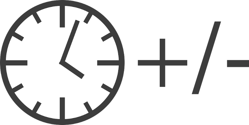
You’ve heard me drone on about how to add time using Excel, and that struggle over the years has inspired me to write a web app to add and subtract time. It seems like a fun project, and within grasp of my skills so far in programming. I’ve already started working on it, and at the rate I seem to be able to carve out time, it should be ready in a year or two.
I have a vision of what the app layout would look like, but I thought it would be fun if we crowdsourced this a little bit. You don’t have to approach this as a programmer, in fact, I’d prefer it if you thought about it from a regular human perspective.
If you wanted to add and/or subtract a bunch of times together and get an answer, in an ideal world, how would you lay that out to be efficient and easy to use without instructions?
Here are some things to consider:
- Should there be separate fields for the hours, minutes, and seconds?
- Or maybe the user should have to entire the time in 00:00:00.0 format?
- How many hours maximum should I allow?
- Should I allow decimal seconds? How many digits should I allow?
- Are there buttons for add and subtract?
- Should those add/subtract buttons be on the left, or right, or maybe even in their own row in between the time entry fields?
- Should the total update when you’re done entering the last number, or should it update only when you hit an add or subtract or maybe an equals button? Would it be distracting if it’s auto-updating the total, or would that be awesome?
- Should the total be at the top or the bottom? If it’s at the bottom I’d have to make sure it doesn’t roll offscreen
- Think about mobile in the layout – how to use the small space efficiently but without making the UI hard to understand.
- Would you choose a different layout if it’s on mobile vs a bigger screen?
- What haven’t I taken into consideration?
Now here’s the fun part. I don’t want you to answer in words. I want you to draw me a picture. Use your fancy pants Apple Pencil and your iPad in Apple Notes, use Omnigraffle on the Mac to draw pretty buttons and fields, use engineering quadrille paper with a straight edge and a mechanical pencil, or use a crayon, scissors, and construction paper.
I don’t care how you create your picture as long as it conveys your vision of the perfect layout for a Time Adder app. Oh and how about the name? Time Adder does say most of it, but I’ve never been good at naming things, so suggestions are welcome.
I posted this question in our Slack at podfeet.com/slack and Allister Jenks and Nuclear Jon have both sent in some great drawings. If you want to answer over there that’s great, or if you want to send me an email at [email protected], or you could Tweet it at me @podfeet. Any way you want to show me your vision would be awesome.
Thanks in advance for your ideas!
I like this tool format simple, intuitive … https://www.epochconverter.com/date-difference
Haven’t looked at this on my mobile device though. Have fun.
Any business needs to increase user loyalty for its own financial success. Creating an application is an amazing tool for this, React JS is an opportunity to create an interactive product in which the interface reacts as quickly as possible to any action of the platform visitor. I advise you to learn more about custom ReactJS software development here