I got a thank you note from a relative of mine recently for a blanket I knitted for her new baby. It was the first time I’d seen her beautiful handwriting and my first thought was, “I’d like a font like that!”
It got me to wondering whether there might be services that would allow you to make a font out of your handwriting. I was delighted to discover that they do exist, and I’ve had great fun this week with one of these services called Calligraphr at calligraphr.com.
This idea wasn’t one into which I was planning on investing my hard-earned money, but as Bart has taught us, it’s a good idea to understand the business plan of any service you employ. Calligraphr has a freemium business plan, meaning you can get a free account and have a lot of fun but if you start wanting to make lots of fonts and get extra features, you’ll need to upgrade to the paid plan.
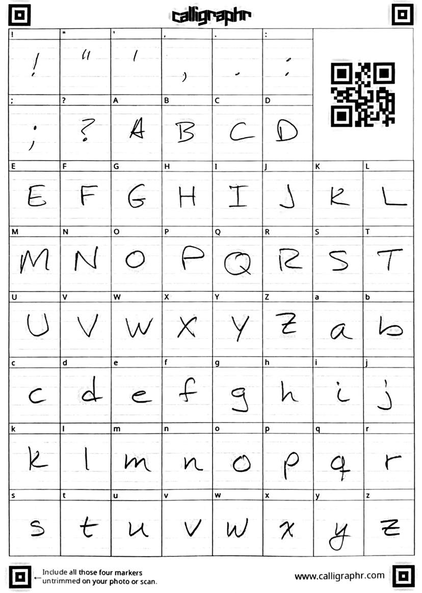
To create a font of your own, you download a template file for the language of your choosing. They have English, German, French, Spanish, and Japanese. The template you download is a like a little kid’s primer to teach them how to write letters.
You have squares with each of the letters in alphabetical order in upper case and then lower case, along with a few punctuation marks. You can choose to have the squares blank with a little guide letter above each one telling you what you’re supposed to write, or you can have them print the letters very faintly where you’re supposed to write them. I went with the second option.
After downloading the template, you print it out and then hand write over each letter in your own handwriting. There are little guidelines inside the squares (just like the ones for little kids learning the alphabet). I sorta paid attention to them but not as much as I probably should have, and I’ll explain why in a minute.
After you’re finished writing like someone in grade 2, you scan the paper back in and upload it to Calligraphr. The paper has four little markers on the corners that need to be included as a reference.
After you upload and save your letters with a name, the next step is to build your font. At this point, you can see the characters as they will look when you get to use them. Evidently in font-speak, the characters in a font are called “glyphs” and I’ll try to remember to call them that from now on. For some reason the scan/upload process creates little dots and small lines, I guess from noise in the scan.
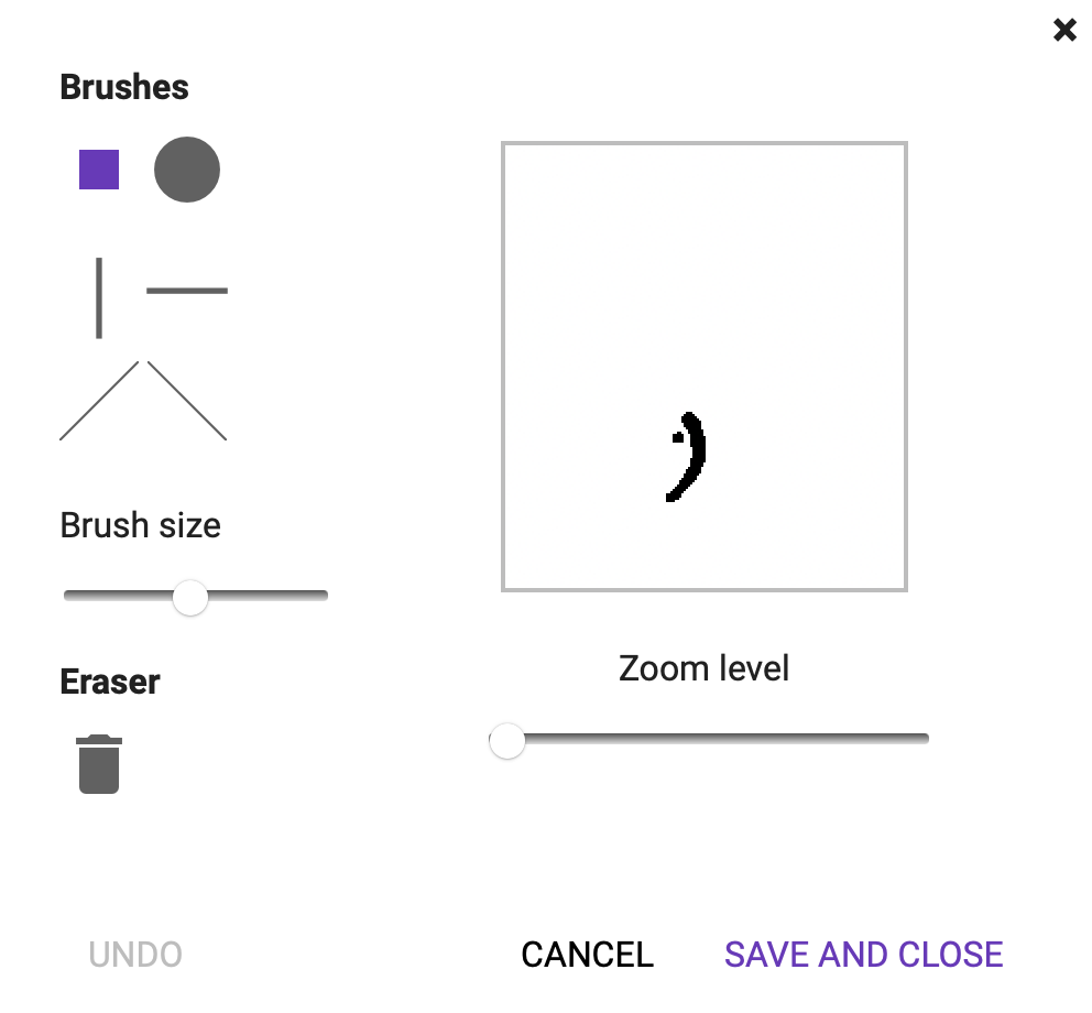
If you select one of your glyphs, you’re given the opportunity to clean things up in a little graphic editor window.
I used the eraser a lot to remove the bits of noise, but you can also use one of six brushes to smooth things out or add to the glyphs to make them more to your liking. There’s nothing like looking at your handwriting zoomed up to this level to make you realize how truly awful your handwriting is.
The one tricky bit of the interface is that the eraser looks like a trash can and is a toggle. If the trash can is highlighted, then all of the brush options are erasers. If the trashcan is not highlighted, then all of the brush shapes are actually brushes.
The interface for editing your letters is very easy and intuitive. It was time-consuming, but it was not difficult. The time it takes you to clean up your glyphs is all a function of how long you want to spend cleaning them up.
When you’ve completed cleaning up your glyphs, the next step is to build your font. The process only takes a few seconds, and then you’ll see your fancy new font used in some random text that appears to be a mix of Moby Dick and Alice in Wonderland.
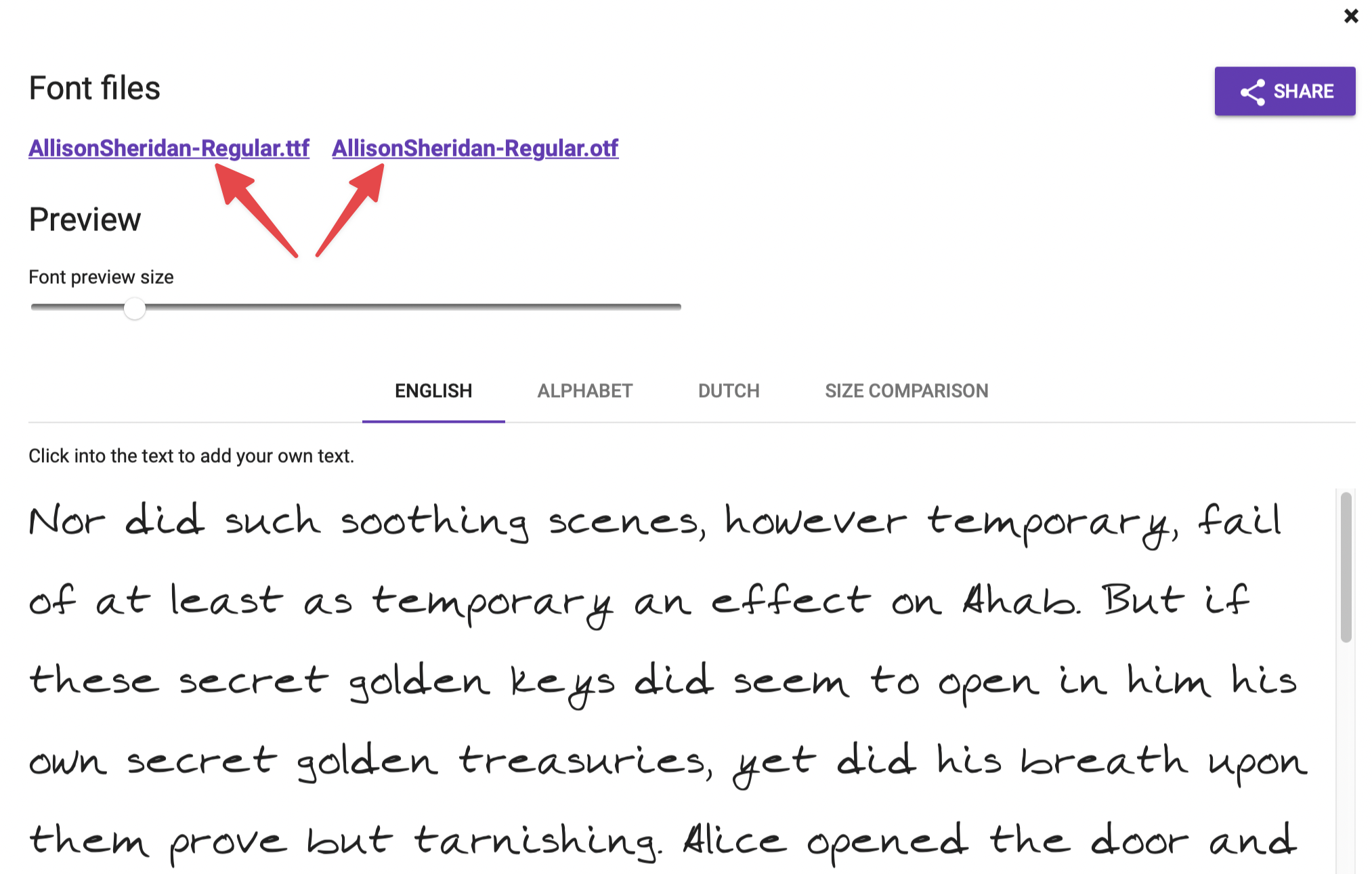
If you’re satisfied, or at least impatient, it’s time to download your font. You won’t see a download button, which is a little confusing. Instead, you’ll see two links for two different font download options: .ttf and .otf.
Make Use Of has a good explanation of the two formats. TTF stands for True Type Fonts, and OTF stands for OpenType Font. I didn’t understand the implications very well, but OTF is the new hotness and they used the word “glyph” with it, so that’s probably what you want. I tested both and they looked identical to me, but newer has to be better, right? 🤪
Installing downloaded fonts is super easy on the Mac. Simply double-click on the font file, and it will automatically launch an app called Font Book (which is buried in your Applications/Utilities folder.) Font Book will offer to install the font and you’re done.
As soon as I had the highly-coveted Allison Sheridan font installed, I popped open TextEdit, changed to the Allison Sheridan font, and started to type. I have to say that it is seriously freaky to type and yet see your own handwriting spitting out on screen!
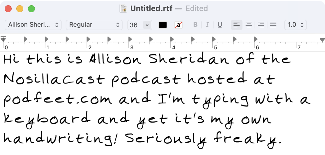
After I got over the shock of how easily I was able to make a font from my own handwriting, I started to look more closely at it. I noticed that some of my letters seemed sunken down a bit while others were somewhat higher.
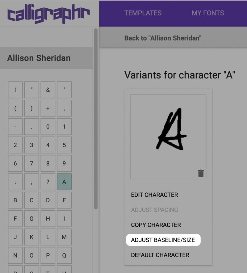
Remember I said there were guidlines and I should have paid more attention? I was going to start over and be more careful with my lettering, but I was worried that I’d be too careful and it wouldn’t accurately reflect my sloppy jalopy handwriting.
Then I discovered that you can do more than edit the character, you can adjust the baseline and size of your character. To get to these options, first select your font from “My Fonts”. You’ll see each of your glyphs with an option to delete them individually for a do-over. If you select one of the glyphs, you’ll see the alphabet on the left sidebar and you can select a specific letter. At this point, you’ll have options to get back into the pixel editor we were in before, but you’ll also see the option to adjust the baseline and size.
The two functions you’re going to perform in this tool are to raise and lower each glyph till it lands on the bottom guideline, and then to increase or decrease its relative size compared to the other glyphs you’ve created. They give you little buttons to move and adjust the glyphs by just 1% or bigger steps of 5%, or you can use keyboard shortcuts to do the same thing.
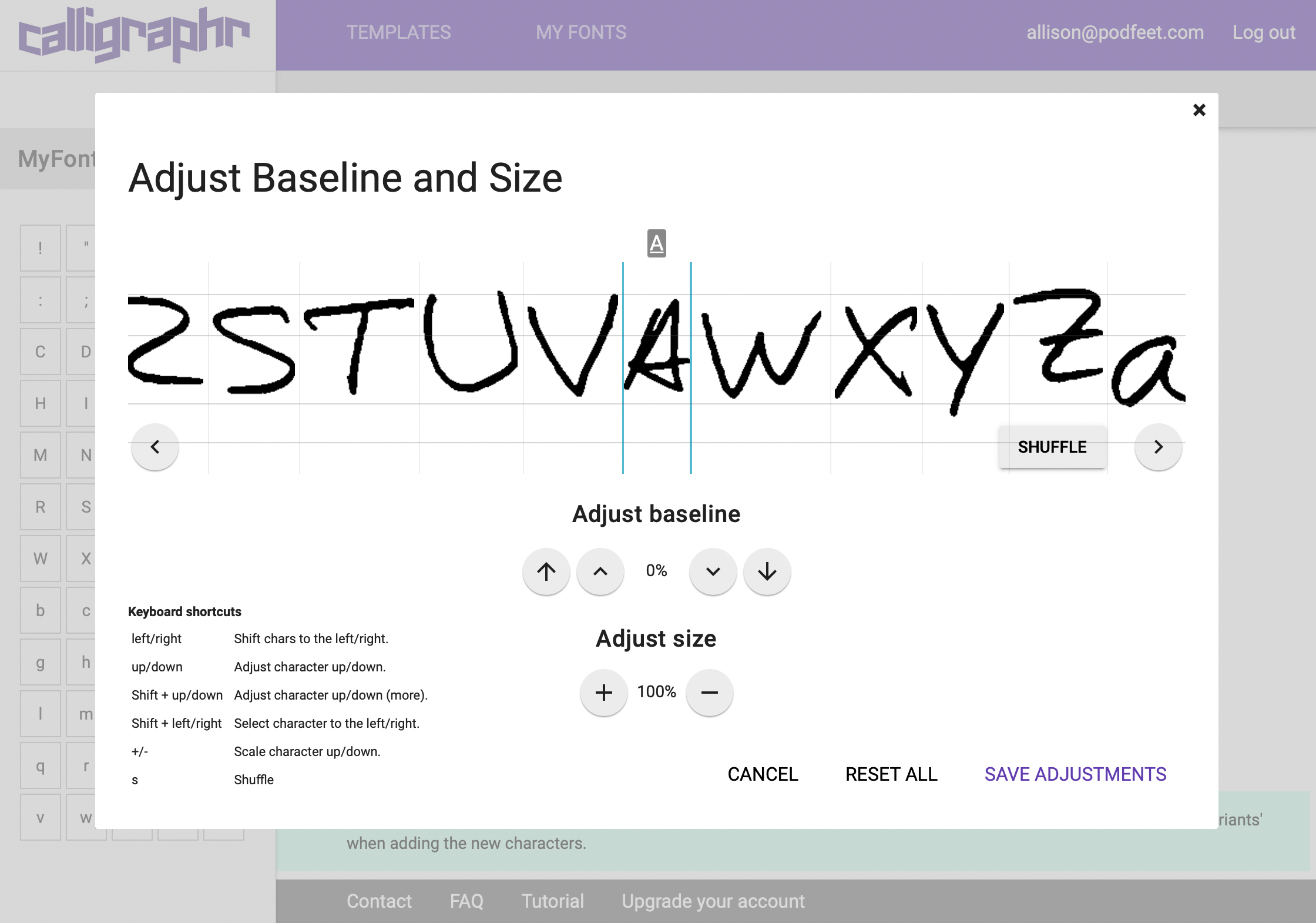
While you’re adjusting a particular glyph, such as the capital A, it’s helpful to see what it looks like next to different characters. It’s hardly ever next to a capital B so you can use the right/left arrow keys to compare to any of the other glyphs you’ve imported.
When you’re done editing one glyph for size and baseline, you can simply select another one and keep editing. As you can imagine, this is an iterative process. That lower-case “g” looks too small next to the “c”, so let’s embiggen it. Wait, now the “h” looks too big compared to the “c”. Just like editing at the pixel level for your glyphs, you can spend as much time changing the baseline and size as you have to spend. When you’ve run out of time, don’t forget to tap Save Adjustments to retain your hard work.
Once you’ve spent quality time editing at the pixel level, moving your glyphs up and down, and resizing them, you’re ready to rebuild your font. You’ll be delighted to see how much better it looks with the glyphs aligned and sized. But you’ll probably notice that when written into words and sentences, the spacing between your letters and words isn’t quite right. In my font, my letters were way too far apart.
I then discovered yet another tool called Edit Font Details. Luckily this tool is pretty simple. You get a slider to change the letter spacing, font size, and word spacing. It’s a little bit iterative because you change the spacing, build the font, change the spacing, build the font, and rinse and repeat until it looks good to you.
I set my font size to 120%, my letter spacing to 85%, and left the word spacing at 100%. It looked a lot better, especially the alignment of the characters. The words were a bit too close together so I went in to adjust that and it didn’t give me a % but I slid it anyway, and something odd happened – I got all Xs for the preview of my font. I couldn’t figure out how to fix it, so I logged out and backed in and my font was back.
I ended up dragging the character spacing to 50% and it looks just about perfect now. I did have the Xs instead of my font showing in the web tool again but I exported it anyway and it was just fine, so evidently it’s just a little bug on the website.
Calligraphr is addictive. I had a great-looking font of my handwriting and could have stopped. But I then started thinking about how it would be cool to have numbers in addition to letters. When I downloaded the original template, it was just the letters and a few special characters. I discovered that they have way MORE templates than I said up front. They’ve got mathematical symbols, currencies, Latin, Cyrillic, and Greek to name a few. One of the templates was called Minimal Numbers.

When I selected the Minimal Numbers template, I was alerted to the fact that I was about to run into my first limitation of the free account. Free accounts can have up to 75 glyphs, but the addition of the Minimal Numbers set (which includes some other characters like +, -, &) adds up to 79.
If you download the template, and fill in just the essential glyphs (I was able to do all of the numbers plus a couple more characters), and then scan it in, you can click the trash can on the ones you don’t need, and then you can import the new glyphs.
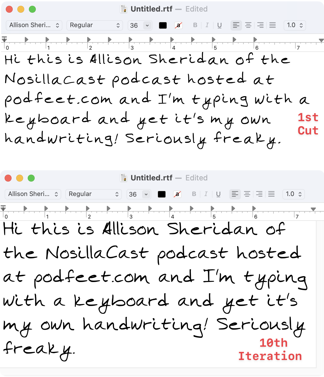
After my 10th iteration on my font, I happened to start reading the FAQs which are really like a user manual and discovered that you’ll get much cleaner scans if you scan in color or greyscale rather than monochrome. Remember all those little bits of noise I had to clean up? I had scanned in black and white.
What to do with your new handwriting font
I was finally ready to start using my fancy new handwriting font. I realized pretty quickly that this will be primarily for my own entertainment. For example, I changed to my handwriting font in Apple Mail, started a new email, and squealed with delight. But then I realized that the email I just received from Steve was also in my handwriting! Boy was that weird. I’m sure you all realized it, but I was slow on the uptake. My emails won’t be received in my font; they’ll be received in whatever font the person on the other end has chosen.
I do have a very important use for my new font. I like to write handwritten letters to people. Often they are thank you notes, but sometimes just letters of encouragement if a friend is feeling blue. Because we never write paper mail to people, these handwritten notes often have a big impact. My mother-in-law in particular really appreciates them.
The main problem to be solved is that I write by hand so infrequently that my hand cramps up after just a few lines. I’m also so out of shape at writing by hand that sometimes my hand sort of flails and I’ll get as many as four humps on an “m”. And remember, “typos” still happen when you write by hand. What do you do? Scratch it out? Try to write over it? Start the whole letter over again? There’s also the problem of reading something over that you’ve written and realizing you didn’t say it quite the way you wanted. Basically, these are all the reasons we type instead of writing by hand.
My solution up until now has been to use Apple Pencil on the iPad Pro in the app Notability to handwrite my notes and then print them. The advantage of writing in Notability is that I can have lined “paper” while I’m writing so my writing doesn’t slide down to the right like a psycho, but then I can turn the lines off when it’s time to print. I can also use the lasso to grab a set of lines and move them down to add a thought, or erase a single 4-humped “m”. It’s been a pretty good solution, but my hand does still get cramped.
But NOW, with my fancy-pants, much-coveted Allison Sheridan font, I can type out my letter of encouragement, maybe choose blue for the color, and print it out on my pretty stationery and it will look handwritten. Only my mother-in-law will figure out what I’ve done because she’s saved my letters and will notice that my letters are oddly consistent when my true handwriting is all wibbly-wobbly (like a psycho).
There’s another use for it that I’m testing out. I wrote an article entitled Write by Hand When You Need to Think in which I explained that using plain old paper and a pencil can be a better way to barf your ideas out than trying to do it while typing. I use this technique when I’m coding, but rather than a paper and pencil, I use iPad with Pencil and my friend Notability.
But sometimes I think of something when sitting at my Mac that I want to jot down about a development project. I’ll open Notability on the Mac and type in my thought. These type-written sections are jarring and for some reason are harder for me to scan through when looking for an idea I remember writing down. Now I’m hoping I can have the best of both worlds by typing in my own handwriting when I do let myself write from a keyboard. I have to resist doing this often though because it absolutely violates the “write by hand when you need to think” first principle!
Fonts on iPadOS
At this point in the plot, I was having such great fun with my font that I really wanted to use it on my iPad. I thought I remembered that Apple had created some backhanded way to add fonts to iOS, so I went hunting. 9 to 5 Mac has a really good article on how to use custom fonts on iPhone and iPad so I studied up. It is as backhanded as I’d remembered. You have to first install a third-party app onto your iOS device, then you tell that app what font you want to download, and the font app will install a profile onto your iOS device to allow the OS to see the font. The app you want to use also has to have support for custom fonts. As janky as that all sounds, you know I had to try it!
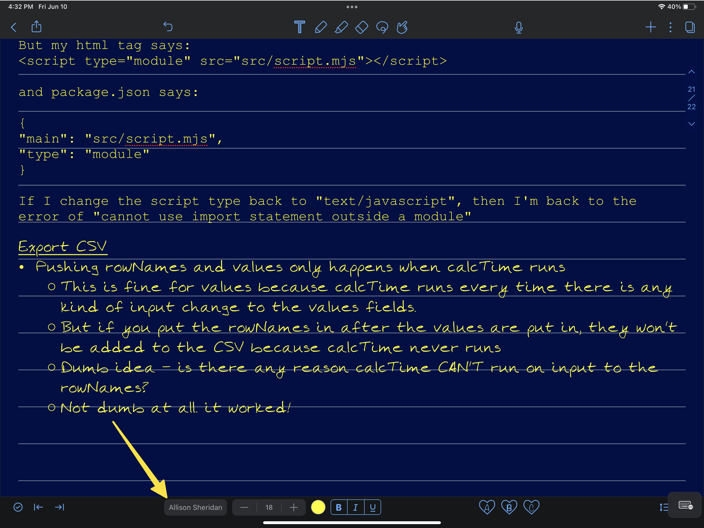
I tried out a few of these font apps and while they would let you add fonts to iOS, they were restricted to services such as Google Fonts. Don’t get me wrong, that’s really cool, but I needed one that would allow me to import a custom font. I also stumbled across one with an exorbitant weekly fee. The 9 to 5 article suggested an app called iFont which will allow you to import five fonts for free and you can point to iCloud or Dropbox to get the font. I followed the clear instructions in iFont and to my delight, I now have my handwriting font on my iPad. Very cool.
More paid-for features
You might be wondering at this point what other advantages you might get with the subscription fee to Calligraphr. Before explaining, you can buy a “cup” of Calligrapher for $8 for one month and you’ll have your font forever after using the advanced features.
I mentioned the 75-character limit of the free plan, and with the paid plan you can have 480 characters. That’s bananas. With the free plan, you can create unlimited fonts, but you can only have one concurrently. If you’re sure you are happy with your font, you can download it, delete it, and now create a new one. You’ll not be able to edit that original font. If you get addicted like I am, you’ll start noticing that your “y” looks a little bit funny, and the & is totally wrong and keep wanting to edit, so I have a hard time picturing ever being “done”.
Calligraphr allows you to create variants of letters. I dragged Sandy into my madness and in a share screen session, I showed her how to import her own handwriting and start editing it. Her first attempt was to use script writing, and it was a disaster.
The problem with script is that each character needs to know what the following character is going to be in order to know what it should look like. For example, if a lowercase “o” is followed by an “i”, the “i” has to know to start at its top point, rather than on the baseline. Similarly, if the “o” is followed by an “s”, the “s” must start in midair, instead of on the baseline.
When I heard about this variant option in Calligraphr, I thought maybe that’s how you do script, but they explain that variants are sprinkled in randomly. I guess it was naïve of me to think that a font could have the embedded intelligence to decide what to look like based on the next character. In any case, if you like the idea of having a lot of random variations to each character, you can have 15 with the paid plan but only 2 with the free plan.
I am tempted to buy a month of Calligraphr for one specific feature. The 8 in my font has a spacing issue; it’s like it’s shoved to the right of the space it takes up. The “1” I created is thin as one would expect, but it also has essentially no space on either side of it. You can adjust letter spacing for single characters with the paid-for plan. There are other advantages of the subscription of Calligraphr, like the ability to have ligatures, but I had to go look that up to see what it meant. I’ll leave it to you to investigate the pricing further.
Then I got to wondering what would happen to my font if I upgraded and then let the monthly fee expire. When you have a free plan, the data about the font is stored in your browser. They explain that your font info will remain in the browser for some time, but they will eventually clear the data out of the cache and you’ll lose your work. They say that Safari is as soon as a week, while Firefox and Chrome save it for around 2 months.
I tested this explanation by logging into my Calligraphr account with Microsoft Edge, and sure enough, I have no font stored. It’s important to note that your downloaded .otf or .ttf files that you created with Calligraphr still exist and you can continue to use them on your Mac and iPad, but once the browser clears the data you won’t be able to make further edits.
If you really get serious about making your own fonts, you can cut the monthly cost in half to $4/month if you upgrade to a 6-month plan.
Bottom Line
The bottom line is that I had a lot of fun making my own font and learning how to use Calligraphr. I love having my own handwriting font and I’m using it everywhere I can just for the sheer fun of it. I need to find an excuse to write a note to my mother-in-law now. If you would like to have a font of your handwriting (or someone whose handwriting you admire and can get to fill out the template), and you have hours to dedicate to perfecting it, head over to calligraphr.com and have some fun.

I’ve been wanting to create my own typeface for a long time, I love having a highlight for my own signature.
I love beautiful fonts
Calligraphr’s paid plan offers valuable features like character spacing adjustments and ligatures, which can refine your custom font. Just be mindful of data loss if you let the subscription expire.
Eurovision Levon