Just a bit over six months ago, I told you why I replaced the Note-taking/organizing app Ulysses with Bear from bear.app. Don’t worry, I’m not abandoning it for something newer and shinier, I’m here to sing the praises of Bear 2.0 which was just released.
As you may recall, I chose Bear out of a host of other options because it has a simple yet elegant design, it syncs across my Mac, iPhone, and iPad, and most importantly supports TextExpander on all of those devices. The price of $15/year made it less than half of all the other contenders. Now I’m not sure when it changed, but the price is now $30/year for the Pro version, but they do still have a free version with some limitations. While $30 is double what I was paying, the price is still under the competitors I tested such as Ulysses at $40, Craft at $60, and Obsidian at $120/year.
Bear was already clean and elegant, but somehow they have managed to make Bear 2.0 even cleaner and more elegant. I’m not sure how to quantify it, but everything is prettier. The new version isn’t just a new paint job, they’ve added and improved a lot of features.
Feature Improvements
I don’t normally read release notes, but when I heard that Bear 2.0 was released, I wanted to learn about every new feature. I won’t go through every feature in detail but I do want to talk about the improvements that blew my dress up.
Bear is a great app for writing in Markdown, the simplified, plain-text way to write for the web. If you’re not a Markdown user, Bear is still a great way to write in plain text, but I’ll be focussing a bit here on using Markdown with Bear.
Markdown is great because instead of giant gloppy HTML syntax like “a href” and weird brackets and such for URLs, you just put the text you want people to see in square brackets, followed by the URL in roundy brackets. It’s much more readable and less distracting for you when you’re typing and if anyone else needs to read it later it’s cleaner for them too.
Tables
Tables are incredibly annoying to create and read in HTML. While they’re much simpler in Markdown, they’re still difficult to type. It’s a lot of pipes and dashes and colons to designate title cells and justification of text inside the tables. I usually Google for a Markdown table generator website whenever I need to make one.
With Bear 2.0, they added a button to create tables. It creates a two-column, two-row table with the first row being a heading. Hovering over any of the cells gives you a slew of options to add more rows, and columns, and to change the text justification for the column. Bear also formats it into a pretty table while you’re working, but when you export the table it’s the full Markdown syntax so you can use it on the web.
| This is a Title | ‘Nother One Title |
|---|---|
| Right-justified | Center-justified |
You have to have lived through typing in tables by hand to appreciate this enhancement, but you can expect to see more tables in my blog posts now.
Markdown Hiding
While Markdown is much more pleasant to look at than HTML when you’re writing, even Markdown is a bit distracting. For example, the level of your heading is designated with the same number of hashes, so a Heading Level 1 would be one hash, and Heading Level 2 is two hashes. In Bear 1, if you put one hash before a title, it would show “H1” to the left.
Not super ugly and intrusive, but Bear 2 gives you the option of hiding your Markdown, so you just see a big, bold title for Heading Level 1 and a slightly smaller version for Heading Level 2. The nifty way they did this is that if you click in the heading, the Markdown reapears so you can easily change it.
With Markdown hiding, linked text to URLs just shows the text in red with a little pencil next to it instead of the full Markdown. It’s just beautiful.
The new fad in URLs these days is to have link previews – a rich media thumbnail of the linked website. Apple Mail added it recently and I think it works really well to give people context for URLs in emails. Bear 2 adds the linked preview option too. For my needs in writing blog posts, I don’t really need the feature but it’s a setting so everyone can see their links the way they want them.
All the Fonts
For some reason, Bear used to only have 6 fonts to choose from. To be fair, it’s a plain-text editor so why do you need all those fancy fonts? Well, because we like fonts, ok? That’s the only justification I can think of. The good news is that Bear 2 now allows you to choose from all of the system fonts.
The other nice thing about Bear 2 is that it gives you different fonts for text, headings, and for embedded code snippets. That last one might not be interesting for normal people but a lot of NosillaCastaways write code and it’s super nice to see it in a font that makes you happy.
For the same reason people like fonts, people like themes. Bear 2 adds six new themes to their library, bringing the total to 28 if my cipherin’ is correct.
Images
I only embed images into my Bear documents as placeholders because I like to do fancy-pants things with my images for my blog posts. I use a big ol’ pile of HTML and styles Helma helped me create to make them look nice. I define the exact size in pixels, I make them part of what’s called a Figure, with a nice little border around them and a title that’s in italics.
But if you like to put images in what you write in Bear, you’ll be happy to know that you can now crop and resize images in the app after you’ve placed them. If you click on an image you’ve placed, you’ll see a little triangle with dots on it in the corner. If you drag the image, it resizes. Now I said you can crop images too, but for the life of me in all of my testing with holding down Option, Shift, Command, and Control, I haven’t figured out how to drag to crop an image. I’m sure it works, but even referring to their support pages I can’t figure it out.
Search Images
Bear 2 added the ability to actually search in images. I know that’s becoming commonplace but it tickled me when I tested it.
Formatting Stuff
In Bear 1, if you hovered over the bottom right of the window, a quill pen icon would magically appear. Selecting the quill would reveal a list of formatting things you could do and their corresponding keyboard shortcuts. From heading levels to bold/italics/underline to different kinds of lists and code blocks, it would all show in this popup menu. But when you let go of the popup menu, it was gone, and so was the quill.
Bear 2 makes it ever so much easier to discover and use the formatting options. If you move your cursor anywhere on screen, at the top of every window, you’ll see a button that says BIU for Bold, Italics, and Underline. If you select the BIU button, a formatting bar appears at the bottom of the screen. It’s the same information we saw in the popup for Bear 2, but I really like having it visible, especially because it has the button to embed a table.

If you’re a VoiceOver user, don’t upgrade to 2.0
As I was playing with this feature, it occurred to me to test Bear in VoiceOver on the Mac. I’m afraid it’s a hot mess. I couldn’t find a single button that was labeled, so they all say “button”. Navigating to the list view of notes, it didn’t even read them.
I switched to the iPad hoping that it would work better, but I was soon disappointed. Unlabeled buttons weren’t the worst of it, it actually read things out incorrectly. For example, when I select an article, instead of reading it, it reads me the name of embedded images and PDFs.
In my recent article How I Test Apps for Accessibility with VoiceOver, I explained that when I find an app that isn’t accessible, I send feedback to the developer in hopes of prodding them to do better.
I wrote to the folks at Shiny Frog, makers of Bear, telling them that I’m in love with 2.0 but that I want all of my friends to be able to enjoy it. Konstantin wrote back 17 minutes later with this response.
Thank you so much for your support and love.
You are totally right. While the first release of Bear was fully functional with VoiceOver, version 2.0 lacks this support. Unfortunately, we couldn’t test Bear for VoiceOver before the 2.0, simply because of lack of time.
Full VoiceOver support is indeed planned and will be integrated as soon as the launch bugs are all squashed. I will personally take care of this.
We always strive to have the most accessible App possible, and I must confess that I feel ashamed of the current lack of VoiceOver.
I told you in my article that I almost always get a good response from developers, and here’s proof of this. While ideally VoiceOver support built into the release would have been a better decision, this response comes in a very close second. If you’re a VoiceOver user and you’re using Bear 1, don’t upgrade to version 2. I verified with Konstantin that you cannot downgrade from Bear 2 to Bear 1.
Info Pane
One of the features I really like about Bear is that it tells me how long it will take to read an article. This is important to you as one of the listeners to the NosillaCast because it’s how I gauge whether I’ve created enough content for you for the week. I’ve never gotten a complaint about the show being too long, but I have heard a comment here and there if the show is too short!
The Info pane in the upper right of the Bear 2 window shows the identical information as it did in Bear 1, but it’s ever so much more readable. This is a really good example of what I said at the beginning of this article – it’s more visually pleasing. It still shows me the number of words, characters, paragraphs, and read time in my article, but in Bear 2 each piece of information is in this nice rounded rectangle box making it somehow clearer and easier to read.
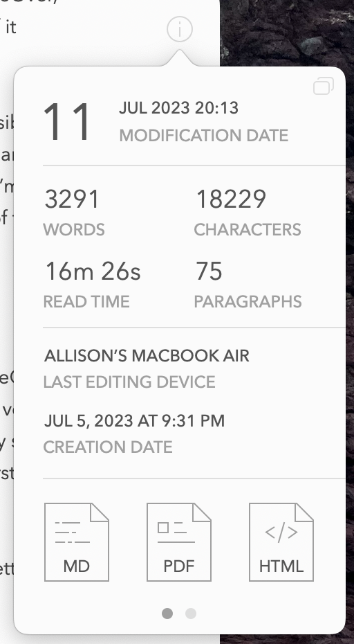
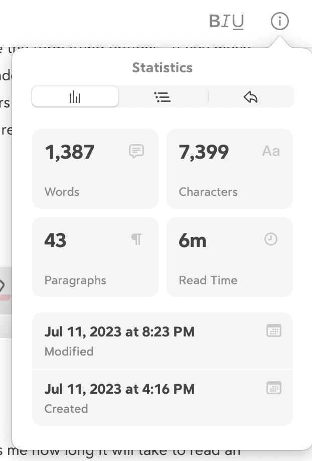
In my usual method of poking things to see what they do, I figured out that if you poke one of these statistics, like read time, it keeps the read time in a little box at the bottom of the window next to the formatting bar. I think it’s probably a really bad idea to constantly be watching these stats as you write, but I do like having instant access to the information.
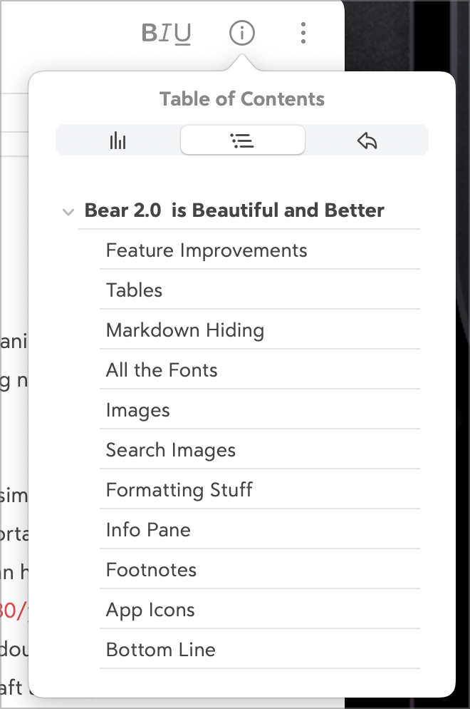
The info panel in the new version of Bear has two new tabs. If you write with headings as I’ve described, you get a sweet table of contents. I say sweet, because not only does it show you each of your headings, you can click on a heading and jump right to it in your document. An interactive table of contents can really help when working on a long-form document.
As a reminder, one of the really good reasons to use headings as a semantic element for your text is that this is how our screen reader friends can more easily navigate a web page. Just making the text big and bold doesn’t help them navigate at all.
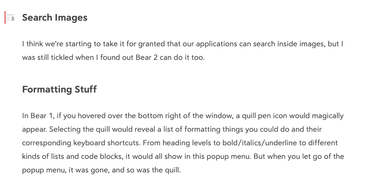
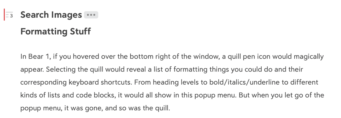
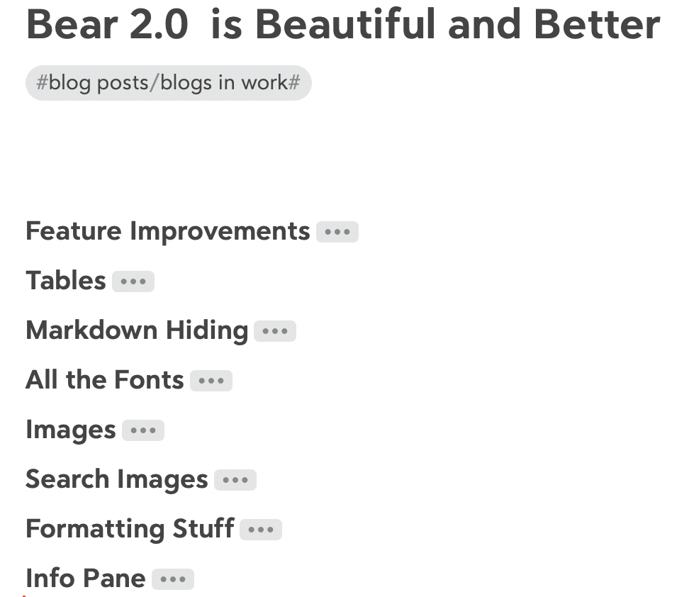
Speaking of headings, Bear 2 lets you fold up heading sections so it’s easier to scroll through your document. As an example, if I click on the heading for Search Images in this article, I can see the Heading Level 3 icon, and a right-click on that lets me choose to fold it up.
When I choose to fold this heading, it shows three dots to the right so I know that’s a folded section. I can tap the 3 dots and it folds back open. You can also choose to fold up all sections which can make it super efficient to jump to one section and get to work.
The one thing I discovered the hard way is that if you export the Markdown text while any sections are folded up, you’ll get some Markdown glop for that section in the export.
Footnotes
If you’re a serious writer, you can now add Footnotes in Bear 2. It’s super easy. Set your cursor where you want the footnote to be, click the 3-dot menu in the formatting bar at the bottom of the Bear window, and select Footnote. You’ll see the Markdown syntax for a footnote which is pair of square brackets enclosing a caret symbol and the number for the footnote. At the same time it inserts that footnote annotation, it puts the same annotation at the bottom of your Bear note with placeholder text that says “footnote text”.
I’d never done a footnote on a web page before, so I tested it, and sure enough, it works!

App Icons
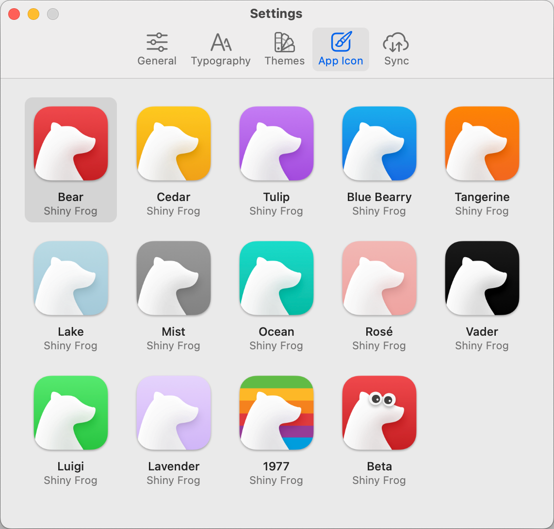
Along with people caring about fonts and themes, people seem to really like changing their app icons. Bear 2 comes with 15 different options – one of which is even an adorable rainbow bear.
Bottom Line
The bottom line is that the upgrade to Bear 2 adds some really useful capabilities (and I haven’t even told you about all of them!) They’ve managed to take a clean and elegant interface and made it even cleaner, more elegant, and easier to use. The only caution I would give you on upgrading to Bear 2.0 is that you need to update all of your devices to the new version. Notes created or edited in Bear 1 will not sync to Bear 2 devices, leaving that device will be kind of frozen in time.
If you want to get a feel for the playfulness and beauty that is Bear, go over to bear.app and watch the delightful line art video they posted on the home page. It will bring you joy whether or not you decide to try the free or paid version of Bear. It’s gratifying to see that the money I’ve spent on my annual subscription is going towards all the great new features.
