On Tuesday I was delighted to hear from many Internet and real-life friends that Apple has added pivot tables to their Numbers app. It’s a well-known fact that I am wild about pivot tables.
I realize, though, that this opening statement absolutely requires an immediate pause to explain first the problem to be solved, then an explanation of what pivot tables are and how they solve the problem, and then finally we can explore pivot tables in Numbers.
The Problem to Be Solved – Too Much Data
The problem to be solved, in its simplest form, is that you have a giant pile of data and you want to get information out of it.
Perhaps you’re a system admin at a university and have a 3000 line spreadsheet with user IDs, class names, instructors, and testing requirements and you need to condense this down to some actionable information.
Maybe you’re the manager of a large city’s intramural sports teams and you’ve got detailed data about the players, the sports they’re playing, the field names, and the coaches and you need situational awareness in case a storm is coming through town on how to contact people efficiently.
Maybe you’ve been doing freelance work and you’ve downloaded all of your income and expense and you want to figure out where your income is coming from by category.
Maybe you downloaded your health data for all your exercise and you want to obsess over it but you need to see it in nice piles by type of exercise with total calories burned.
Or maybe you just had solar panels installed and the Sense Solar you added to your electrical panel has given you a 1208-line long comma-separated value (CSV) file of your solar power generation and your power consumption during the same time period. You’d like to understand how much each type of device the Sense identified used in energy over the last three months, and whether you collected enough energy from the sun to compensate for your usage.
All of these problems have lots of data in lots of columns and rows and it’s very hard to get real information out of that data. You can use filters and manual subtotals to try to get information out of this data, but it’s tedious and you can’t have different views of the data at the same time. When you get an update to your data, you have to entirely recreate all of your filtering.
Our Hero – the Mighty Pivot Table
This is where pivot tables save the day. Pito Salas, working at the Lotus Corporation in the 1980s noted that spreadsheets have patterns of data. A tool that could help the user recognize these patterns would help to build advanced data models quickly. His work was included with Lotus Improv, released in 1991 on the NeXT platform and with it users could define and store sets of categories, then change views by dragging category names with the mouse. (source: https://en.wikipedia.org/wiki/Pivot\_table)
Since then pivot tables have been incorporated into Excel, Libre Office, Open Office, and Google Sheets. Pivot tables today pretty closely match the vision Mr. Salas had over 40 years ago and they are an easy way to organize all that data into actionable information, simply by dragging and dropping category names with a mouse.
I say that it’s easy, and it really and truly is easy, but it’s weird so it often intimidates people. I promise it’s easy and maybe by explaining it through Numbers and an example I can convince you to at least give it a try next time you have a lot of data to work with.
I went back through the archives and found the first time I ever talked about pivot tables on the NosillaCast was on show #25 in January of 2006. In that episode, I was talking about trying to get pivot tables to work in Star Office from Sun!
Spoiler
Now let’s talk about pivot tables in Numbers. Spoiler: pivot tables in Numbers are fantastic. If you’ve used pivot tables in other spreadsheet software, you’ll be able to figure out how to use them in Numbers quite easily. For the purposes of this article, I’m going to assume you’ve never used pivot tables before, or you use them so infrequently that learning how to use them from scratch in Numbers would be helpful.
I’m also really pleased to say that there is feature parity between Mac and iPad, and even iPhone. I’ve been doing my testing while going back and forth between the Mac and iPad and it’s been really easy and intuitive to work on both platforms. That’s in huge contrast to Excel on the iPad. I’m sorry to use such harsh language, but Excel on the iPad is just darn poopy. It’s extremely limited in capability and so of course it does not have pivot tables at all.
Another spoiler, I’ve had enough fun using pivot tables in Numbers this week that I might just finally switch over to Numbers from Excel. I’ve tried Numbers many times, but the interface is just weird enough that I’ve always abandoned it. Using Numbers with pivot tables may have turned me though. No promises but I’m going to give it a shot.
Now that I’ve spoiled the story, I’d like to teach you to create pivot tables of your own.
Basics of Pivot Table Use
There are a few things you need to know before you can create a pivot table. First, you need a giant pile of data. You also need every column in your data set to have a title. If any columns don’t have a title, the pivot table won’t include that column of data or anything to the right of it.
To start a pivot table in any of these spreadsheet applications I’ve tested, you click on any old cell in the spreadsheet that has data in it, and then ask for a pivot table from the menus. In modern spreadsheet applications, you’ll get a new tab in your document.
From here you’re going to do some simple drag and drop to make the table give you the information you desire.
Describing how to make the pivot table do what you want is far clumsier than actually doing it. I’ve tried four times to come up with a non-clumsy way to describe it in a generic sense and failed all four times. I’m going to switch to a real-life example and hopefully that will allow me to explain it without just making your head spin.
As you follow along, I want you to remember one thing. The trick of pivot tables is to play with them. It’s super easy to drag and drop the fields around and you’ll get ridiculous results, but you can just drag the fields back out, or delete the whole pivot table sheet and start over with zero loss of data. Pivot tables are just a view into your real data so you can’t break anything.
I said that you’ll create ridiculous pivot tables at first, but there’s actually value to those stumbles. Sometimes you end up with the pivot table that you need, rather than the pivot table you meant to make. Remember, before you start, you don’t understand your data and the pivot table’s reason for being is to reveal that understanding.
Real-Life Example – Sense Solar Data
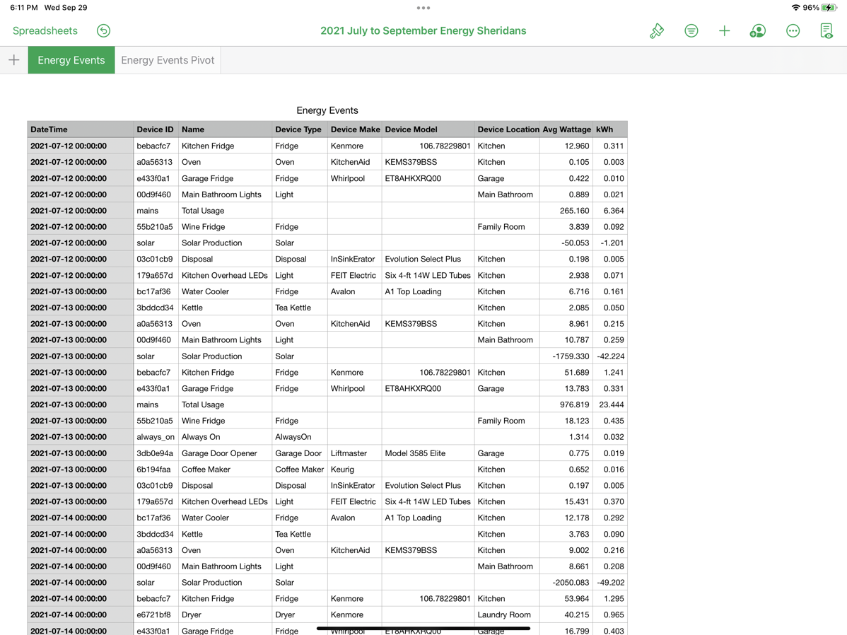
The example I’m going to use to explain pivot tables in Numbers is our electrical energy usage and solar energy production. We just had solar put in, and so of course we’re obsessed with the data. On Jamie Cox’s recommendation, we bought a Sense Solar, which is a device that collects and analyzes our electrical energy usage, and also collects our solar production. Over time the Sense learns what our different devices are by using their energy waveform profiles, and Steve’s been actively naming them as the Sense identifies them. Sense will say, “Hey, I found something, might be a refrigerator” and Steve will identify it as the Kitchen Fridge.
As you can imagine, we’re enjoying the heck out of all of this data and we want to analyze it over time. We especially want to track whether our total energy usage is less than our total solar production over time. Sure the electric company will tell us, but they’re three months behind getting started doing it so we want to look at it ourselves. This is what happens when nerds marry.
The Sense web app has a button to download a comma-separated value (CSV) file of all of our data for the year. So far that’s just July, August, and most of September, but it’s still a lot of data. It’s a lot of data because there are multiple lines for each day of the month for each of the different devices for which it recorded data. For example, on July 12th, it reported the kWh of energy usage of the kitchen fridge, the oven, the garbage disposal, the bathroom lights, and more.
The data also has a twist which will be a perfect thing to explain a feature of pivot tables. Not only does this one CSV file have the energy usage of every single device it knows about, the same file has buried in it subtotals for the days and the solar power generated for the day.
For example, scanning down a column of names it will say Main Bathroom Lights, Solar Production, Kitchen Fridge, Garage Fridge, Total Usage, Wine Fridge. All of the Solar Production numbers are negative, which will really mess up the pivot table, and the Total Usage will double the usage. But don’t worry your pretty little head about that, pivot tables can solve this very easily.
There are a lot of columns in our energy data that I’m not going to use. I only care about three columns. The date, the name of the device using the energy, and the kWh for the device on that date. My goal is to be able to see in one tidy table each month’s total energy usage and solar power produced.
Creating the Pivot Table in Numbers
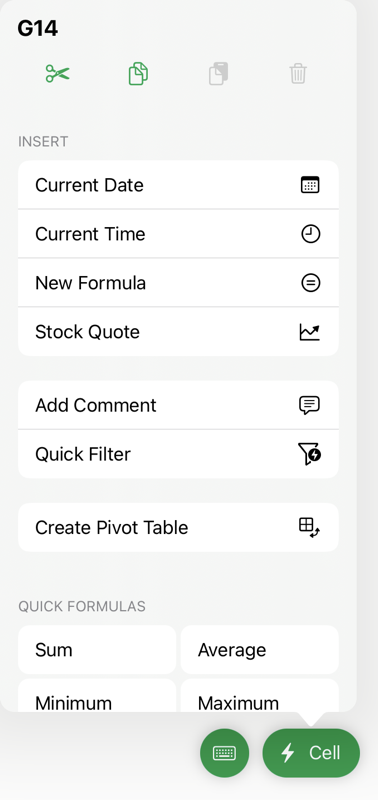
On the iPad, if I select any cell in my Numbers spreadsheet, a bright green “Cell” button will appear at the bottom with a very exciting lightning bolt next to it. It’s just begging to be clicked. You’ll be rewarded if you do because among other things revealed, you’ll find Create Pivot Table. Would you believe this works on the iPhone too? On macOS, selecting a cell adds a new menu option in the toolbar to add a pivot table.
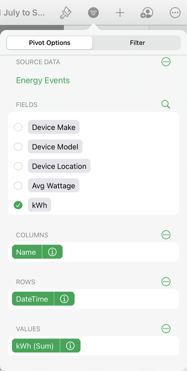
We’re now faced with a blank pivot table, but to the right are Pivot Options. Here we have a list of the column headings from our source data and they are now options to use as fields. In my example, I can see the DateTime field, the Name of the device that consumed energy, and the column for kWh. I’ll be ignoring everything else.
At this point, all we have to do is drag the fields we care about to build a table – dragging to columns, rows, and then the values in the cells. For some reason rows vs. columns is often hard to keep straight (at least my family has trouble with this when playing the card game “Golf”), so Numbers provides you with a handy little graphic to show you which one is which.
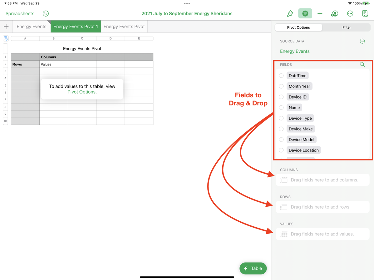
My plan is to drag the dates to be the rows, the names to be the columns and then the kWh to be the values. This should give me a pivot table with the dates down the left, the names of the devices consuming energy across the top, and the kWh each device consumed as the values in the table by date. The pivot table will also create a total column on the right, so I’ll be able to see the total energy consumed by day.
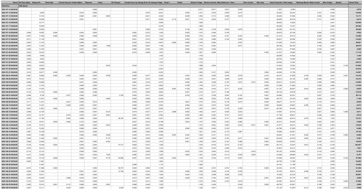
While technically this did work exactly as I described, the resultant pivot table is awful. Now I have 25 columns of devices, including those pesky “Total Usage” and “Solar Production” columns. Remember that the values for Solar Production in kWh are in negative values and Total Usage is doubling all the energy consumed, so this is a hot mess! The whole idea was to turn data into information but I’ll be darned if I can draw any conclusions from this pivot table.
Remember that I said you have to play with pivot tables until you get the information you need. Even though it did exactly what I told it to do, it wasn’t at all what I expected.
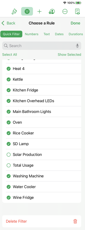
Before we abandon this pivot table, let me explain how we would fix the problem of the data set including those two columns for Solar Production and Total Usage from our pivot table. In the upper right of the toolbar when you have the pivot table selected, you’ll see a typical filter icon – a green circle with descending width white lines in it. This brings up not just the pivot options we saw when we created the pivot table, but there’s also a filter tab.
From here we can choose which of the fields we’d like to filter, so I’ll choose Names, which will be our column headings. This reveals a list of all the column headings such as Kitchen Fridge and Bathroom Lights, but also Solar Production and Total Usage. I can simply uncheck those two items with the handy dandy radio buttons and boom, both columns have disappeared from the table. But much more importantly, it’s also not including their values in the total calculation on the right side of my pivot table.
At this point, the pivot table is trying its little heart out to please me but it’s not meeting the mark. I can’t look at this giant array of numbers and glean much knowledge. When I created the same pivot table in Excel, I added some conditional formatting so that I could define an energy usage value above which I’d find a device interesting. That highlighted just some values in red. Numbers does have conditional formatting but not in pivot tables though so that was a little bit of a bummer. It wasn’t that helpful even in Excel, because there’s still too much data here.
Not only are all these columns just a jumble of information, the pivot table is 82 lines long because every day has its own row. It’s better than the 1208 rows I started with in the original data, but I’d really rather just see the months rather than the days. In case you’re wondering, I looked back at the Sense web app if I could get it by month instead of by day and that wasn’t an option. Luckily a pivot table should be able to easily show it to me by month.
There’s Always One Pesky Column
I’d like to pretend that getting this to a reasonable final pivot table view was a walk in the park, but instead, I’m going to tell you the reality of working with spreadsheets. Invariably one column of data won’t be formatted correctly so it doesn’t play nice and it takes you ages to figure out why it has its panties in a bunch. The problematic column of data is almost always a date or time. All spreadsheet applications stink at dates and times.
I said that our energy data came in with the date in the left column. I lied. It came in with the date and time. So instead of “2021-07-12”, it had “2021-07-12 00:00:00”. That was the first problem, and the second problem was that while it looked like a date and time, it was actually a text string. Spreadsheets recognize text strings that look like dates, but that doesn’t make them real dates.
Now, why do we care about that? Because in order to have our pivot table recognize that these are years and months for a nice subtotal by month, we need the data to be a real date.
This data set from Sense had the same problem in Excel and in Numbers. I worked on this for a while in Excel where I’m a lot more comfortable and after quite a bit of work I figured out how to fix the format, but the same solution didn’t work in Numbers. After noodling it on my own for quite a while I threw out a call for help in our Slack community at podfeet.com/slack looking for Numbers nerds. Luckily Richard Piazza answered the call and helped me figure it out.
Normally when a column is pesky like this, I add another column and then do some spreadsheet fu on it, like tell it to give me the left 7 characters. That would turn “2021-07-12 00:00:00” into “2021-07”. I was able to do that with my data, but the pivot table still didn’t see it as a date.
Once Richard saw my file he pointed out that I didn’t have a real date. He told me about a function called DATEVALUE that turns a text version of a date into a real date. That meant all I needed to do was add a column and to the right of the original DateTime column. In this next column, I could put DATEVALUE(A2). This changed cell A2 to a real date, but it was still formatted as a full date and time.
A quick trip to the format menu and I was now able to set the format to just show year and month. The next task was to fill that calculation all the way down so I’d have a full column of real dates. I know how to fill down in Excel, but for the life of me I couldn’t figure it out in Numbers. I was uninterested in dragging the fill handles in Numbers down 1208 rows. I asked Richard for help.
The best thing Richard did was teach me how to fish, instead of fishing for me. Instead of telling me the answer, he told me how to find the help menu in Numbers on iPad OS – it’s hidden in the three dots inside a circle icon in the upper right of the screen. Before sending me to the help menu, Richard verified that the trick to fill down was in help.
If you want to know how to do it, it’s command-\ to get the little grab handles, and then command-down arrow to fill all the way to the bottom. Once you’ve filled down, command-up arrow takes you back to the top to get back to work.
I know this was a big side story that’s supposed to be about pivot tables, but I’m telling you, something like this happens every time I make a pivot table so I figured it was better to walk you through this example than pretend it never happens.
After entitling my new, shiny column “Month Year”, I deleted the original pivot table and started over. I could have modified the original one but I find it’s easier to think with a blank slate.
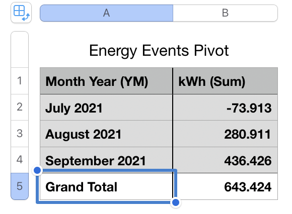
As soon as I dragged month into the rows, and kWh into the data box, the pivot table created three rows, one for each month of data and a column for the total kWh for the month! Finally, I’ve got a tiny pivot table that gives me the information on energy consumption.
But wait, why is the total of one of the months negative? Oops, I guess I forgot I have to filter out Solar Production and Total Usage again since I deleted the table where we fixed that.
Formatting
The data that came from the Sense was out to three significant digits for the energy consumed, which makes sense in the detail view because some devices sip energy, but it was just distracting in my high-level pivot table. In every pivot table function in the various spreadsheet programs I’ve used, you have to select all of the data cells by tapping and dragging and then go to the Format tab and change the Number format to 0 decimals. Tedious way to do it but I don’t know of another way. Maybe one of you knows a better method?
But What About Solar Production?
As I looked at my nice, simple pivot table, I realized it only told half the story. I eliminated the Solar Production so all this shows me is our consumption. It would be cool if I could get that data in the same pivot table, but since the Solar Production data is all intermingled I couldn’t figure out how to do it separately, but I did get something pretty workable.
I figured out that you can copy a pivot table in Numbers, simply by selecting the little pivot table symbol in the upper left of a selected table and then hit copy. I pasted this duplicate to the right of the original. Now I only had to go into the Name filter, and instead of selecting all but Solar Production (and Total Usage), I hit deselect all and selected only Solar Production.
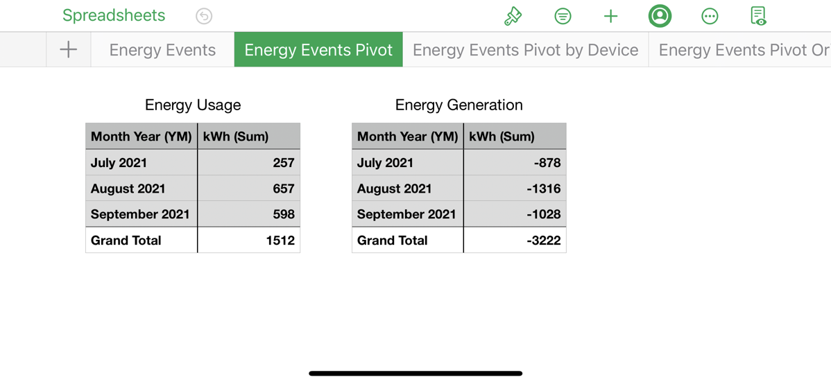
That gave me a table just like the consumption table but for Solar Production. Now I can see that over the first three months of our solar panels and data collection, we’ve generated more than double the amount of energy we consumed. I know July through September are some of the highest energy production months we’ll get, and the sun will start being lower in the sky and shine less often, but getting double the solar generation with two electric vehicles eating up power is still looking pretty awesome.
And THAT’S what this is about – I have turned this 1208 line spreadsheet into knowledge I didn’t have before.
And You’ll Keep Playing
Once you get a pivot table doing what you want, you’ll start thinking of what else you can do and you’ll start making more pivot tables or modifying the one you originally created.
I looked at my simple table and wondered what it would look like if instead of having the month as the row headings, what if they were the column headings? Then I thought maybe I could put the names of the devices back in as the rows.
This gave me a slightly more dense table but it’s also very interesting. I’ve still only got three columns of energy data for the three months plus the grand total, but the rows are each of our devices. I can see for example that the EV charger accounts for 292 out of the total 1512kWh we consumed in three months.
If I wanted to get fancy, I could change all of these values into percentages of the rows or columns, so I wouldn’t have to calculate to know that the EVs account for 19% of our energy consumption.
I only bring up this last pivot table to warn you that you might be drawn into my madness if you start down this path.
Refreshing Pivot Tables
Your reward for paying attention this long is that you’re going to learn the most important thing to know about pivot tables. The people who drifted off to sleep earlier will miss this part and they’ll be sorry later.
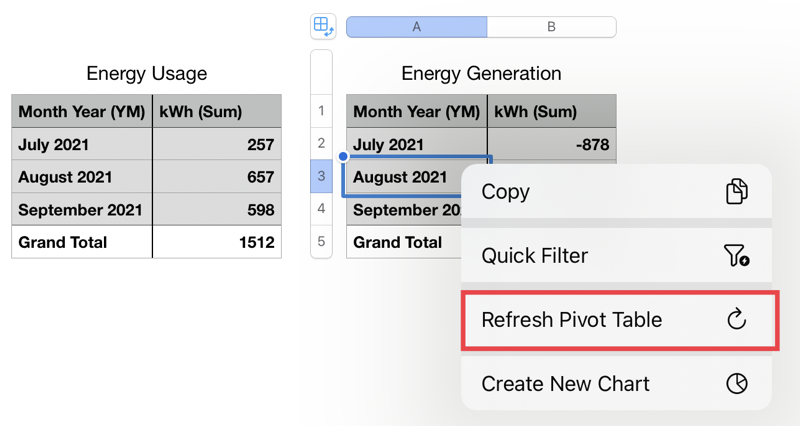
Pivot tables do not refresh themselves when the data changes. Let me repeat this another way to make sure you heard me. You have to manually refresh your pivot tables if you want them to reflect the most recent data.
On iOS in Numbers, tap on any cell in the table, then tap that exciting lightning bolt Cell button and you’ll see Refresh Pivot Table. On the Mac, either go to the Organize menu and pull down to Refresh Pivot Table, or just right-click in any cell and you’ll have access to refresh right there.
Aren’t you glad you stayed awake for that part?
If for some reason you want to maintain a copy of the pivot table to freeze the data in time, you can create a snapshot. I’ve never seen this in any other spreadsheet app (but I may have just missed it).
Simply select the little pivot table icon in the upper left of your selected pivot table and then tap on the exciting, green, lightning bolt Table button in the bottom right and you’ll see an option to Copy Snapshot. You can paste this into a new sheet and it’s just a dumb table now.
Bottom Line
Would you believe that I’ve only scraped the surface of what you can do with pivot tables? This top surface is what I do most often with pivot tables, and as you can tell, this excites me very much. I am thrilled about pivot tables in Numbers and I want to thank all of the people who told me about them when the announcement came out. And a special last shout out to Richard Piazza for helping me with that pesky date formatting.
