
I’m pretty sure I wrote an article a while ago about why it sometimes takes me so long to write the blog posts that serve as companion content to the NosillaCast podcast. I’ve got another great example to tell you about.
This week wrote a tiny tip about my discovery that you can delete the Audio Workouts from the Apple Watch Workout app. It’s a very short article – only 623 words. I’ve been known to write articles in the thousands of words. And yet, it took me a very long time to publish it. Why? Because of the images.
If I’d just put my 623 words down, you would have absolutely understood exactly what I was explaining. But I couldn’t resist making it look good for you.
Every image in the article is a screenshot of an Apple Watch screen. It’s super easy to take screenshots – you simply hold down the side button and the Digital Crown at the same time. It will flash the screen showing it worked, and in a short bit of time, the screenshot will show up in your Photos Library. If pressing those two buttons doesn’t work for you, open up the Watch app on your iPhone, go into General, and very close to the bottom you’ll see a toggle you can turn on to Enable screenshots.
I took a grand total of four screenshots to illustrate the annoyance of Audio Workouts, how to delete it, and how to put it back. Easy peasy.

I waited for the screenshots to sync over to my Mac so I could grab all of them and export them to the Finder, with a plan to pull them into MarsEdit (my blogging application from redsweater.com/…) to fancy up the blog post. But as I looked at them, I realized how dreadfully boring they looked. Tiny rectangles only slightly taller than they are wide are dull and uninteresting.
I have a fabulous iOS app called Popframe that I use to add pizazz to my screenshots of the iPhone that I told you a little bit ago, but it doesn’t have frames for the Apple Watch. I went out hunting on the googles to find a solution. It was actually harder than you think to search for this because it’s difficult to exclude all of the sites trying to tell you how to take the screenshot itself.

Finally, I found a blog post by a gentleman named Rafael Zeier talking about how he created a Shortcut to do it, and then turned it into a free app in the App Store called Watchshot. It runs on the iPhone, iPad, and on Apple Silicon Macs.
Some of you out there are more alert than I am. In the heat of the moment of discovery I had this vague sense in the back of my mind that Watchshot looked familiar. It wasn’t actually until I started writing up this article and went searching for Rafael’s blog post that I stumbled across another blog post. The title of this second article is Add Custom Watch and Band Frames to Your Apple Watch Screenshots with Watchshot Screenshots and the author is … me.
If I’d remembered that I already knew about Watchshot, the 623-word, 4-image blog post would have gotten started a bit faster but I still found ways to make it take a long time.
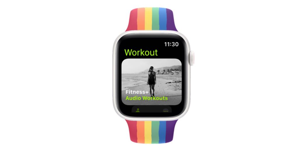
In Watchshot, you get to choose the model of watch and the band. I chose the Pride band because I’m an ally. Watchshot does’t let you batch a bunch of screenshots, you have to open each screenshot individually from Apple Photos, add the frame and band, and then export them back to Photos.
Now I had to export the newly-framed versions to the Finder. Just in case something went wrong, I made a subfolder for the raw screenshots, and another one for the ones with bands.
I dragged the first banded image into MarsEdit, and to my surprise, it was huge. The original images were under 400 pixels on a side, but the new ones were square and 1716 pixels! That’s not a big deal, because as I drag images into MarsEdit it gives me a spot to scale the images down. I scaled this first one down to 300 pixels wide. It looked gorgeous.

Since this was such a short post, I wasn’t going to be able to sprinkle the remaining 3 watch images throughout the text. I needed to put them in a horizontal row side-by-side. The wonderful Helma from the Netherlands taught me about grouping images in HTML to do this so thank her every time you see more than one image in a row.
I had a problem now though. Three 300 pixel wide images plus their padding was not going to fit in my theme which is only 800 pixels wide. Even though most people probably view on mobile devices which would slot the images one above the other, I didn’t want it to look really silly with two images on one row and the third dangling below them.
Watchshot does a beautiful job of creating this square image, but it also adds a lot of white space on either side of the watch to make a square image. I figured all I needed to do was get rid of some of the white space.
I opened one of the banded images (which were still 1716 pixels wide) in Shottr, and using the crop tool I selected a crop area that still gave me some white space but made it a pretty narrow width. I slid it left right to make sure it looked good. I was pleased when I noticed that the crop I’d hand drawn was exactly 1024×1716.

But I didn’t actually crop the image. You see, if I did all of the crops by hand like this, there would be minute differences from image to image from me just eyeballing it, right? That would destroy our OCD friends, and we can’t have that.
It was time to break out Retrobatch Pro, the app I told you about in April that lets you automate manipulating images. Once you get the hang of Retrobatch Pro, even if you don’t use it daily, it’s super easy to use the drag-and-drop method of building little workflows to solve a problem. It was so easy I didn’t even bother to save the workflow because I knew I could recreate it in just a few minutes.
I dragged in a Read Individual Files block, then did a search for Crop because I was too lazy to look for it. The crop block defaults to showing you width and height in percentages. I wanted to leave the height alone at 100% but I changed the width value to 1024 and using the dropdown, changed the units from percent to pixels. I threw in a Write node to write the pictures out to a folder I created called Cropped. I dragged the four images (because why not do them all) onto the Read Individual Files block and hit play.

In the blink of an eye, I had all of my screenshots cropped to the same width appropriate for my blog post. Looking back, I could have saved myself some storage and bandwidth by also resizing them to the width I wanted instead of making MarsEdit do the heavy lift but I had already spent an awful lot of time messing around with this!
The best part of all this is that I’ve actually skipped some steps. At one point I got it in my head that I needed to remove the alpha channel to make the images narrower, but all that did was keep the same square size but they were see-through.
I hope you appreciate now how pretty my little grouped screenshots are with their fancy pride bands and aluminum watch frames. And the fact that I spent 1372 words telling you how I created a 623-word blog post.
I love it.
Thanks for sharing how you put it all together