Verizon LTE rocks but I can’t use it. Thoughts on how school districts could evaluate the idea of iPads for books in our schools. Professor Albert reviews Lumin from iTunes. Lens cap holders and more from >photojojo.com. Art Text 2 review from Belight Software and in the Mac App Store. Todd McCann asks in Dumb Question Corner whether iLife ’11 actually comes with Lion or not. Another interview from CSUN Persons With Disabilities Expo – LookTell Recognizer in the iTunes store for $9.99. in Chit Chat Across the Pond Bart reviews the Twitter client Osfoora in the Mac App Store.

Hi this is Allison Sheridan of the NosillaCast Mac Podcast, hosted at Podfeet.com, a technology geek podcast with an EVER so slight Macintosh bias. Today is Sunday March 25th, 2012 and this is show number 359.
New iPad – More Impressions
So I’ve gotten to play with the new iPad for about a week now, and I thought I’d bring you up to date on some issues I’ve been having with it. You may recall that I returned one of my three original iPads, because the battery would only charge to 75% and the home button wasn’t seated properly. I got the new NEW iPad home and guess what? It would only charge to 75%. That got me wondering whether the charger might be different on the new iPad than the iPad 1 charger I was using, but I looked at them and they were both 10W. After consulting with my in-home Electrical Engineer Steve, I confirmed that 10 watts is 10 watts.
Next I consulted the Twitterverse, and on Mark Sheppard’s advice, I discharged the iPad completely and then charged it over night. That night it got to 92%. The next night I discharged it completely again, but this time charged it on the new iPad charger and it got to 100%. The only thing left was to charge it on the old charger – and it again reached 100%. So evidently there is something slightly amiss with the iPad batteries (in some cases at least), but now mine appears to be working well. I should also mention that on the days it said it had charged to 75% it was discharging at a ludicrous rate – dropping to 20% in about 3 hours.
When I got the new iPad I was thrilled with the display, as I told Adam Christianson when he had me on the Maccast, I would have bought the new iPad JUST for that. However. an odd thing is happening – if I show people the new iPad next to the iPad 2, they cannot tell the difference! I even took a very detailed photo with the new iPad which looked GORGEOUS on the new screen, and then put it on the old screen and without minutes of careful consideration it was hard to tell which one was better. The main place I notice the high res display is on text, specifically things like the keyboard – it really looks better there, or on really fine text, like the old style thin font the WordPress editor uses.
The next coolest thing about the new iPad is 4G LTE on Verizon, but let’s talk about Verizon customer service first and back into it.
Verizon Customer Service
![]() Remember when Diane and I were home being perplexed by the decisions FedEx was making on our behalf? I called a local Verizon store to see if they had any new iPad’s in stock and a lovely woman answered and told me that they were out, but that they were pretty sure they were going to get some more within the hour, and asked did I want her to call me back, and she actually DID call me back when they came in? There’s even more good news on Verizon customer service.
Remember when Diane and I were home being perplexed by the decisions FedEx was making on our behalf? I called a local Verizon store to see if they had any new iPad’s in stock and a lovely woman answered and told me that they were out, but that they were pretty sure they were going to get some more within the hour, and asked did I want her to call me back, and she actually DID call me back when they came in? There’s even more good news on Verizon customer service.
So here I was with my shiny new iPad with wicked fast 4G. I did some timing tests, one test in my house was 16mbps down, 24 up! to put that in perspective, I pay over $100 per month to get 15 down and 2 up on my cable modem service. So on Sunday I experimented to see if that was really as fast as they said, so I turned on tethering on the iPad, hooked the Mac up via wifi to the iPad, and dang, the 35MB podcast went up to Libsyn in 33 seconds!!! Amazing, that’s more like 5 minutes on my cable modem.
I made one error at that point, I turned off the tethering, but I didn’t turn wifi back on with the iPad, so I was on 4G for the rest of the evening and most of Monday. Luckily I didn’t stream or download any movies, I didn’t update any apps, I just did twitter and email on it, plus a little Downcast video podcast watching (with Downcast set to use wifi only). By the end of the day Monday, the cellular usage on the iPad said that I’d used 400MB of my 2GB data plan already! Yikes! That sure didn’t sound right, so for the next day I kept cellular data off, and watched the usage, and darn it if it didn’t go up by 39 MB when it was turned off.
I mentioned my consternation on this and @VZWsupport answered me and offered to help. While I appreciated the effort I really wanted to talk to a human to walk through all the scenarios I’d tested. @VZWsupport insisted they could help me instead of giving me the phone number I asked them for. it might have worked, but unfortunately they have MANY people answering that twitter account (you can tell because they end the tweet with / and then their initials). Because it was several people, one would ask me a question, another would ask me a new question not realizing I’d answered the first. It was a mess. Finally I gave up and began the hunt on the VZW site to try and find the number. Took me about 10 minutes but I finally found it.
My new little friend Amanda answered my call, and recorded all of my experiments and then went off to consult with the technical folks. She went back and forth between us a few times and finally came back sadly to tell me that the technical folks were going through a system upgrade and couldn’t analyze my usage to try and figure out what was going on! Then she asked me if it would be ok if she simply erased all my usage for the month so far and reset me to zero? Yes please, I replied.
All day Thursday I kept cellular data off and it reported I’d used a grand total of 1.5 MB in that time. I know it should have stayed at zero and the scientist in me is bothered by that, but I can also live with it.
A LOT of people are being shocked by how much data they’re using with 4G, my poor friend Danny streamed a video during dinner in a restaurant to keep his toddler entertained, and managed to chew through a gigabyte in that hour! I read online that one of the problems with 4G is that they don’t compress the movies as much because they have that big fat pipe so you use WAY more data to watch the same movie on 4G as 3G.
I feel like I bought a Maserati, but if I take it out on the road I run out of gas in 3 miles. So sad not to be able to USE what I’ve got! I did play at Starbucks on Friday morning and even thought hey have free wifi, I thought I’d try out the tethering again on 4G but only do text stuff like Twitter, email and letting Summer distract me from writing up the shownotes. In over an hour of text I only used around 50MB of data so that wasn’t too bad. It of course never needed to be on 4G because 3G would have been fine for text anyway but it’s good to know that worked out without emptying my account for the month.
Oh one more thing on data usage. On iOS, you can go to General, Usage and then Celluar usage to view. But you can also go to Cellular data, View Account and log into Verizon/AT&T to see your usage. This is important because in many cases you get totally different numbers! Before the reset by Verizon, logging in there showed way MORE than the on-device usage showed, but now that it’s been reset, I’m seeing less usage when I log in than the on-device usage shows. Maybe there’s a lag on Verizon’s reporting and when I check later today it will show that I’ve chewed through a gigabyte. Sure hope not!
iBooks Author vs. Schools
A friend of mine is the president of the school board for her district and she and I got in a quite interesting dialog about what iBooks Author means to schools. When iBooks Author first came out, I explained how amped up I am about this, and how I really think Apple could change the world…again, with this. I haven’t changed my mind, but when I put myself in the head of a school district board, it made me think of some more in depth questions. My friend was about to go to a planning session for their 5 year tech plan, so I gave her some advice on how I would approach the subject.
 A lot of people have immediately dismissed the idea of iBooks for schools because of the price of the iPad itself. I’m worried that school districts will not be able to see past that and not think about the big picture first. I’m a firm believer that the $500 price tag will sort itself out. And on top of that, I wouldn’t be surprised to see Apple come out with an education-only iPad. They have education-only Macintosh models, why not iPads. So let’s go on an act of faith that the cost of the iPad will work itself out.
I suggested rather than focusing on the technology, I’d recommend trying to picture where they wanted education to be in five years. Not things like “an iPad in every desk” but, rather try to picture the effects of technology changes. Engaged students, higher graduation rates, increased attention to the diversity of learning skills of students. Think about those with dyslexia, students with visual or hearing impairments, students who learn better through reading and also those who learn better. Tools can even the playing field and allow more students to participate and reach their full potential. Picture students with books in their hands that are always up to date. If Pluto isn’t a planet this week, boom, Pluto is gone from the book, or relegated to an explanation of why it doesn’t meet the definition of a planet. Instead of kids mocking their books for being out of date, the books will finally be able to keep up with the students.
Another thing I suggested they carefully consider is what a world where Apple controls our learning. I’m a big ol’ fanboy as you know, but do we trust Apple to be the sole provider of our educational system? Do we maybe want a world where even education has competition – perhaps Apple and Amazon? Would the simplicity and ease of having one provider be worth the risk? Maybe it would be, I’m not in a position to make these tradeoffs but I think the educators would be wise to consider that future nirvana of an Apple Logo on every book.
When we think about the $500 price tag, that gets interesting too. That sounds like an unachievable amount, but consider this. Text books cost on the order of $100-150 per book, and the schools tend to keep them for around 5 years. Some books do get destroyed faster than that, but since iPads will be far more destructible, let’s set that aside for a moment. So if books are say $125 on average, they last for five years, that’s $25/year per student. Apple has a commitment from the publishers to keep the prices to $15 or less for “most” books. So you’re saving $10/book/year/class. If a student has books for say 5 classes, that’s $50/year. Assuming they can keep their iPad in good shape for four years (which might be a stretch), that’s $200 savings for the book. This week Apple dropped the price of the iPad 2 by $100, so we’ve got a $400 device. I fully believe that Apple will come out with an education iPad, just as they have with the Macs for all these years, perhaps a special model but definitely special pricing. So let’s say Apple has an education iPad for $300, and we already established we’re saving $200 over four years, now we only have a gap of $100. That might just be achievable.
Another thing my school district president and I discussed was how you’d phase in iPads and iBooks. She was thinking that phasing in by subject might be best, but I wasn’t convinced. If you did that, you’d still have the cost of the other books for each student AND you’d have the full cost of the iPad. It might be easier to get used to it but it wouldn’t be very cost effective and you wouldn’t get the advantage for the kids of lighter backpacks by much. I thought perhaps by grade – say start with sophomores, so you got three years worth of use out of them (can’t give the freshman something cooler than the sophomores have right?)
If you have thoughts and opinions on how iPads will be changing education, whether it’s dangerous to trust Apple with this, or if you think this is going to be amazing, I’d sure like to hear from you.
Lumin Review by Professor Albert
Professor Albertʼs Review of the LUMIN IOS app for iPhone.
Hello Dis is Professor Albert vith a one minute review of an IOS app dat I love.
Now I am a very old man, and my eyes are not vurking dat vell. Ven I am out on a romantic dinner vith Elsa, I find dat many times I can not read da menu, and dat is not fun. DA solution
LUMIN, an IOS app for da iPhone by Mahboud Zapetian. Dat Dis app saves da day. Dis app uses da camera viewer on da iPhone to be a magnifying glass. So ven da print is very small like in da menus dere, I pull out my iPhone, turn it on, and magnify da menu. But even better dere is a flash light so you can magnify and light it up using da flash on the iPhone. OH! Now I am very romantic dining with Elsa and very tech savvy ven I take out my phone vith da LUMIN app. Dis app is only $1.99. Every iPhone user should load it in on dere phone. I love it.
Now a quick shout out to HUGO at the Patent office for BAD GERMAN ACCENTS. If you look in the da fine print dere, you vill see dat da patent for my BAD GERMAN ACCENT expires in 2017 not 2012. Maybe you should download da LUMIN app.
Well Professor, it sounds like a great app AND I’m glad to know that your license for your bad german accent actually doesn’t expire till 2017, that’s such a relief. I know Wayde will be VERY happy to hear that.
Photojojo
Problem: the Nikon D40 digital SLR camera does not have a tether for the lens cap. That means I’ve lost about 128 lens caps over the last 4 years since I got it. I buy them by the sleeve. I can remember each lens cap fondly by where I lost it – like the one I lost on a fake pirate ship off the coast of Cancun with our friends Mona and Dave. I think Steve’s jeans pockets have stolen at least 17 of them all by themselves. I’ve tried everything to keep track of them I could think of, including buying this lame tether. It was a piece of elastic that went around the lens, and then had a double-backed tape sticker thing that stuck to the lens cap. Yeah, that think broke in about 3 days.
But now I think I’ve found the solution – a simple little device by PhotoJoJo at photojojo.com. It’s a lens cap strap holder that you feed your camera strap through, and then gives you a place to pop on your lens cap just like you’re popping it onto a lens. You buy the holder based on the diameter of the lens cap – in my case the lens I use the most is the 72mm for my wide angle zoom.
Now this would be an exciting find if it simply allowed me to stop buying lens caps but at $15 it’s even an inexpensive miracle. But seriously, the best part was when it came in the mail. It had a GIANT yellow sticker on the package that said, “WARNING – BEWARE OF POTENTIAL STOWAWAYSAURUS. And sure enough, when I opened my package a tiny little dinosaur leapt out. Good thing they have that warning on the packaging.
Check out the Lens cap strap holder and LOTS of other cool camera gadgets at photojojo.com.
Art Text
A little over a year ago David Allen of Mac 20 Questions did a review of a product called Art Text. I didn’t really have a use for it back then so I didn’t ever try it out. This week I had a great use for it though, but let me set the stage for why.
As you may recall, Apple has started pulling podcasts from iTunes who’s artwork has imagery that they own. My wonderful artist, Ryan Sakamoto from ryansakamoto.com created my logo quite a few years ago (voluntarily and I loved it) and it included a laptop with the aurora image that comes with OSX. I was a little worried that might be a copyrighted image, so I asked Ryan to take it out. I pestered him over and over again with changes till I got it to something that was ok, but both Steve and I agreed that we didn’t love it the way we did Ryan’s original work, but we went ahead and deployed that logo to iTunes.
Then I was watching one of Knightwise’s videos, and he had this wicked cool intro with stuff flying all over and pictures of Nyana in it and I asked Steve if he could try to figure out a way to spice up the intro for our videos. This gave Steve an excuse to learn Motion, a companion tool for use with Final Cut Pro X. Steve discovered a whole bunch of editable themes to play with and started learning. He found one called Skyline that has dark grey, black and red accents and we both loved it! He had the irreplaceable podfeet come flying in, put podfeet.com in red, and NosillaCast Mac Podcast highlighted on top. It looks FANTASTIC.
So then we got to thinking…maybe this could be the new look for podfeet.com. Instead of torturing Ryan, I decided to see if I could find a vector based tool that would create scaleable imagery to make a header banner for the website. A while ago I had recommended LogoDesignStudio Lite to a friend of mine since it was free, but for the life of me I couldn’t get that thing to work right. I thought maybe the full, paid for version would solve my problem, but a quick look at the reviews on iTunes (very low scores) AND the $90 price turned me right off.
 I started hunting around and I found Art Text 2 from belightsoft.com. They had a free trial on their website, and if I liked it, the paid for version was only $20 through the Mac App Store. Oddly it’s $40 through their website so stick with the Mac App Store!
I downloaded and installed Art Text 2,and immediately I was able to start creating artwork without reading any instructions. When you first open Art Text 2 you get a white screen with the word Art Text in giant blue ltters in the middle. Along the bottom is a row of graphics representing your layers. Once you add a second layer this becomes obvious and you can simply drag them back and forth rather than that annoying “send to back” or “send backward” thing where you have to guess which layer is above which. On the bottom right you have a Set Size button that lets you define the size of the canvas, and you get an Export To button for exporting to either the clipboard, or a file in png, jpg, gif, tiff, pdf or eps.
On the right side of the screen are three tabs, Effects, Geometry and Styles. It defaults to Effects, so when you see the giant blue letters on screen when you first open Art Text 2, you see that the color is set to blue, but you can change it right there to a gradient, with up to three colors. You can change the intensity and the angle of the gradient, again right there on the first screen. Every program I’ve ever used seems to make gradients hard – I’m never sure which color I’m changing or how to control the angle once I do figure it out. On this same effects panel you can add stroke and change the width and also add a shadow/glow. On the shadow/glow you have a convenient slider to adjust the blur, and values for distance and angle as well. All of these controls right at your fingertips right when you want them is awesome.
Now let’s say you wanted to add some geometry. command-shift-L to add a new layer, or use the menu, or just his the plus on the layers panel. This time you get a big blue rounded rectangle. My brain said I should click on it, and sure enough a floating window popped up with a plethora of geometric shapes from which to choose. From within that floating window, I can change to text, icons, custom which lets you draw your own shapes, or Finder. I knew I was going to need the Finder option because I wanted to add podfeet to the header banner but the free version let me know I’d need to pay for the tool to get that feature. Fair enough.
I mentioned the three tabs on the right, tapping on the geometry tab allows you to modify shapes into trapezoids, arcs and all kinds of weird shapes. Once you’ve chosen one of these options, your shape gets sliders that allow you to modify the distortions you’ve applied. You can apply these same transformations to text too.
Styles is the third tab, which gives you beautiful buttons – shiny ones, shadowed ones, all kinds of beautiful effects. You can even select an icon from the floating window and then apply the effects to it. I’ve wanted something like this so many times – I’ve opened up Pixelmator and worked for HOURS to try and make a pretty button but always given up in dismal failure. With Art Text 2 I have them a click away now. You can even add images as textures to text and geometric objects – just for fun I made the podfeet be covered in flowers!
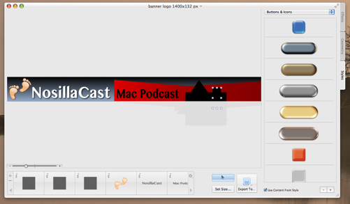
In real life use now, I grabbed a copy of my existing header on podfeet.com, and measured the size in pixels, and then created a blank canvas in Art Text 2 of the same size. I dropped in a rectangle, easily sized it to fill the screen, and made it a dark grey gradient going almost to black at the top. then I dropped in a couple of red skewed rectangles using the Geometry tab, and played with the gradient on them too, just making them darker on one side. I needed to zoom in on the connection between two of them, and my instinct was to pinch to zoom on my tackpad and sure enough Art Text 2 responded to my gestures. It let me scroll left to right with two fingers too. I used the Finder option to drop in the podfeet, resized easily, wrote NosillaCast Mac Podcast in two colors of the same font to match the intro video Steve had created. Added shadows and glow. And finally I dropped in some black shapes to simulate the skyline from the video too.
With the exception of some artistic tweaking by Steve and I later, the entire design took me under an hour. this was from no knowledge of the tool to useful artwork in ONE HOUR.
Art Text 2 at $20 in the Mac App Store is underpriced in my opinion, but don’t tell the folks at Belight Software. I will definitely use this tool over and over again, and not just for logo work. Later in the day I needed a black rectangle in gif format, and none of my other tools wanted to play nice with gifs, so I popped open Art Text 2 and boom I was done. I needed the Verizon Wireless logo for the shownotes, but it came in white text on a transparent background. Popped it into Art Text 2, dropped in a red backgraound (using the color picker to grab the RIGHT red from their website), dragged the red layer under the white text, hit set size and found the “fit all objects to margin 0” and in 30 seconds I had the logo as a png file.
If you think you ever might want to create any artwork, grab yourself a copy of Art Text 2. I put a link in the shownotes to buy Art Text 2 through my affiliate link so it’s easy to find. Oh and by the way, check out podfeet.com – the new logo is up, all the colors have been changed to match (for the most part, still doing some tweaking here and there) and I’m thrilled about it!
Dumb Question Corner – GarageBand ’09 vs ’11 in Lion
Todd McCann has a great Dumb Question Corner and it’s delivered in his wonderful style. Let’s hear what he has to say:
Hey Allison,
Sorry about all the noise. I’m recording inside the cab of my big rig and I’ve got a major case of Planes, Trains, and Automobiles going on outside. Anyway, hoping you can help me out with this dumb question. Way back in show #287, you went on an EVER SO SLIGHT rant about Flex Time in the new GarageBand 11. Sorry to bring that painful memory back up, but hey, I figure I don’t want to go through the same torment that you did. So here’s my situation.
I’m running Snow Leopard with GarageBand ’08 and I’m currently in the midst of a huge project. You see, I’ve got over 50 podcasts in the editing stage right now. Yes, I know what everyone says about not making any major changes to your workflow when you’re in the middle of a huge project. The problem is, I just upgraded The Evil Overlord’s machine to Lion and she’s now mocking me because her Mac is “cooler than mine.” And no, I’m not a mad scientist, The Evil Overlord is my wife and ex co-driver who willingly accepts her name. She’s called this because whoever wakes her up has to wrestle the bazooka from her grip. When my nephews are over, I make them go do it. LOL
Anywho, back to the cursed Flex Time. I know it’s a feature of iLife 11. Now here’s where I get as confused as a hillbilly at a physics convention. The Apple Web site says that iLife 11 is preinstalled on every new Mac with Lion. Yet when I upgraded The Evil Overlord machine from Snow Leopard to Lion, it installed iLife 09. So which is right? I’d really love to upgrade to Lion to shut The Evil Overlord up, but the last thing I want is to screw up all these podcasts. So, whatcha think?
Todd McCann of twitter.com/ToddMcCann & abouttruckingjobs.wordpress.com
EXCELLENT Dumb Question – because in real life I’ve been asked many times. The most simple answer is that they’re both right. To elaborate, if you buy a new machine, new actual hardware, it comes with Lion installed and iLife ’11. If you buy Lion, without buying any hardware at all, it doesn’t come with any flavor of iLife. not ’09, not ’11. This is a common confusion because it comes on the installer DVD (or used to back in the old days when we used to use DVDs Allister) but it doesn’t come with the installer for standalone Lion. The good news is that if you upgrade to Lion you can still use your installer disk from Snow Leopard to install iLife ’09.
You’re a brave man to upgrade in the middle of this project Todd, please make about 7 backups before you do it? And if you ever do get iLife ’11, there IS a way to avoid the dreaded flex time editor, but I still cause it to kick in on occasion. the trick is that if you’re going to click and drag across a region to edit in the GarageBand waveform, you HAVE to click below the centerline on the wave form. If you click above the line, be prepared to wait MINUTES for the darn flex time editor to analyze your waveform, and then MORE minutes when you click on undo to get it back. Like I said, I manage to avoid it most of the time, but as the live chatroom will tell you I still hit it from time to time and then you hear me using some non-girlscout safe words.
LookTell Recognizer
![]() Quite a while ago I told you guys about a neato app called Money Reader from a company called LookTell. MoneyReader lets you point your iPhone at a bill and it tells you the denomination. If you’re sighted this sounds silly but if you’re blind this is something completely impossible to do without assistance but now with MoneyTell it’s completely trivial. When I was at the CSUN Persons With Disabilities Expo I saw the LookTell folks and decided to check out what else they have going on. Let’s listen to that interview now.
Quite a while ago I told you guys about a neato app called Money Reader from a company called LookTell. MoneyReader lets you point your iPhone at a bill and it tells you the denomination. If you’re sighted this sounds silly but if you’re blind this is something completely impossible to do without assistance but now with MoneyTell it’s completely trivial. When I was at the CSUN Persons With Disabilities Expo I saw the LookTell folks and decided to check out what else they have going on. Let’s listen to that interview now.
=====insert interview===
I put a link in the shownotes to LookTell Recognizer in the iTunes store for $9.99.
Clarify
When I switched to fewer episodes in the feed using Feeder, Steve Harris helped me but I was afraid I’d forget how to do it so I used my trusty Clarify from BlueMangoLearning.com. Check it out in the Mac App Store
Chit Chat Across the Pond
Security Light
- (now patched) Java vulnerabilities on OS X continuing to be exploited in the wild. You really need to keep your Java up to date to be safe – this is massive problem for people on un-supported OSes like Leopard & Tiger. This is not hypothetical anymore. In this case the vulnerabilities are being used to target Tibetan activist groups, but anyone could be next (or collateral damage) –http://blog.intego.com/tibet-malware-takes-advantage-of-java-vulnerability-to-harvest-information-on-macs/
- A new variant of the Imuler Mac Trojan now masquerades as an image file – telling the Finder to show file extensions is a good defence against this kind of tomfoolery-http://blog.intego.com/new-version-of-imuler-trojan-horse-masquerades-as-image-files/
Security Medium – The Evolving Mac Malware Threat
For the past few months I’ve made a point of including a note in Security Light when ever Mac Malware takes a new an interesting turn. The trend is clear, Malware on the Mac is getting smarter and more dangerous at a worrying rate. The other big change is that these attacks have gone from proof of concept toys to real-world malware that is infecting hundreds of thousands of Macs. It’s hard to say exactly when we rounded the corner on the wisdom of running AV on your Mac, but I think we have, or if not, that we’re getting very close to it. My advice now is to run AV on your Mac.
It’s true that OS X 10.8 Mountain Lion’s Gate Keeper will make things are lot harder for the bad guys, but that probably won’t be enough to full stop Mac Malware. Assuming there are zero flaws in the implementation of the OS it would mean that, but there is of course no such thing as 100% bug-free code. Perhaps being diligent about updates combined with GateKeeper will be enough to keep safe, we shall see. Until Mountain Lion though, I think it would be very wise to run AV on your Mac, when Mountain Lion comes out we can take stock again.
Main Topic – Osfoora Review
It’s no secret that I’ve been having a very hard time of finding the perfect Twitter App for me. Everyone’s needs are different of course, and I know many people had found their perfect match years ago, but I’ve stumbled from dead project to dead project for years now.
I think I’ve finally found my perfect OS X Twitter Client – Osfoora!
The Good:
- native OS X app – so full cocoa goodness like spellcheck
- good Growl integration (this is where Twitterific fell flat on it’s face IMO)
- a very clean an elegant UI – no clutter and no garish colours, but all the features you expect from a modern client
- proper integration with the various image uploading services etc..
- Supports Tweet Marker – so you can take up where you left off on your other devices – an absolute MUST for someone like me with three computers and two iOS devices!
- Supports lists (not important to me, but critical to many)
- Good multi account support (important for people who have personal accounts and accounts for their work or podcast or what ever)
- Nice and easy to view conversations – just click on the text bubble icon next to every post that’s part of a conversation
- Does Spell check (this was off by default initially, but that has been fixed in an update) and auto-completion of usernames
- Nice account view so you can who tweeted at you (and an easy report spammer function in the account view which is sadly all to important these days)
- A very responsive developer (Said Marouf, he’s even a listener to the MRT)
The Bad:
- I did hit some initial bugs when using a network with WPAD/PAC/autoproxy web proxies – but I was able to work around that
- No support to search the tweets in your window yet – but the developer has it on his list for future versions
Minor Quibbles:
- No reply-all button on tweets, so you have to right-click to do that – would be nice to have that on the active tweet next to the reply button
- No keystroke to send a tweet – you have to click the button
- The icon is quite un-memorable and un-inspiring
Conclusions:
- Osfoora is well worth the money at just euro; 3.99 on the MAS
- This app is only at version 1.1 ATM – I can’t wait to watch it mature and improve from it’s very impressive starting point!
That’s going to wind this up for this week, many thanks to our sponsor for helping to pay the bills, Blue Mango Learning at bluemangolearning.com makers of ScreenSteps and Clarify. Don’t forget to send in your Dumb Questions, comments and suggestions by emailing me at [email protected], follow me on twitter at @podfeet. I contribute a fair amount over on Google Plus nowadays so just search for me by name if you want to circle me up. If you want to join in the fun of the live show, head on over to podfeet.com/live on Sunday nights at 5pm Pacific Time and join the friendly and enthusiastic NosillaCastaways. Thanks for listening, and stay subscribed.
Love your thoughts on the new iBooks textbook potential. I’m starting to see them rolling out, but California will need to adopt the Common Core Standards in order for this to really work here, I think. Right now, the language arts series we use in elementary school is a special California edition, and I don’t think the textbook companies are going to invest in creating separate text editions for states.
Now, for my students with visual impairments, I think the iOS devices have some fantastic potential–if you want to know more, I invite you to read my latest post on my blog, Attitudes are the REAL Disability. Allison, thanks so much for infusing your podcast with thoughts on issues like accessibility!
This episode reviewed some of my favorite apps, Lumin, Art Text, and Osfoora. Osfoora also has a very good iOS Twitter app, although I use Tweetbot on iOS. A couple of things about the Mac version. You can set CMD-Return to send a tweet in the advanced preferences. When you reply to a message with more than one recipient, the person you will be replying to will be shown in normal type and the others highlighted in blue, so if you want to do a reply all, you just start typing. if you want to reply only to the original person, you hit backspace once and the other names go away. Lastly, you were wondering about what Osfoora meant, I had read that it was Arabic for bird.
I found Apple, Verizon, and Vodafone (T-Mobile, Europe) all with the same info: there can be a substantial delay between data use and its posting to your online account report. How about 48 hours? And while there are APPs, both built into devices and available through the APP store, to monitor data use, very few of us are going to have Verizon (or ATT or Sprint or the ETC Cell Company) push reset as VZ did for Allison.
These guys want your money. The can make lots if you burn data watching HD movies on LTE. Enjoy. Pay. It is the American way, isn’t it?
iBooks for Education
Just say no, please.
I gave my iPad to my daughter because there are law school course reviews she can access on the device. (Most of which also seem to be available on Android). Her husband is updating his EMT skills and license, and there are Apps for that, too.
The Apps they’re using are glorified electronic flash cards. Handy, but hardly tremendously innovative.
Thing is, tablets, iPad or Android, are glass and electronics, and therefore fragile.
If a tablet format is to work in schools, devices must last several years. Apart from being fragile, the iPad has a death date certain from battery failure, though it may well be killed off even sooner by Apple’s frenetic update schedule
The update cycle is a huge disadvantage to schools. A small district, with 120 students per grade has 1,560 total K-12
$780,000 (retail) for basic iPads. iPads that will break, be lost, be stolen. iPads that will die when either their software can’t be updated or their batteries expire. (e.g., iPod Touch Gen 1 and 2, now dead-ended, in the case of Gen 2, about 2 years after last sold).
Imagine the plight of a school district that bought into iPads, then had to replace them every three years to be sure all students have access to all features of their educational software.
The touch interface can help students learn.
But there is a much better, and cheaper, way.
That’s smaller, lighter, cheaper textbooks fortified with device agnostic HTML5 web enrichment.
I don’t know how state textbook selection committees and school districts bought into the enormous, heavy, graphic intensive, four color textbooks prevalent today. But it is a waste, and, as the New York Times reported July 21, 2009 unhealthful. Kids shouldn’t carry more than 10% of their own body weight. Meaning the sixth grader carrying a 30 pound school backpack should weight 300 pounds . . . More McFries, McShakes, McSteroids, Quick!
Re finding the “perfect” twitter client – I feel your pain. I was on the search for the (to me) ultimate twitter client on iOS, and it took quite a while before I finally settled on Tweetbot. Does exactly what I want/need more or less in the way I want it to. Just hope they don’t change it.
But yeah, everyone has their own set of likes/dislikes/needs/wants, and finding the balance can be tricky. Fortunately there are quite a few clients to choose from, hopefully people will be able to find something that fits their needs. As Mick Jaggar once said, “You can’t always get what you want. But if you try sometimes, you just might find you get what you need.”
That having been said, I would like to thank you for turning me on to Osfoora on the Mac. My “perfect Twitter client” search hasn’t been going so well on that platform, Echofon being my current (but not ideal) choice. Osfoora’s implementation of the features I need is far better than Echofon’s, and so it has taken the coveted Twitter client spot on my dock. (I hear you about that icon though)
BTW Tweet Marker (tweet syncing) works remarkably well. Tweetbot on iOS supports it; so now I don’t end up reading the same tweets twice whenever I switch between Mac, iPhone or iPad. Yay!
Allison, I’m sorry to say that I think the reason the Retna display may not look any better to you than the “old” display (except in the case of rendering fine structure), is the same reason I am unmoved by the addition of the Retna disoplay: We’re over 50.
Our ability to discern the individual pixels is somewhat limited because we don’t focus as well at close distances (we would need to get close to resolve them, but we can’t focus that closely because of our aging eyes).
The same argument goes for people buying High Def televisions: The rule of thumb is don’t shell out for 1080p for a screen smaller than 36″ diagonal measure because, when viewed at a “comfortable” distance (which is typically around 2-3 times the diagonal measure of the HD display), the additional resolution will be lost on the viewer. Under those conditions the human retina will not be able to resolve the individual pixels the 1080p provides [caveat: I’m writing this from memory, so the numbers may be off — this is not buying advice!!!].
Ask your young-adult offspring if they can tell the difference, and you may get a very different response.
In short, it’s not your retina (visual system) that Apple is talking about. Sorry.
“iPad Nu” display
There are any number of web sites (Google new iPad pixel, or pixelated, or pixelization. Mashable has an excellent piece entitled “New iPad Screen Under Microscope Makes the iPad 2 Screen Cry” It includes pictures of other device screen pixels, too.
Then there’s Mashable’s “Why Do Magazines Look So Terrible on the New iPad?”
And the answer is pages appearing as images are “badly aliased.” Meaning badly, on the “new” screen because they’re set for the lower resolution iPad 2.
But at the end, all current computer screens use “pixels.” All those images purporting to show the “advantage” of the “new” iPad Screen over the older one depend on huge magnification. Like the one in “The Verge” review March 14. Magnify the Gmail Icon from iPad so it is 2.25″ on my 24″ monitor, and pixels show on the iPad 2 screen that don’t on the iPad “Nu.” So what? Until we have computer displays that don’t use pixels, it will always be possible to enlarge a part of the screen and make it look pixelated when compared to a higher density replacement.
The thing is, does it matter in daily use? Remember all that talk of Android fragmentation? Millions and millions of “old” iPads (at most, 2 years old), a resolution too old, and relegated to separate lower-res downloads. Of course, at small file sizes – 280 mb vs 400 for the “Nu” Res model.
But there’s no stopping the train . . . get on, or get outta’ the way.