 Apple has accomplished something really extraordinary in the physical design of the Series 4 Apple Watch. They have managed to give us a far bigger display area in a watch that is barely larger than it was in the previous generations. I wanted to figure out a way to convey this without just splatting out a bunch of dimensions to you.
But I had to start by compiling all of the data, as I do when I dig deep into a topic. I found two useful definitive sources from Apple. The first is at support.apple.com/en_US/specs/applewatch. This tool gives you almost every spec I needed, with height and width and thickness and weight for each version of Apple Watch, but it was missing one important spec. This page doesn’t show the display area for the different versions.
For the display area comparisons, I went to apple.com/watch/compare/. Between these two links and a lot of opening of separate tabs and scrolling around, I was able to make a spreadsheet comparing all of the measurements I found relevant in comparing the new Apple Watch 4 to the older Series 2 and 3.
Armed with the specs, I could calculate even more data. I had the width, height, and thickness of all the watches, so of course I should calculate volume. I had the pixel width and height, so how about the total number of pixels? Ooh, with the total number of pixels and the total pixel area, I can calculate the pixel density!
And then there’s the weight. I wanted to compare Apples to Apples (literally) and I didn’t want to have to figure out every single comparison, so I stuck with the Aluminum GPS version of the Apple Watch. Obviously stainless would weigh significantly more, and it turns out having cellular in some models increases the weight a smidge.
One thing to keep in mind is that the Series 2 is the exact same size and weight and display area as the Series 3. If you have a Series 2, as you listen to me describe the differences to the Series 4, the comparison applies to your watch as well.
Now I could take all of THOSE stats and start to calculate the percentage differences between the models for every single measurement. I bet a bunch of you are really hoping I’m going to list them all off for you now, right? It occurred to me that I needed a better way to tell the story.
This Year’s Big Apple Watch vs Last Year’s Big Apple Watch
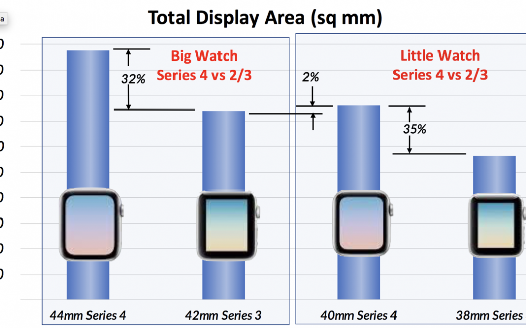
Let’s say you already have the bigger Apple Watch Series 2/3, which is 42mm tall. You heard on the keynote that the new one is bigger, referred to as 44mm. The question I sought to answer for you was how much bigger would that feel and what would you gain for that bigger size?
This year’s big Apple Watch is only 4% wider and taller, but it’s actually 6% thinner, so it has a total volume of only 1% more than the older big watch. For that tiny percentage increase in physical size, you get 32% more display area! There is one more cost though, the 44mm Apple Watch Series 4 weighs 14% more than last year’s 42mm Series 3. So you get a huge increase in display area with a very minor increase in physical size, but a noticeable increase in the weight.
This Year’s Small Apple Watch vs. Last Year’s Small Apple Watch
But about the little-watch people? Let’s do the same comparison. The difference in physical dimensions on the smaller watch is even less noticeable. The 40mm Series 4 is only 2% wider and 4% taller than last year’s Series 3 while coming in 6% thinner making the overall volume of the watch drop by 1%. I have the 38mm Apple Watch and I’ve always said the one thing I wanted was thinner, so this sounds great to me.
The Series 4 smaller watch does gain weight. In fact, it packs on 13% more weight than the Series 3. However, the new watch packs in a display area that is 35% larger. I just finished saying the one thing I wanted was thinner, but I lied. I wanted two things. I wanted thinner AND I wanted a bigger display! But I never thought to ask for both at the same time. I thought I’d have to bump up to the big girl watch size to get that bigger display.
This Year’s Small Apple Watch vs. vs. Last Year’s Big Apple Watch
With all these great metrics running around, there has to be someone in the audience who did go for the larger Apple Watch and is now wondering what they would lose if they went down to the smaller size, which now has so much more display area. Well, I ran those numbers too!
This comparison is the Series 4 40mm Apple Watch vs. the Series 3 42mm watch. This will be a big drop in volume as the new smaller watch will be 7% narrower, 6% shorter, and 6% thinner, for a total volume drop of 17% and you get a drop of 7% in weight. But get this, you don’t lose anything in display area. In fact, you get 2% more even though the Series 4 40mm is so much smaller. How cool is that?
Say It in Pictures
 While I’m a data nerd and all these numbers make me feel all warm and fuzzy, I realized that some people work better with pictures. I decided to graph some of what I just told you. I struggled with how to make it tell a story and not be all boring (like the numbers were already). People love to make 3D bar graphs but you actually lose information that way. It’s very hard to see which bar is actually higher when they’re slanted like that.
A hundred years ago at work, I came out with a style of graph that looks 3D without making it more confusing. Here’s the trick. Create a standard boring bar chart. Now select your bars and change the fill from solid to gradient. You want to set it to linear, with the angle at 180°. Then with the little gradient stops sliders, set the right and left to the same dark color, and change the middle one to a lighter hue of the same color. This makes the columns look like they’re cylinders. You’re welcome!
So anyway, back to the Apple Watch chart. I figured the most interesting one might be the total display area. I made my pretty cylinders and then painstakingly drew in some lines to say the percentage difference between the heights of the bars, and it was looking pretty good. I showed it to a few people, and Pat Dengler said it needed some pretty pictures.
 On Apple’s comparison page, they have a graphic of the different looks of each of the four watches. It’s cool because you can see that the Series 3 has a square rectangular area with a significant bezel, but the new ones have a larger rounded rectangle that more effectively fills the face of the watch. Anyway, Pat suggested I use these pictures to snaz up my graph.
I cut each picture out, opened the crops in Preview, used the magic wand to erase the empty white space, and then copied each image back into Excel, plopping each one on top of its respective bar. It looks pretty cool and I think it’s a compelling way to tell the story.
I then told her that there’s another pretty fun way to add pictures to a graph but it doesn’t help you understand a darn thing. In Excel (and probably in Google Sheets) you can click once to select all of the bars in your chart, but then click again to select just one. In the Format Data Point menu, you can change from Fill (or Gradient) to “Picture or texture fill”. You can select a picture on your desktop or it will take whatever you’ve got in your clipboard.
 In our example, I had the 44mm Series 4 watch graphic in my clipboard. When I selected it, it made the graphic be the bar, but stretched the whole height of the bar. We don’t want that. Back in the Format Data Point menu, change the default from Stretch to Stack. Now you’ll have a bunch of adorable little watch faces stacked up to the height of the bar. It’s really hard to gain any knowledge from this graph but it’s cute! I used to make these at work when I felt like irritating my boss. They’d ask me to make the 278th revision of my budget charts so I’d make them with giant dollar symbols stacked up. They didn’t think it was as funny as I did. No sense of humor at all.
 Then I started playing around with how to show the case dimensions in a pretty graph. I didn’t want to make four comparison charts for height, width, thickness, and weight, so I combined them into one graph. This took a bit of trickery though.
The first three dimensions are in millimeters, while the weight is in grams. I figured out that Excel would happily plot the four data points for weight as though they were millimeters. When I entered the weight data, I created a custom format of 0.0.”g”, but Excel ignores that and happily plots it along with the other linear dimensions. But here’s the cool part. I can turn on the data labels just for the weight bars and it looks perfectly reasonable.
I’m not sure this is the best chart of the bunch. I like the raw numbers better, especially with the percentages, but if you’re visual it’s not bad.
But then I had another idea for a visual effect. You may remember a blog post I just did last month entitled Freemium Archisketch Helped Me Rearrange the Room of Crap? Archisketch lets you do scale drawings so I thought I’d see if drawing the watches would help. I wasn’t skilled enough to draw the real watches and I was tired of the pretty pictures. Instead, I simply drew rounded rectangles.
 But then I got the idea to plop the two old watches on top of the two newer models. So all you see is two rounded rectangles on the left for the two big watches (Series 3 on top of Series 4) and the two little watches (again with Series 3 on top of Series 4). As simple as this diagram is, I think it’s the most compelling imagery of everything I did. Why? Because the Series 4 watches, which sound so much bigger, barely stick out from under last year’s counterpart. In other words, you’ll never be able to tell the difference in the size on your wrist if you go from big to big or from small to small.
Superb! I was looking for such detailed information. Actually, it’s basic info that Apple should supply in an easy to find table.
Now, there is one thing that is missing. What size are the screens, width and height, in inches?
You’ve given it in pixels, and an area figure in square mm, but what I have been trying to find are the actual dimensions of the display.
I noticed that Apple omitted such basic info for iPhones and iPad, too!
Thanks Carl! The dimensions you seek can be calculated using the data you referenced. I’ve calculated the pixel density, but that’s in square area. If we take the square root of the pixel density, then we have the linear pixel density. (I do have to assume square pixels for all this). Given that linear density, we can calculate the height and width in mm.
Here’s an example: The 42mm has a pixel density of 164 pixels/sq mm. The square root of 164 is 12.8 pixels/mm. The width is 312 pixels so if we divide that by 12.8 pixels/mm, the display would be 24.33mm wide. If you want that in inches, there are 25.4mm/inch so divide 24.33mm ÷ 25.4mm/inch = .96 inches wide.
If you really want this and find the math annoying, let me know and I’ll send you the original spreadsheet with all the math done for you! I don’t want to add this much complexity to the blog post.
Awesome, I was looking for exactly this!
Thank you for the data: it saved me a trip to the Apple Store and I am now the very happy owner of a 40mm Series 4.
A small error: Volumes should be in cubic millimeters (cu mm) not square millimeters (sq mm).
Will a waterproof case for a 42mm watch fit the 40mm series 4?