 A couple of weeks ago I told you about Affinity Photo’s extensions to Apple’s Photo app. I promised that I’d come back later and give you an idea of what you can do with the full Affinity Photo from affinity.serif.com/…. Just to make sure we’re all on the same page, remember that Affinity Photo is only $50 in the Mac App Store.
I’ve struggled a bit to do this review because the tool is so crazy capable, I can’t possibly go through everything it can do, but on the other hand if I don’t, you might walk away thinking it’s another Pixelmator, when in reality it might be another Photoshop. I’m not a Photoshop expert by any means but I’ve been showing Affinity Photo to a bunch of my photography friends and they’ve all been very impressed. I’m going to pick out a few things that make Affinity Photo stand out from the crowd, while continuing to stress that this is a $50 piece of software with no monthly fees.
I’m going to tell you about the interface, call out interesting highlights and try to give you a feel for the breadth of the tool. Hope this works!
Affinity Photo has what they call “Personas”. It sounds kind of goofy and I know Lightroom does have something along these lines but there are reasons to have these modes of operation separated. The four personas are:
- Photo: The default Persona for photo editing including crop, selection, brush, retouch, erase, warping and vector-based tools.
- Liquify : Used for distortion of image areas, such as retouching and adding special warping effects.
- Develop: For in-app development of raw images, giving you full control of image colour and tone.
- Export : You can output your image, layer, or slice to a range of image formats.
Photo Persona
![]()
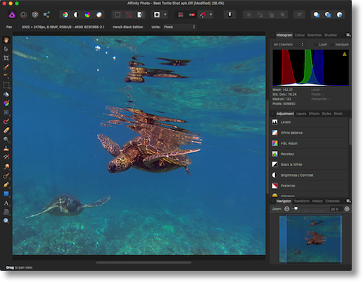
 The Photo Persona is where you would do most of your image editing operations so we’ll start there. Affinity Photo is familiar in many ways if you’ve used other image editors. Down the left side you have the typical tools: selection, tools, cropping and correction. On the right hand side you’ve got a whole bunch of palettes for sliders and layers. I don’t know what the generic term is for these tabs and palettes, but Affinity calls collectively them “Studio”. While you’re working, you have to also keep an eye on the bottom of the window, because that’s where Affinity puts the tool tips.
Let’s do this in an example. Let’s say you want to use the flood selection tool to select an area of close colors. You’re going to drag across the area to select. In the top of the window you can see buttons for New, Add, Subtract and Intersect. But at the bottom there are tool tips telling you that you can flip between add and subtract using the shift and option keys. If you like to read the words and push the buttons, great, but if it’s a tool you use all of the time, you’d look to the bottom to learn a faster way to do it.
If you’ve used other image editors, you’ll like that Affinity follows many of the same keystroke standards set by Adobe, like left/right bracket to decrease/increase brush size, and command-d to deselect an area. If there’s a keystroke you like, try it in Affinity because it might just work.
Affinity Photo does this so similarly to other image editors that it’s confusing when they do something completely differently. For example, on every image editor I’ve ever seen, there’s a tool on the bottom left for the color picker. It’s two circles for the foreground and background colors, and usually starts with one black, one white. You tap on one of the circles and you can change the color using a color palette, or an eyedropper.
I had to bring Mark Pouley of Twin Lakes Images up on Skype to do a screen share with me so that we could fish our way through all of the menus and tabs to find out where the heck they hid the color control. In the right side panel there’s a tab entitled Colour (note the “u” in color or you won’t be able to find it in the Help menus). There you’ll see the two circles for foreground and background and an eye dropper. But even after discovering it, we couldn’t figure out how the heck to get it to work! Then we enlisted Steven Goetz to figure out that you have to press and hold on the color next to the eyedropper, and then drag it into the image to pick a color. Once you know the trick, it’s easy to use, it’s just not the way any other image editor works that I’ve played with.
Like I said, Affinity Photo generally does things the same as other tools but once in a while you’ll be thrown for a loop trying to figure it out.
 If you listened to last week’s Chit Chat Across the Pond where I talked to Antonio Rosario, you’ll remember we got into a discussion about the difference between adjustments and filters. We settled on a definition that was later proven to have flaws, but it sort of holds true. Adjustments tend to be about light, while filters are more like something you put in front of the sensor, like a blur or a vignette.
Aperture and Lightroom and allow you to make adjustments to an image, such as brightness, contrast, vibrance and saturation, but they don’t have layers. Layers allow you to edit adjustments separately and across parts of an image selectively. Affinity Photo, like Photoshop, has layers for masking and all of the lighting adjustments I mentioned.
Affinity Photo also has a unique feature called Live Filter Layers. In other image editors, including Photoshop, when you apply a filter such as a blur, you’re shown a very small area of the image to see the effect of the changes to the blur you choose. You watch that little area as you change the radius, blend mode and opacity. With Affinity Photo, you see the effect being applied live to the entire image as you perform the edit. Seems like an obvious thing, but there’s a lot of math going on when it does this so it’s pretty impressive that they were able to pull this off.
Now that I’ve brought up layers, it’s time to talk about that right side panel area. As I mentioned Affinity Photo calls that area Studio. I’m going to start using that terminology so you get used to the name, and you’ll see why that’s important.
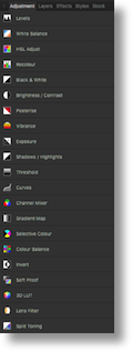
Studio is made up of three sections. By default, the top section is made up of things that don’t change the image at all. You can see the histogram, the colour picker I just talked about, Swatches which is where you gather up the colours you’re using, and Brushes. The second section, again by default, is dedicated to tools you can apply to the photo. For example, you’ll see the Layers tab where you select the layer on which you want to apply an effect, add new layers, name layers and remove layers. After selecting a layer, you’ll see in this same section the adjustment tab which includes sliders for levels, white balance, HSL Adjust, recolor, black and white, and about ten or so more adjustments.
The second section also includes tabs that are more about creating artwork such as logo design, rather than image editing. You’ve got the Effects layer that includes inner and outer shadows and glows, 3D effects, bevels and embossing.
The final section at the bottom of Studio has tabs that simply give information about the image, such as the History, Channels, Transformations, and a zoom slider just in case you got lost in your photo.
I’ve been careful to keep saying “by default” as I describe these sections of Studio because you can pull these tabs out of their predefined locations. Pulling on the tab will allow you to float it where you need it, and you can simply drag it back by the other tabs and it will slide back into place. However, this means you can completely move any tab anywhere you like. You have the freedom to move tabs up and down in sections to your hearts content…but it can also be really really confusing because the tabs can move around so easily. I finally discovered in the View menu an option called Studio and within there you can turn tabs on and off to remove them from view. But more importantly you can simply choose Reset Studio. All the tabs go whooshing back where they belong! See why you need to remember the name Studio?
Another confusion I had with the Studio interface was that you have the flexibility to change the width of the side panel. If you’re on a smaller screen, you might want to get more room for your image. This is swell but when you do that, the names of the tabs get shortened into abbreviations. So an area might say Histogram, Colour Swatches, Brushes one time and the next time you look at it, it says Adj Hg Sty Lyr, etc.
I have to say that as a new user of the tool I kept thinking my memory was failing me because I couldn’t find things where they were the last time I looked for them. Once I realized I was causing this change, and that it wasn’t happening all by itself, I got real good at finding Reset Studio in the View menu! I think when I’m finally done learning Affinity Photo I’ll uncheck the tabs I don’t think I’ll use, and gather the ones I will use into a single area.
One more tricky bit to the Studio is to keep your eye out for a teeny tiny little menu on many of the tabs. It’s in the upper right corner of each tab when opened and looks like four lines with a minuscule tick mark indicating it can be opened. This often reveals huge amounts of functionality. For example, on the Colour tab, you’ll see the traditional color wheel, but if you click on the teeny menu, you’ll find you can change it to sliders and other methods, along with adding the color chosen to the Swatch panel including complementary colors. Just this one little tab with all its menu options could be a 20 minute lesson! So my advice is to look for those little menu buttons and click them all to see what’s inside.
Top Menus
I mentioned that there are some unique buttons on the top panel of the Photo Persona window. There are four simple buttons for automatic levels, colours, contrast and white balance. Not sure why those are so prominently displayed in an app that’s clearly for the less casual user. There are four buttons to select all, deselect, and invert selection which would be handy, and then a button to change the way masks are represented – black, white, overlay or transparent. To be honest, I haven’t been able to master doing masks well enough to tell whether this button works well or not!
Also in prominent position at the top are three buttons for the art designers. They let you work by single pixel, force pixel alignment and snapping. Again not sure why that’s there so prominently but for the literal pixel pushers, you go for it.
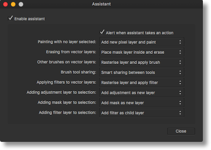
 The next button is for the Assistant and this little button looks like a butler’s uniform. I love the Assistant. Its job is to help prevent you from doing dumb things. Here’s a perfect example of something dumb we ALL have done. You want to paint on an image and you forget to create a layer first. The Assistant gives you options of what it will do. You can have it create a layer for you knowing you just forgot, or do nothing. You can also have it alert you to your mistake to help you learn, or not alert you so you don’t have to worry about it. There are 8 things the Assistant can help you with but I won’t go through all of them. It’s very much worth investigating the options.
Liquify Persona
I’m going to talk about the next three personas much more briefly now that we understand the fundamentals of how to work in the Photo Persona. The Liquify Persona is formatted the same but the tools down the left hand side are now for doing warping and twisting, freezing and thawing as we talked about with the extensions.
You’ll see just a few tabs in the Studio to work with brushes and the mesh, adding masks, etc. Just like in the Photo Persona you can tear these tabs off, float them around and reattach them as you please…and more importantly use View, Reset Studio!
Develop Persona
 I mentioned at the beginning that the Develop Persona is for accessing the full control of image colour and tone for RAW images. It’s the third Persona in the menus but it’s where you’ll actually start automatically when you open a RAW, or uncompressed image like a TIFF image. Again you’ll have scads of controls for exposure, contrast, clarity, white balance and more all in Studio on the right sidebar. But in here you can also do lens corrections to remove the inherent distortions from a wide angle lens.
When I first discovered the Develop Persona and noticed that you have to hit Develop when you’re done in there. I assumed I had to really commit to those changes before moving on and could never go back, but you can go back into Develop at any time and do more work, so it’s not as permanent as it sounds.
Export Persona
Export Persona confused me at first too – how hard is it to export? Don’t you just choose a format and hit save? Affinity Photo has a feature I haven’t seen before but may be in other tools. You can take a slice of an image. Here’s a use case. You have a terrific photo of you and your husband and you want to crop yourself out to use as an avatar. In a traditional program you have to be careful not to wreck the original image. Maybe you make a duplicate, maybe you try really hard to not save over the original, or maybe you crop, export, and then undo.
With Slices you simply drag across the area or even multiple areas you want to export and export them separately. Zero destruction of your original image. This is also where you can find the 1x, 2x stuff I talked about last week but let’s not open THAT kettle of fish again, ok?
Conclusion
I’ve been rattling on here for a very long time and I haven’t even begun to brush the surface of what you can do with Affinity Photo. See why this was so hard to do? The folks at Serif, makers of Affinity Photo have scads of videos where they demonstrate in bite-sized chunks how to do particular tasks. They don’t point at a tool and say, “this paint bucket dumps paint”. Instead they say, what if you wanted to take a weed-covered stairwell from this photo and put it in this canyon shot over here? Or what if you want a photo of some cool sculpture but people keep walking in front of it? Here’s how, using the Stacking feature of Affinity Photo, you can take a slew of shots, have them all combined together and automatically remove anything that was moving between images.
I’ve watched about 20 of them and you really learn how amazingly powerful Affinity Photo is, especially for a first generation product. If you want an industrial-strength image editor but don’t want to pay an arm and a leg a month, but rather $50 one time, check out Affinity Photo at affinity.serif.com/….

Hi Allison, thanks for the great review. You can select US English via Preferences > General > Language which should solve your colour/color question.
[…] Affinity Photo – Part 2 […]
Great review – really helped – thank you
This is very helpful.
Hi Allison,
Based on your story about Affinity Photo, I’ve cancelled my Photoshop CC subscription (which luckily runs out the end of this month!) and purchased Affinity Photo. While Affinity Photo does have a few quirks that border on being bugs, it performs all the functions I require and saves me a bunch of money. So I thank you for pointing your listeners to this software.
Now, I’d like to recommend something to you. Nik software originally sold a package of Photoshop plugins for $500. Google purchased Nik Software in 2012 and dropped the price to $150. Then in 2016 Google made the collection free, but one year later announced that they would no longer be updating the product.
Although no longer supported by Google, the collection remains very useful and is easily installed into Affinity Photo. I find Dfine (noise reduction) and Color Efex Pro to be particularly good, but I need to experiment more with the other plugins as well. Helpful tutorials are available on Google’s Nik Collection page and of course even more can be found on YouTube.
Download the Google Nik Collection here:
https://www.google.com/nikcollection/
Installation Instructions for Affinity Photo here:
https://www.dam-photo.com/install-nik-collection-plugins-affinity-photo/
Give them a try,
Drew