Dave Gerlits sent me this email:
Allison, Hi there. I’m taking you at your word about giving you feedback.
On a recent show you talked about one of your listers (Darren) speaking up about the text on the email and how hard it is to read. You responded and said that you had fixed the problem by reducing the width of the banner across the top. My email still has that problem. Could you please look into reducing the size of the banner for me too?
Love the show, and I listen every week. Cheers, Dave
Busted!
When I wrote that up, I HAD figured out how to make it stop but I had ONLY figured it out for the one-off newsletter that I sent out announcing no live show. When I went back to the RSS-driven feed that goes out automatically, for the LIFE of me I could not figure out how to get it to stop showing the wide banner!
When I looked on Mailchimp (the site that drives all of this) it showed my very small, square logo but it still sent out with the wide banner. I looked and looked but couldn’t figure out how to change to a new template to start over.
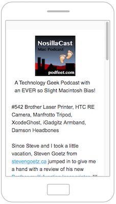 His email prompted me to go back in and I FINALLY found it. So now with a new template, I dropped in my square logo and previewed: Success! narrow in the mobile preview. Great!
I dropped in some text under the image (and fought with their difficult editor trying to get it centered without success) but still it showed up narrow in mobile preview. Great!
So then I dropped in the RSS block that goes out and grabs my latest item from the RSS feed which is the shownotes summary and links…and now it was sort of wide, definitely requiring scrolling left/right on mobile. ARGH.
I fooled around with some stuff and then got it to where it was maybe two words wide, so it would be about a hundred pages vertical scrolling to read the summary! ARGH.
I realized then that I could see a hairline box around the RSS code, so it was sort of in a block that was indented. I tried to copy/paste it out of there but it stayed super indented and looked worse than before. ARGH.
Finally I started with a brand new template, dropped in the image from scratch and it invited me to put a caption on it, which I dropped in and it formatted beautifully. THEN instead of using an RSS template block, I dropped in a plain text box and pasted in an unformatted version of the RSS code…and it worked!!! Great!
While I was at it I finally got around to changing the bottom stuff that said some glop about send me a paper mail to an address I made up, and the copyright that wasn’t true, and instead replaced with my real Creative Commons license that says you can do everything but make money off of my content as long as you give me attribution.
With any luck at all, you should get a nicely formatted NosillaCast News on both mobile and desktop next week. The good news is that I KNOW you’ll tell me if it didn’t work!