There were a few things I was super excited about in El Capitan that have turned into big disappointments to me, split screen and pinned tabs.
Split Screen
 Split Screen was one of those features that sounded really useful. For a few years I was forced to use Windows at work and one of the few things I liked was how I was able to drag a window to the side of the screen and it would snap to the edge and fill half the screen. If I wanted to, I could put another application window on the other side and it would also snap to half screen. If I wanted to, I could have one window filling half screen but the rest of the screen open to play with.
On my Mac, I use the $10 application Moom from manytricks.com which does a ton of cool stuff, one of which is to do split screen. Using Moom, if you drag a window near the top/bottom/left/right of your screen you’ll see a light blue dotted line around the half of the screen you’re near. If you let go it will snap right into place. Even nicer than the way Windows implements it. Some windows don’t allow you to modify their size, like System Preferences for example, so if you drag it to an edge, instead of a blue line showing you half screen, it makes it grey and includes a big red “no” symbol. You can put one app in split screen mode without irritating your other apps. Moom also lets you do quarter size, has keystroke commands to invoke these split screens, tons of fun for $10.
When El Capitan came along I tried split screen out on my 12″ Retina MacBook, and I would call it a complete failure. First of all, you would NEVER discover how to do this if you didn’t already know it was there. You press and hold on the green button in the upper left that normally takes you to full screen. You get a blue rectangle on the left, and you can slide to the right to move to the right to have the split to the right. No top/bottom option, no quarter screen and you HAVE to choose a second app for the other side. You can’t leave it half screen by itself. Oh, and it makes both of the applications part of their own space so if you command-tab away they disappear. This confused the heck out of me the first time I did it.
I also find that when you do get it working, the resulting windows vary dramatically in how they look. In some cases the text has been shrunk down to make the full width fit (Facebook) making it unreadable. In some cases (G+) the text of several panes got smashed onto other panes making it unreadable. I did an experiment on my 12″ MacBook where I put a web page in half screen using Moom, and also using El Capitan’s built-in effect. Moom cuts the text off so you have to scroll side to side, but El Capitan shrinks the text so that the full width of the web page fits on screen…which means I can’t read it any more. Definitely prefer the consistency of Moom.
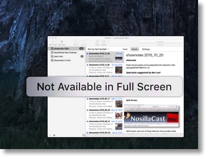
I was complaining about split screen online and Allister Jenks and I started comparing notes. One of the apps I had tried to go split screen with simply said, “not available in full screen” when I tried to see it side by side with Safari. He said it worked fine for him. We shared screenshots and eventually figured out what’s happening. We think that software vendors have a minimum width they’ll allow in their app. Because I was working on a 12″ retina MacBook and he was working on a 27″ iMac, we were getting different results. When I put Safari on the left, there wasn’t the minimum width left for 1Password. We also noticed that if I put 1Password in half screen first, then Safari showed the “not available in full screen’ message. I’m not sure now that I think about it what WAS going on. And why THAT error message? I wasn’t trying to do full screen at all!
Another problem is that with El Capitan’s implementation the software dev has to have implemented it. For example, Feeder has not (which is the main app I need side by side). With a tool like Moom, it can do split screen on any app regardless of whether the dev has implemented it. Feeder doesn’t necessarily obey the definition of “half” but Moom can definitely control it while El Capitan just pouts in the corner and won’t play at all.
Tools like split screen are only good if you can rely on them to work every time you need them. If you have to pay attention to which Mac you’re on, remember whether the application you want to use in split screen supports it, and pay attention to which order you want to set them up, then it’s a non-starter for me. Consistency is critical here.
One last complaint. I had split screen get stuck on me once, leaving half my screen blue, refusing to accept any apps into the blue side, couldn’t use app switching, and a relaunch of Finder wouldn’t fix it, couldn’t get to the menubar either to restart. It’s a good thing that I’ve tamed the Terminal because I had to use it to reboot! So yeah, I’m a REAL big fan of Apple’s split screen implementation.
Pinned Tabs
 Another failed implementation in El Capitan is Pinned Tabs. According to Apple’s Knowledge Base article PH21462, You can “Pin Facebook, Pinterest, Twitter, Gmail, or any other website you visit frequently throughout the day. Pinned Sites stay put on the left side of your tab bar so you can easily get to them at any time.”
Well that sounded swell to me. I go to the NosillaCast Google Plus community many times throughout the day so I thought that would be a great thing to pin. I read the instructions in the knowledge base article that said to drag the tab to the far left till it shrunk to a small icon and it worked. Ok great. I clicked the tiny G icon on the little bitty tab and went right to our G+ community. Cool! While there, I read a few posts and then decided to look at a G+ community for podcasters. I went back to some other tabs, did some goofing around and then later in the day hit the NosillaCast G+ pinned tab again…and it wasn’t on our community, it was on the podcasting community where I left it.
That’s when I realized that pinned tabs were something completely different than I thought. They’re a tab to a domain and that’s all. If you make one for iMore, you can go anywhere you want within the domain and you stay on the pinned tab, but if you click a link to a different domain, it opens up a new tab. It sounds good but this means that you basically have no clue where this pinned tab is going to take you, other than the domain. On iMore I jumped around, followed an internal link to Peter Cohen’s page and when I came back to the iMore pinned tab, there was Peter’s face. The only way I could get it to revert back to what I’d set it was to quit Safari and reopen. I guess this makes some sort of sense, but I can’t think that there’s much use to it.
There are exceptions to even this rule though. I went back to my pinned G+ tab, which is set to plus.google.com, and used the Google navigation grid to go to Gmail, which is at mail.google.com and instead of staying in the pinned tab it opened a new tab. So evidently in at least some cases different subdomains don’t stay in the same tab. I guess this also makes sense.
My confusion on the utility of this odd little continues because if you right click on the pinned tabs, you get two choices – unpin tab and close tab, but I couldn’t figure out the difference. Closing each one caused them all to disappear and restarting Safari didn’t bring them back. Another time I had a window with no tabs – and hence no pinned tabs. As soon as I made a new tab in that window, all the pinned tabs came back.
Bottom line – I have no idea why you’d want to use pinned tabs in the way Apple has implemented them.